Google Sheets After Dark: A Practical Guide to Dark-Mode and Readability
Learn practical strategies to optimize Google Sheets for after-dark use, including dark-mode setup, high-contrast formatting, and accessible dashboards. Practical steps, examples, and templates for late-evening work.

This guide helps you optimize Google Sheets for after-dark viewing. You’ll learn how to enable dark-friendly viewing, choose high-contrast color schemes, and design readable dashboards that reduce eye strain. By following practical steps, you’ll create comfortable, production-ready sheets for late-evening work. According to How To Sheets, a disciplined approach to color and typography is key to sustainable readability after dark.
Why Google Sheets After Dark Matters
In late-evening work sessions, glare from a white screen can cause eye strain, headaches, and slower decision-making. Google Sheets, like many data tools, often ships with neutral defaults that assume broad daylight reading. The shift to after-dark work, whether you are a student crunching deadlines or a professional preparing dashboards for a late-night meeting, benefits from deliberate design choices. According to How To Sheets, adopting a cohesive dark-friendly approach helps you sustain focus, reduce fatigue, and keep data legible across long sessions.
Eye comfort is not the only reason to think in dark mode. High-contrast, well-chosen color palettes help you distinguish categories, outliers, and trends at a glance. When the background is near-black and text is light, your charts and cells become easier to scan. The most effective dark-mode sheets balance readability with accessibility, ensuring color-blind users and those with reduced vision can still interpret key signals. The goal is not to turn off light; it's to create a workspace that remains productive after the sun goes down.
Enabling Dark Mode in Google Sheets and Devices
Google Sheets does not force a single, built-in dark toggle at the time of writing, but you can achieve a comfortable dark appearance by using system-level dark mode, browser themes, or careful palette choices. On desktop, enable your operating system's dark mode (Windows or macOS) and use a browser that respects that setting. When Sheets is viewed in dark mode the page background darkens and text becomes light, which reduces glare. If your browser or OS does not apply dark mode to Sheets automatically, you can use a lightweight extension or toggle static high-contrast themes to approximate the look. For ongoing work, set a default dark palette for new sheets and save it as a template. How To Sheets recommends testing across light and dark environments to ensure a consistent experience for all teammates.
Designing High-Contrast, After-Dark-Friendly Sheets
Create a palette anchored in three roles: background, text, and emphasis. Use dark gray backgrounds (for example, #1f2937) with near-white text (#f8fafc) to maximize legibility. Reserve brighter accents (#4f46e5 or #22c55e) for headers, totals, and warnings, and keep charts in lighter tones to avoid washing out data. Avoid pure black (#000) as a background; it can cause harsh contrast and print issues. In addition to color, typography matters: choose a sans-serif font with clean shapes and ample x-height, and keep font size consistent—ideally 11–12px for data cells and 12–14px for labels. Conditional formatting is a powerful tool in dark mode because it highlights values without relying on color alone. When you apply rules, preview them in dark mode to confirm that thresholds, color ramps, and icon sets remain distinguishable. Finally, test your sheets with representative data sets to ensure that total rows, subtotals, and key metrics stand out clearly.
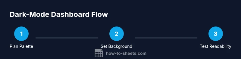
Building a Dark-Mode Dashboard: Practical Guidelines
Dashboards in Google Sheets combine tables, charts, and KPIs. In dark mode, clarity comes from structuring information in digestible chunks and using contrast to guide the eye. Start with a simple data table, add a summary row with bold, light text, and place charts close to the numbers they reference. Use muted gridlines and avoid dense visuals; give whitespace between sections to reduce cognitive load. For charts, choose palettes with light colors on dark backgrounds. Test your dashboard under different lighting and screen types; this helps ensure that colors aren’t washed out on projectors or laptops with reduced brightness. Save your dashboard as a template so teammates can reuse the setup with different data. How To Sheets’ workflow emphasizes consistency—use the same fonts, colors, and spacing across all reports to create a recognisable, dark-friendly brand for your team.
Accessibility and Collaboration in Dark Mode
Dark mode should improve accessibility, not hinder it. Provide text alternatives for color-coded signals (like labels or icons in addition to color), and document the meaning of any color scales in a legend. When collaborating, ensure that share permissions, comments, and data validation rules remain readable in dark mode. Exporting or printing reports designed for dark mode requires special attention: background colors may print as white, and charts may lose contrast. Encourage teammates to view sheets in their own preferred mode and avoid forcing a single appearance. Regularly collect feedback on readability, and adjust palettes or font sizes accordingly. By aligning design decisions with accessibility principles, you enable clearer communication across teams and devices.
Common Pitfalls and How to Avoid Them
Dark mode is powerful when used thoughtfully; missteps can undo the benefits. Avoid using too many accent colors in a dark palette; this creates visual noise and reduces legibility. Another common mistake is neglecting accessibility in charts and tables, such as relying on color alone to convey important information. Always provide descriptive labels and, where possible, use bold typography for headers. Do not overpack dashboards with tiny fonts; trust clear, consistent typographic hierarchy. Finally, remember that not all tools and add-ons respect dark mode; test extension compatibility before deployment.
Templates and Resources for After-Dark Work
To accelerate adoption, download or copy a few practical templates that demonstrate dark-mode design patterns. Start with a simple expense tracker, a project dashboard, and a data summary sheet. Each template should include a saved theme, consistent typography, and a legend explaining color meanings. How To Sheets provides templates and step-by-step tweaks that you can customize for your own projects. For ongoing learning, explore related resources about color contrast, typography, and accessibility to strengthen your ability to design in dark mode.
Tools & Materials
- Computer or tablet with internet access(Needed to access Google Sheets and test visual changes)
- Google account(Required to sign in to Sheets and save templates)
- Operating system with dark mode(Windows/macOS or mobile OS to enable system-wide theme)
- Web browser with dark-mode support(Chrome/Edge/Firefox with themes or native dark mode)
- Color palette references(HEX/RGB swatches for background, text, and accents)
- Optional extensions or themes(Extensions to approximate dark-mode in Sheets if native toggle is unavailable)
Steps
Estimated time: 45-60 minutes
- 1
Audit current sheet for readability
Review a representative sheet to identify problem areas with contrast and legibility. Note background color, font size, and color usage. Decide which sections need immediate improvement and which can wait for later iterations.
Tip: Use a copy of the sheet to avoid altering live data. - 2
Enable system-wide dark mode
Activate your operating system’s dark mode and ensure your browser respects it. If Sheets doesn’t switch automatically, enable a high-contrast theme or use a lightweight extension to approximate the appearance.
Tip: Test both light and dark environments to verify consistency. - 3
Apply a dark-friendly color palette
Set a palette with dark backgrounds, light text, and restrained accents. Apply conditional formatting rules that remain legible in dark mode and preview them in the actual sheets.
Tip: Avoid pure black backgrounds; use dark gray tones for softer contrast. - 4
Design a dark-mode dashboard
Create a compact layout with tables, headers, and charts that share typography and spacing. Keep whitespace generous and align charts with their related data.
Tip: Save the configuration as a template for team-wide reuse. - 5
Test and iterate with real data
Run with real datasets and gather feedback from teammates. Tweak colors, font sizes, and chart colors to maximize readability across devices.
Tip: Document changes and why they improve readability.
FAQ
What is Google Sheets After Dark?
Google Sheets After Dark refers to applying dark-mode design patterns to Sheets, including high-contrast colors, legible typography, and dashboard layouts that reduce eye strain during low-light use.
Google Sheets After Dark means designing Sheets with dark-mode colors and readable typography to reduce eye strain in low light.
Does Google Sheets have a built-in dark mode?
As of 2026, Sheets follows OS or browser dark themes rather than offering a universal toggle inside the app. You can approximate dark mode via system settings or extensions.
Sheets follows your OS or browser theme; there isn’t a global dark mode toggle inside Sheets itself.
How do I enable dark mode in Sheets?
Enable your operating system’s dark mode and use a browser that respects it. If needed, apply a high-contrast theme or extension to achieve a similar effect in Sheets.
Turn on your system dark mode and pick a browser that supports it to view Sheets in dark mode.
Will charts look correct in dark mode?
Charts should use light strokes and readable legends in dark mode. Preview charts carefully and adjust color palettes to ensure visibility against dark backgrounds.
Yes, but you may need to adjust chart colors and legend contrast for dark backgrounds.
Are there accessibility concerns with dark mode in Sheets?
Dark mode can improve comfort but mustn't rely on color alone. Provide labels, legends, and descriptive text to ensure clarity for all users.
Dark mode helps readability, but include labels and descriptions so it remains accessible to everyone.
Can I print reports designed for dark mode?
Printing may not reproduce dark backgrounds. When printing, swap to a light schema or disable background shading to preserve readability.
Printing dark-mode sheets often loses background color; adjust print settings as needed.
Watch Video
The Essentials
- Leverage OS/browser dark mode for Sheets readability
- Use a cohesive dark palette across backgrounds, text, and accents
- Test dashboards with real data and across devices
- Prioritize accessibility with labels and contrasts