Google Sheets Dark Mode: Enable, Customize, and Use
Learn to enable and optimize Google Sheets dark mode across web and mobile. Practical steps, accessibility tips, and troubleshooting to reduce eye strain and improve readability in everyday spreadsheets.

Goal: enable and optimize Google Sheets dark mode across web and mobile for comfortable, long-form editing. You’ll align your device or browser theme with Sheets, verify readability, and apply accessible color choices. This guide covers how to enable dark mode on desktop and mobile, best-practice palettes, and common issues to troubleshoot, plus practical tips for real-world workflows.
What Google Sheets dark mode is and why it matters
Google Sheets dark mode refers to the UI and spreadsheets adopting a dark color palette, reducing glare and eye strain during long editing sessions. For many users, this makes data review more comfortable in dim environments. According to How To Sheets, adopting a consistent dark-mode workflow can improve focus and reduce fatigue when working across lengthy data sets. This section explains the core benefits, including improved contrast for text, more distinct gridlines, and reduced blue-light exposure over extended periods. It also clarifies what parts of Sheets may change with dark mode, such as the interface chrome, menus, and chart legends, while data cells retain their usual values.
Understanding the impact on readability and accessibility
Dark mode changes how you perceive numbers, text, and charts. High-contrast combinations (near-white text on near-black backgrounds) generally improve legibility, but some palettes can wash out digits or blur gridlines. Accessibility best practices emphasize sufficient contrast, consistent color cues, and font legibility. When choosing a palette, aim for a contrast ratio that keeps headers readable and formulas clearly distinguishable from data. The goal is to minimize eye strain without sacrificing accuracy or quick scanning of data in Sheets.
Platform differences and how to think about them
Web, iOS, Android, and desktop apps may implement dark mode slightly differently. In many cases, Sheets will inherit the system or app theme, but there can be UI chrome variations—such as menus and tool panels—depending on the platform and version. Plan your approach by prioritizing one method (system, browser, or app) and testing across devices you and your team use. This helps prevent mixed experiences when collaborators share the same sheet.
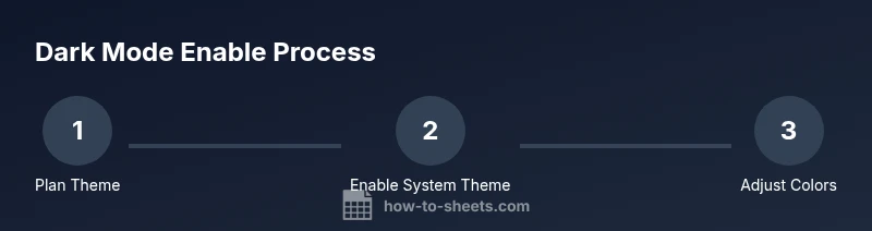
How to enable dark mode on different devices (practical paths)
Most users achieve dark mode by one of three paths: (1) system-wide dark mode, (2) browser-level dark mode that applies to web apps, or (3) an in-app toggle if provided by the Sheets app on mobile. Start by enabling your preferred method on your device or browser, then verify Sheets renders with the dark palette. If in-app options exist, you can refine the look further by tweaking the interface chrome and grid contrast to your liking.
Practical tips for readability, colors, and charts
To maximize clarity, pair a dark interface with high-contrast text colors for headers and key labels. Use muted or medium-bright background cells when you place dense data over dark surfaces to keep subtle differences readable. For charts, ensure axis labels and legends remain legible by choosing light or bright hues that stand out against the dark canvas. Save templates with pre-approved palettes to reduce setup time for future sheets.
Troubleshooting common issues in dark mode
If certain elements don’t render dark as expected, try syncing the app with the latest version, check for browser extensions that force light mode, and verify the OS or app theme is consistent across devices. Some users report occasional flickering headers or faint gridlines; adjusting contrast settings or temporarily switching back to light mode can help diagnose whether the issue is global or device-specific. A quick reset usually restores consistency.
Real-world workflows: budgets, project tracking, and more
Dark mode is popular for long budgets, schedules, and project trackers because it reduces screen glare. Use dark palettes in financial templates to highlight totals, and reserve bright accent colors for warnings or critical dates. The How To Sheets analysis shows that teams benefit from consistency: when templates use a unified dark-mode palette, onboarding is faster and collaboration improves as visual cues remain stable across sheets.
Quick-start checklist and next steps
Set one method (system, browser, or app) as your primary approach, verify readability across key views (data tables, summaries, and charts), and save a dark-mode template for future use. Share your approach with teammates and gather feedback on contrast and legibility. With a consistent setup, you’ll spend less time tweaking and more time analyzing data.
Tools & Materials
- Device with internet access(Desktop, tablet, or smartphone capable of running Google Sheets)
- Compatible browser or Google Sheets app(Chrome/Edge on desktop; iOS/Android Sheets app on mobile)
- Active Google account(Required to access and save Sheets)
- System color and display references(Have a basic color palette handy for tweaks)
Steps
Estimated time: 25-40 minutes
- 1
Choose dark-mode method
Decide whether you’ll rely on system-wide dark mode, browser-specific dark mode, or an in-app Sheets option. This choice guides the subsequent steps and helps maintain consistency across devices.
Tip: Consistency reduces confusion when collaborating on shared sheets. - 2
Enable system-wide dark mode on your device
Turn on dark mode in your device’s operating system. This often provides a baseline that Sheets can adopt for a cohesive look across apps.
Tip: If you enable scheduling, consider aligning it with your work hours for automatic transitions. - 3
Enable browser or app dark mode
If your browser or the Sheets app offers a dark-mode toggle, enable it or set it to follow the system theme. This ensures Sheets displays with the dark palette.
Tip: Test on at least two devices to catch platform-specific quirks. - 4
Open Google Sheets and verify the theme
Launch a few sheets (data tables, dashboards, and charts) to confirm the dark palette renders as intended. Look for readable headers, visible gridlines, and legible axis labels.
Tip: If some UI elements remain light, consider adjusting your palette or relying on the system-wide setting. - 5
Adjust colors for readability
Fine-tune header text, data cell text, and background colors to maximize contrast. Prefer near-white text on near-black surfaces for headers and data labels.
Tip: Avoid very light blues or greens that can blur on dark backgrounds. - 6
Validate charts and formulas
Ensure chart labels, legends, and formula results stay visible. If needed, tweak chart colors to maintain contrast against the dark canvas.
Tip: Keep a single accent color for critical values to avoid visual noise. - 7
Create templates for future sheets
Save a dark-mode template with your preferred palette to streamline new sheets and maintain consistency across projects.
Tip: Document the chosen palette rules for teammates. - 8
Share and gather feedback
Share the dark-mode template with collaborators and collect feedback on readability, especially for teams with accessibility needs.
Tip: Iterate based on user input to improve long-term usability.
FAQ
What is Google Sheets dark mode and why should I use it?
Dark mode changes the interface to a darker palette, reducing glare and eye strain. It can improve focus during long data sessions, especially in low-light environments.
Dark mode makes the Sheets interface darker, reducing glare and making it easier to work in dim light.
Does dark mode work on all devices?
Dark mode generally follows system or app themes on web and mobile. Availability and exact appearance can vary by device and Sheets version.
Most devices support dark mode through system or app settings, but appearance can vary slightly by device.
How do I enable dark mode on the web?
Enable your device or browser theme to dark, then open Google Sheets to see the effect. If Sheets has an in-app toggle, use it to fine-tune the interface.
Turn on dark mode in your device or browser, then check Sheets for the expected appearance.
Does dark mode affect formulas or colors in cells?
Dark mode does not change the data or formulas themselves; it changes the UI colors. You may need to adjust cell text or background contrast for visibility.
No, formulas stay the same; you may need to tweak colors for readability.
Can I share dark-mode Sheets with others?
Yes. Shared sheets will display in dark mode if the recipient’s device or browser supports it. Encourage consistent palettes for readability.
Yes, but others should have similar theme settings for the best viewing experience.
Are there accessibility considerations I should follow?
Yes. Aim for high contrast, legible fonts, and clear color cues. Provide fallback options or templates for users with sensitivity to certain palettes.
Yes—prioritize contrast and legibility to accommodate accessibility needs.
Watch Video
The Essentials
- Explore one consistent method for dark mode
- Prioritize high contrast for readability
- Test readability on headers, data, and charts
- Use templates to ensure consistency
- How To Sheets's verdict: adopt accessible palettes across sheets