Box and Whisker Plot in Google Sheets: A Practical Guide
Learn how to build a box-and-whisker plot in Google Sheets using built-in formulas and visualization techniques. This step-by-step guide covers candlestick and stacked-bar approaches, data preparation, and best practices for comparing distributions in Sheets.

You will create a box and whisker plot in Google Sheets by calculating min, Q1, median, Q3, max and then visualizing with either a candlestick chart or a stacked-bar whisker method. This approach is practical for one or multiple datasets and helps you compare distributions at a glance. This quick setup requires only your data range and no extra software.
What is a box and whisker plot in data analysis
A box and whisker plot, or box plot, summarizes a data distribution using five values: minimum, first quartile (Q1), median, third quartile (Q3), and maximum. The box represents the interquartile range (Q1 to Q3), while the whiskers indicate data spread beyond the quartiles. The median line inside the box communicates the dataset's center. According to How To Sheets, box plots are a compact way to compare distributions across groups at a glance. They are especially useful for spotting skew, variability, and outliers when you have several datasets to compare side by side. In Google Sheets, there isn’t a built-in box plot chart, but you can reproduce the look and interpretation with built-in charts and a little data preparation. This guide outlines two robust approaches and the data-workflows that make them work in Sheets.
Why Google Sheets lacks a native box plot and what this means for analysis
Google Sheets ships with a solid set of chart types, including bar, column, line, scatter, histogram, and candlestick, but not a dedicated box plot. The lack of a native box plot means you must construct the visualization using data transformations and a chosen visualization technique. The good news is that Sheets supports flexible workarounds that preserve the box plot semantics: you can either simulate with a candlestick-style chart or build a custom box using a stacked bar with whisker-like extensions. As noted in How To Sheets Analysis, 2026, many users successfully recreate box plots for single datasets or multiple groups by combining data series and careful formatting. With patience, you can achieve a clear, publication-ready distribution view directly in Sheets.
Two practical approaches to a box plot in Google Sheets
There are two common paths to a box plot in Google Sheets. The first uses a candlestick-style chart to reproduce the “box with whiskers” shape by mapping quartiles and extremes to Low/Open/Close/High values. The second approach builds a stacked-bar visualization where the segments represent the whiskers and the box, allowing straightforward interpretation and easy comparison across multiple datasets. Each approach has trade-offs: candlesticks visually resemble a real box plot but can obscure the exact quartile positions, while stacked bars make quartile ranges explicit but require careful data structuring. The choice depends on your data size, the need to compare groups, and how much you value precise quartile labeling versus visual immediacy.
Approach A: Candlestick-based box plot (one dataset)
This method uses a candlestick chart to emulate a box plot by configuring Low as the minimum, Open as Q1, Close as Q3, and High as the maximum. The resulting shape looks like a box with whiskers, which is familiar to analysts used to stock charts. Because median is not a standard element of candlesticks, you can optionally overlay a separate median marker using a secondary series or a line chart on the same sheet. The candlestick approach works well for a quick distribution snapshot of a single dataset and translates nicely into comparative visuals when you have a few groups.
Approach B: Stacked-bar whiskers (a practical approximation)
A stacked-bar approach creates a single horizontal bar where the segments correspond to: min to Q1 (lower whisker), Q1 to Q3 (the box), and Q3 to max (upper whisker). By making the lower whisker bar color transparent, you visually reveal the whisker edges and the central box. This method scales well for comparing multiple groups in a single chart, as each group is represented by a separate category with identical three-segment construction. It requires a precise helper table and careful axis labeling to keep the interpretation unambiguous.
Data preparation: calculating min, quartiles, median, and max in Sheets
Begin by calculating the key statistics from your data range. For a data column in A2:A101, the formulas typically are:
- Min: =MIN(A2:A101)
- Q1: =QUARTILE.INC(A2:A101, 1)
- Median: =MEDIAN(A2:A101)
- Q3: =QUARTILE.INC(A2:A101, 3)
- Max: =MAX(A2:A101) Use these values to populate a small helper table with columns labeled Min, Q1, Median, Q3, and Max. If your data extends beyond A101, adjust the ranges accordingly. This data is the backbone of both visualization approaches and helps ensure your quartile positions are exact.
Step-by-step overview for Approach A (candlestick)
Prepare the helper table and then map values to a candlestick-oriented dataset: set Low = Min, Open = Q1, Close = Q3, High = Max. Create a single-category candlestick chart to depict the distribution. Optionally, add a Median marker by inserting a separate data series (e.g., a single-point line) and overlay it on the candlestick chart. Finally, format colors (box fill and whiskers) to your preference and label the axis clearly to facilitate interpretation. Pro tip: ensure your data range is tidy and free of non-numeric values that could skew the chart.
Step-by-step overview for Approach B (stacked-bar)
Build a three-series data table for each group: Lower whisker length (Q1-Min), Box width (Q3-Q1), and Upper whisker length (Max-Q3). Plot a horizontal stacked bar chart with these three series per group, then make the Lower whisker transparent to reveal the whisker edges. Add category labels for groups and annotate key quartiles directly on the chart or in an adjacent legend. This method scales cleanly to multiple groups and emphasizes direct comparison of box positions and whisker spans.
Interpreting the chart and extracting insights
A box plot communicates distribution shape and spread at a glance. Look for the following cues: a longer whisker implies greater spread beyond the quartiles; a box that shifts left or right indicates skew; a short box with long whiskers points to variability but central tendency alignment. When comparing groups, align quartile positions and whisker lengths across categories to identify which group has higher variability or a more left/right-skewed distribution. Always cross-check the quartile values with the underlying data to ensure the visuals reflect the numeric reality. With practice, you’ll become proficient at quickly spotting outliers, skew, and dispersion differences across datasets.
Practical tips for multiple datasets and quality control
When you scale box plots to compare several groups, keep data ranges consistent and label each group clearly. If you notice outliers, decide whether to display them with a dedicated marker or to note them in a separate appendix. Validate your formulas by cross-checking with a few manual calculations and by sampling data values. Consider creating a small template sheet that houses the helper table for each group, so you can reuse the same structure without re-deriving formulas. Finally, export your chart as a PNG or SVG for reports or presentations, ensuring readability at different sizes.
Tools & Materials
- Computer or device with internet access(Any modern browser; sign in to Google account)
- Google Sheets data range(Numeric data column, e.g., A2:A101; adjust to your dataset)
- Optional: visualization templates or add-ons(Not strictly necessary; can speed setup)
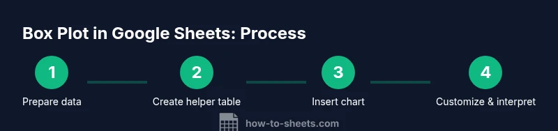
Steps
Estimated time: 30-60 minutes
- 1
Prepare data and compute key statistics
Identify your data column (e.g., A2:A101) and compute Min, Q1, Median, Q3, and Max using standard Sheets formulas. Create a small helper table with labeled rows for Min, Q1, Median, Q3, and Max. This establishes the numerical basis for the visualization.
Tip: Double-check that all inputs are numeric and consider excluding obvious outliers before computing quartiles. - 2
Create a candlestick-ready dataset (Approach A)
In a separate area, map Low to Min, Open to Q1, Close to Q3, and High to Max to form the data series for a single-category candlestick chart.
Tip: Keep a clean label for the category axis (e.g., Dataset A) to avoid confusion when you add more groups. - 3
Insert the candlestick chart
Select your candlestick-ready data and choose Insert > Chart, then change Chart type to Candlestick. Adjust axis labeling and chart title for clarity.
Tip: Ensure the category axis aligns with your data; misalignment can make the chart hard to read. - 4
Add a median marker (optional)
If you want to show the median, add a separate line or point series representing the Median value and overlay it on the candlestick chart using chart editor options.
Tip: If overlaying is difficult, place a small annotation near the box noting the median value. - 5
Customize visuals and labels
Tune colors (box fill, whiskers), apply data labels if helpful, and ensure axis tick marks properly reflect the data range.
Tip: Use contrasting colors so the box and whiskers stand out even at a small display size. - 6
Repeat for multiple groups (Approach B)
If you're comparing several groups, create a three-series helper table per group: Lower whisker, Box width, and Upper whisker. Plot a stacked-bar chart with these series.
Tip: Maintain consistent data structure across all groups for clean comparisons. - 7
Interpret and validate
Review quartile positions and whisker extents against the raw data. Confirm the plot communicates the distribution accurately and adjust if necessary.
Tip: Cross-check a few data points manually to ensure quartile calculations align with expectations.
FAQ
Can I create an authentic box plot in Google Sheets without add-ons?
No, Google Sheets does not include a dedicated box plot chart. You can approximate a box plot using a candlestick chart or a stacked-bar whisker method with helper data. Both techniques rely on built-in functions and charts, so no external add-ons are required.
Sheets doesn't have a native box plot, but you can approximate with candlesticks or stacked bars using built-in tools.
Is there a limit to data size for these plots?
Box plots work well with typical datasets. Google Sheets supports large spreadsheets, but performance may slow with thousands of rows. For best results, keep data ranges focused and organized, and break into smaller groups if needed.
They work for normal-sized datasets; very large sets can slow things down.
How do I add a median line to the candlestick?
Candlestick charts do not display a median line by default. You can overlay a separate median data series or use annotations to indicate the median value. If you prefer a single-chart view, opt for the stacked-bar approach and position the median as a separate cue.
Median isn't shown by default on candlesticks; overlay a marker or use a separate cue.
Can I compare multiple data groups in one chart?
Yes. Create a helper table for each group (min, Q1, median, Q3, max) and plot them as parallel series in the same chart. This enables side-by-side comparison of distributions with consistent scales.
Yes, you can compare groups with a single chart by using a uniform data structure.
What common mistakes should I avoid?
Avoid mixing data ranges for different groups, mislabeling axes, or treating whiskers as outliers. Verify quartile formulas and keep annotations consistent to prevent misinterpretation.
Watch out for inconsistent ranges and mislabeled axes that confuse interpretation.
Watch Video
The Essentials
- Compute the five-number summary (min, Q1, median, Q3, max) accurately.
- Choose between candlestick and stacked-bar approaches based on your needs.
- Label axes and groups clearly to avoid misinterpretation.
- Use a median marker or annotation to enhance clarity when possible.
- Validate results by cross-checking with the raw data and trying a sample set.