How to Make a Histogram on Google Sheets: A Practical Guide
Learn how to make a histogram on Google Sheets with a practical, step-by-step approach. This guide covers data prep, chart setup, bin sizing, labeling, and interpretation for clear data storytelling.

You can create a histogram in Google Sheets by preparing your numeric data, inserting a chart, and selecting Histogram as the chart type. Then adjust bin size, label axes, and tune colors for clarity. This quick roadmap helps you visualize data distribution quickly and accurately.
How to make a histogram on Google Sheets: Why histograms matter
Histograms are a powerful way to visualize data distributions, revealing where values cluster, where they spread, and whether there are outliers. If you’re a student analyzing test scores, a professional tracking monthly sales, or a small business owner evaluating customer ages, a histogram helps you see patterns at a glance. In Google Sheets, you can create a histogram using the built-in Chart tool, which compares favorably to manual frequency tables and external add-ons. The goal of this section is to explain when histograms beat simple bar charts, and why the histogram you make in Sheets should focus on bins that reflect your data’s range. By the end, you’ll be ready to translate raw numbers into a concise visual story: how to make a histogram on Google Sheets that informs decisions rather than just looking nice. This guide uses practical examples and screenshots to help you implement quickly.
Data preparation for a clean histogram
Before you draw a histogram, ensure your data are organized in a single numeric column with no text or missing values that would distort the shape. If you have multiple related fields, copy the numeric column to a new sheet, remove duplicates if necessary, and fill blanks with a meaningful value or delete the row. Check for outliers that could skew bin ranges and decide whether to include them. It’s helpful to add a header row and freeze the top row so your data stays stable as you explore different bin sizes. If you plan to compare groups, you can create separate histograms side-by-side by duplicating the sheet and applying the same bin settings. The cleaner the data, the more accurate your histogram will be, and the easier it is to interpret.
The Chart Editor in Google Sheets: navigating the histogram options
The Chart Editor in Sheets is where you configure the histogram. When you insert a chart, switch the chart type to Histogram in the Setup tab. In the Customize tab, you’ll find options to adjust the bucket size (bin width), bin boundaries, and label formatting. If your data includes a header, make sure Sheets recognizes it as a label to improve the chart legend and axis descriptions. As you experiment with different bin sizes, compare the shapes to identify which view most clearly conveys your data story. Remember: the goal is clear communication, not just a flashy chart.
Creating the histogram in Google Sheets
To begin, select the data column you want to visualize. Then go to Insert > Chart to open the Chart Editor. In the Chart type menu, choose Histogram. Sheets will render a histogram using the automatic bin settings. The Chart Editor provides two tabs: Setup and Customize. In Setup, confirm the data range and ensure the chart type is Histogram. In Customize, adjust the bucket size if you want wider or narrower bins, turn on or off the histogram visuals, and label the axes clearly. If you’re using headers, ensure Sheets uses the first row as a label, which makes the legend and axis descriptions more meaningful. As you experiment, try different bin sizes and compare how the shape changes. The goal is a chart that communicates your data story without overcomplicating the image.
Fine-tuning: bin sizes, color, and labels
Bin size is the most impactful lever for histogram readability. Start with a moderate number of bins and adjust to see how the distribution changes. Use distinct colors to emphasize the bars if you’re presenting to non-technical stakeholders. Label the x-axis with the data range and the y-axis with the frequency or count. If your dataset spans multiple groups, consider separate histograms or a grouped layout to highlight comparisons. Don’t overfit the chart with too many labels; keep the display clean so the audience can spot the main peaks quickly.
Common mistakes and how to avoid them
Common pitfalls include mixing numeric and non-numeric data in the same column, ignoring missing values, and selecting an inappropriate bin width that hides important features. Avoid overusing color that distracts from the data. Always check the data range in the chart editor to ensure you aren’t accidentally including headers as data points. If the histogram looks flat or jagged, reconsider the bin size and confirm the data are numeric. Validation steps, such as quick checks with a separate frequency table, help ensure accuracy.
Interpreting your histogram and telling the data story
A histogram summarizes distribution shape, central tendency, and variability. Look for skewness, modality (single peak vs. multiple peaks), and gaps. A right-skewed histogram indicates a long tail of higher values, while a left-skew suggests lower values dominate. A symmetric, bell-shaped histogram often implies normal distribution. Use the histogram alongside summary statistics like mean and median to tell a clearer story. When presenting, explain what the peak means for the audience and what decisions or actions it suggests.
Real-world example: exam scores dataset
Consider a class with 100 exam scores ranging from 0 to 100. After cleaning the data, you create a histogram with bin widths of 5 points. The result shows a strong concentration between 70 and 85, with fewer scores below 60 and very few above 90. This shape signals where students typically perform and which score ranges may require targeted review. Such a histogram becomes a practical tool for instruction planning and student support, illustrating distribution at a glance.
Sharing and exporting your histogram for teams
Google Sheets charts can be shared directly within the document or exported as image files for reports. When sharing, ensure collaborators have appropriate access to view or edit the sheet. Consider adding a caption that explains the histogram’s purpose and the bin logic you used. If you’re distributing the chart across platforms, exporting as a high-resolution PNG or SVG helps maintain clarity when scaled. Always include a brief interpretation note to help viewers understand the distribution without needing to inspect the raw data.
Tools & Materials
- Computer or device with internet access(Needed to access Google Sheets)
- Google account with access to Google Sheets(Sign in to Google Drive and open a sheet)
- Data prepared in a single numeric column(The column to visualize in the histogram)
- Headers for data and bins(Helpful for labeling in the chart)
Steps
Estimated time: 15-25 minutes
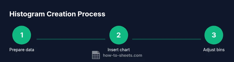
- 1
Prepare your data
Ensure the data column is numeric, free of text, and free of non-numeric values. Clean blanks or remove those rows to avoid distorting the histogram shape.
Tip: Use data validation to prevent non-numeric entries going forward. - 2
Insert the chart
Select the data column, then go to Insert > Chart to open the Chart Editor.
Tip: If Chart Editor doesn’t appear, refresh the page or reopen the sheet. - 3
Choose Histogram as the chart type
In the Chart Editor Setup tab, select Histogram as the chart type. The histogram will render with default bins.
Tip: Check that the data range shown matches your numeric column. - 4
Adjust bin size
In Customize > Histogram, use the bucket size control to widen or narrow bins for readability.
Tip: Aim for a bin count that reveals the main features without overcomplicating the view. - 5
Label axes and title
Add a descriptive chart title and label the x-axis with the data range and the y-axis with frequency.
Tip: If you have a header, ensure Sheets uses it for the legend and axis labels. - 6
Review and compare
Toggle bin sizes and compare shapes to ensure the distribution is represented clearly to your audience.
Tip: Create a duplicate chart to compare multiple bin settings side by side. - 7
Publish or export
Share the sheet with collaborators or export the chart as an image for reports.
Tip: Add a short interpretation note to help readers understand the distribution quickly.
FAQ
What data should I include in a histogram?
Only numeric values from a single column should be used. Exclude text, dates, or blanks to avoid distorting the distribution.
Include only numbers from a single column; remove non-numeric data to get a clean histogram.
Can I compare two datasets in one histogram in Google Sheets?
Google Sheets does not support overlaying two histograms in a single chart. You can create separate histograms side by side or build a frequency table for comparison.
You can’t overlay two histograms in one chart; use separate histograms or a frequency table to compare.
How do I adjust bin width?
Open the Chart Editor, go to Customize > Histogram, and adjust the bucket size or bin width slider to change how data are grouped.
Use the bucket size option in the histogram customization.
What if there are blanks or non-numeric values in my data?
Blanks are typically ignored by the histogram. Remove or convert non-numeric values before charting to ensure accuracy.
Remove or convert non-numeric values to ensure accuracy.
How should I interpret the histogram?
Look for skewness, peaks, and spread. The shape communicates where values cluster and how they vary, which complements summary statistics.
Use the shape, peaks, and spread to interpret distribution.
Is histogram useful for small data sets?
Yes, but histograms can be noisy with small samples. Consider wider bins or an alternative like a dot plot for very small data.
Histograms work but very small datasets may look noisy.
Watch Video
The Essentials
- Prepare a clean numeric data column before histogram creation.
- Choose Histogram as the chart type and adjust bin size thoughtfully.
- Label axes and title for clear interpretation.
- Compare different bin widths to find the most informative view.
- Share the chart with context for collaborative decision making.