How to Make a Chart in Google Sheets: A Step-by-Step Guide
Learn how to make a chart in Google Sheets with a practical, step-by-step approach. Prepare data, choose chart types, customize visuals, and share confidently. Ideal for students, professionals, and small business owners seeking practical, repeatable methods.

Make a chart in Google Sheets by selecting your data, inserting a chart, and customizing from the Chart editor. You’ll need a clean data range with headers, a stable data series, and a goal for the visualization (trend, comparison, or distribution). This guide walks you through choosing a chart type, filtering data, and refining labels, colors, and legends for effective storytelling.
Why charts in Google Sheets matter
Charts transform raw numbers into visual stories, helping you spot trends, compare categories, and communicate insights quickly. In Google Sheets, charts are tightly integrated with your data—so when your numbers move, your visuals can adapt in real time. According to How To Sheets, learners gain confidence faster when they see direct connections between data points and their visual representation. Use charts to support decisions, present data in meetings, and include visuals in reports for clearer storytelling. Whether you’re tracking sales, student progress, or project milestones, the right chart makes your message clearer and more persuasive.
In practice, a chart should highlight the most important pattern without clutter. Start with a clean data table, ensure headers describe each column, and keep units consistent. When your audience can read a chart at a glance, you’ve achieved a key goal of data visualization: clarity.
Chart types you can create in Google Sheets
Google Sheets supports a wide range of chart types, each suited to a different story. Common options include:
- Column charts for comparing categories over time or across groups.
- Bar charts for horizontal comparisons with long category names.
- Line charts for trends and time-series data.
- Area charts to emphasize magnitude across categories while preserving a sense of total volume.
- Pie charts for proportional breakdowns of a whole.
- Scatter charts to explore relationships and distributions.
Choosing the right chart type depends on your data structure and the question you want to answer. For instance, use a line chart to show monthly revenue trends, and a stacked column chart to compare quarterly performance across regions.
Preparing your data for charts
A clean data layout is the prerequisite for reliable charts. Start with a header row that clearly labels each column (e.g., Month, Region, Revenue). Keep numeric data free of stray characters and ensure consistent units (no mixing currencies in one column). Place related series in adjacent columns, and avoid blank rows within the data range you intend to chart. If your data grows, use named ranges or dynamic ranges to keep charts up to date. Finally, consider using a separate sheet or a clearly labeled tab for chart data to minimize confusion when you build or update visuals.
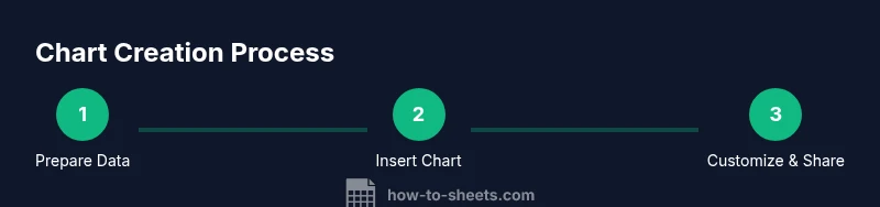
Step-by-step: creating your first chart (overview)
Creating your first chart in Google Sheets is straightforward and repeatable. Start by selecting the data range, then choose Insert > Chart. Google Sheets will propose a chart type automatically, which you can adjust later. Use the Chart editor on the right to refine the Setup tab (chart type, data range, and series) and the Customize tab (titles, colors, axes, and legend). As you adjust, check the chart’s readability on different screen sizes and ensure axis labels are descriptive. Remember: the goal is to make the data tell its story clearly, not to impress with complexity.
Customizing charts for clarity
Customization improves readability and storytelling. Give your chart a descriptive title and axis labels that convey what’s being measured. Use contrasting colors for different data series, and limit the number of series to reduce clutter. Enable data labels only if they add clarity, not noise. Adjust the legend position to avoid covering the data, and consider gridlines or tick marks for scale readability. If you present the chart in slides or reports, keep a consistent color palette and font style to maintain professionalism and accessibility.
Advanced charting tips and tricks
Take charts beyond basic visuals with advanced options. Create combo charts to show two different data series with different scales. Use secondary axes to compare disparate values without crowding the main axis. For large datasets, add trendlines to reveal long-term patterns, or use moving averages to smooth fluctuations. If you need to compare multiple regions or categories, consider small multiples (side-by-side charts) for quick visual comparisons. Lastly, try conditional formatting-inspired color schemes to emphasize high and low values without overwhelming the viewer.
Troubleshooting common chart issues
If a chart doesn’t update when data changes, verify that the data range covers all current data and that there are no blank rows within the range. If colors or labels look off, recheck the data series and ensure consistency across columns. When charts appear cluttered, simplify by removing extra series, shortening axis labels, or switching to a more concise chart type. If the chart’s data is dynamic, explore named or dynamic ranges to automate updates. Finally, ensure your browser and Google Sheets are up to date to avoid rendering glitches.
Best practices for sharing and presenting charts
Share charts with a clear narrative. Always provide a short caption or title that explains what the chart shows and why it matters. When embedding charts in documents or slides, keep them large enough to read and avoid stacking multiple charts on a single slide without whitespace. Use annotations or callouts to highlight key points, and tailor the level of detail to your audience (executives, students, or teammates). For accessibility, ensure sufficient color contrast and consider providing a text description for screen readers.
Accessibility and inclusivity considerations
Make charts accessible by using high-contrast color pairs, readable font sizes, and descriptive axis titles. Add alt text when charts are embedded in web pages or documents, and consider providing a data table underneath the chart for users who rely on screen readers. Keep the data source and calculation methods clear in the caption or an accompanying note. When sharing with a diverse audience, offer a short verbal summary of the chart’s message to ensure your insights reach everyone.
Tools & Materials
- Google account with access to Google Sheets(Used to sign in and save charts to Google Drive)
- A device with internet access(Laptop, tablet, or desktop; ensures connectivity to Sheets)
- Dataset prepared in Google Sheets(Headers clearly describe columns; data is numeric where appropriate)
- Optional: sample dataset or template(Helps practice chart creation and experimentation)
- Chart type cheat sheet or reference(Helpful for selecting the best chart for your data story)
Steps
Estimated time: 15-25 minutes
- 1
Open your dataset in Google Sheets
Launch Google Sheets in your browser and open the workbook containing your data. Verify that headers exist and data ranges are organized in columns. This step creates a reliable foundation for any chart you build.
Tip: Keep data in a single sheet or clearly labeled tabs to avoid confusion when selecting ranges. - 2
Select the data range for the chart
Click and drag to highlight the cells you want to chart, including headers. Avoid including unrelated columns or empty rows. If your dataset grows, consider using a named range for easier maintenance.
Tip: Include headers so the Chart editor can automatically label series and axes. - 3
Insert the chart
Go to Insert > Chart. Sheets will insert a default chart and open the Chart editor on the right. You can move this chart anywhere on the sheet as you refine it.
Tip: If the default chart isn’t suitable, you can adjust the type in the Setup tab immediately. - 4
Choose chart type and data series
In the Chart editor, switch the chart type under the Setup tab. Add or remove data series if needed. Ensure axis labels reflect what is being measured and keep the legend informative.
Tip: Experiment with two or three types to identify which best communicates your data story. - 5
Customize chart appearance
Tweak titles, fonts, colors, and axes in the Customize tab. Enable data labels sparingly, adjust gridlines for readability, and place the legend where it won’t obscure data.
Tip: Use consistent colors across charts to help viewers track the same categories. - 6
Place, resize, and share the chart
Drag the chart to your preferred location, resize it for readability, and copy or embed it into Google Slides or Docs if needed. Verify the chart updates when the underlying data changes.
Tip: Link charts to a living data source or set up a dynamic range to keep visuals current.
FAQ
How do I switch chart types after creating a chart?
Open the Chart editor and go to the Setup tab to swap the chart type. The diagram will update immediately. This is helpful when you want to compare how different visuals convey the same data.
Open the Chart editor, go to Setup, and choose a different chart type to see the change reflected instantly.
Can I chart multiple data series in one chart?
Yes. Add or remove data series in the Chart editor under Setup. Distinct colors help differentiate series, and use a legend to label each one clearly.
Yes, you can add multiple series in the Chart editor and use colors and a legend to keep them distinct.
Why isn’t my chart updating when I add data?
Check that the chart’s data range includes the newly added data. If the range is fixed, adjust it or use a dynamic range/named range so the chart expands automatically.
Make sure the chart range includes new data or switch to a dynamic range so the chart updates automatically.
Can I export a chart as an image for reports?
Yes. Click the chart, then use the three-dot menu to download as PNG, SVG, or PDF. This helps you share visuals outside Google Workspace.
Click the chart, choose download, then pick PNG, SVG, or PDF for easy sharing.
Is there a recommended color scheme for accessibility?
Aim for high-contrast color pairs and use labels or patterns in addition to color to distinguish data series. This helps readers with color vision deficiencies.
Use high-contrast colors and consider patterns or labels to aid accessibility.
Watch Video
The Essentials
- Choose the right chart type for your data.
- Keep data clean and labeled for clarity.
- Customize with descriptive titles, colors, and axis labels.
- Share visuals with consistent branding and accessible design.