Gantt Chart Template in Google Sheets: Step-by-Step Guide
Create a reusable gantt chart template google sheets to plan projects, track tasks, and visualize progress with formulas and formatting. Ideal for teams.

This guide shows how to build a gantt chart template google sheets you can reuse across projects. You’ll set up tasks, start and end dates, durations, and dependencies, then apply simple formulas and conditional formatting to visualize progress. By the end, you’ll have a live, shareable template that updates automatically when dates change.
What is a Gantt chart template Google Sheets?
According to How To Sheets, a gantt chart template google sheets is a practical visual project plan that maps tasks over time in Google's spreadsheet environment. It combines a horizontal timeline with a task list, allowing you to see overlapping work and milestones at a glance. By using a template, you avoid rebuilding the wheel for every project and ensure consistency across teams. In Google Sheets, you can tailor columns for task names, start and end dates, durations, dependencies, assignees, and progress. The appeal of templates is that they’re shareable, pre-populated with formulas, and update automatically when dates or statuses change. This is essential for students, professionals, and small business owners who manage multiple projects simultaneously and need clear accountability. The next sections explain how templates deliver real value in planning, tracking, and reporting. How To Sheets analysis shows that standardized templates save time and reduce errors in scheduling.
Benefits of templates for Gantt charts in Google Sheets
Templates provide a reusable structure that reduces setup time, improves consistency across projects, and enhances collaboration by giving everyone a single source of truth. When you start a new project, you copy the template and simply replace task data; the Gantt visualization updates automatically. This approach is especially valuable for teams that operate in fast-paced environments or manage multiple clients. Students benefit from clear assignment timelines; professionals gain a unified view of milestones; small businesses can track progress against deadlines without expensive tooling. By adopting a well-designed template, you also simplify onboarding for new teammates who can learn the standard data model quickly.
Core features to include in a Google Sheets Gantt template
At minimum, your template should support a task list, date range, duration, and a visual timeline. Additional features like dependencies, assignees, status fields, and progress indicators dramatically improve usefulness. A well-designed template uses named ranges to keep formulas readable, and protective measures to prevent accidental edits in formula cells. It should also provide a clear starting point for formatting and labeling so that charts render consistently. The goal is a scalable, maintainable tool that you can reuse across multiple projects and teams.
Data layout and columns you should include
A solid Gantt template typically includes: a Task column, a Start Date, an End Date, a Duration, a Dependency column (reference to another task), an Assigned To column, and a Status column. A Timeline grid runs horizontally across the top or bottom, with each date column corresponding to a day, week, or month. You can add a Progress column and a Milestone indicator to highlight key dates. Keep your date cells formatted consistently and use data validation to restrict inputs, which reduces errors and keeps charts accurate.
Formulas and conditional formatting to drive the timeline
Formulas compute duration, determine bar positions, and calculate progress. A simple duration formula is End Date minus Start Date plus one. To render bars, you use conditional formatting on the timeline grid: cells are shaded when the corresponding date falls between the Start and End dates. You can also use a helper column to determine bar color by status. The result is a clean, color-coded timeline that updates as you modify dates or statuses.
Practical tips for collaboration and maintenance
Share the sheet with teammates and set permissions to avoid accidental changes in formulas. Use a named range for the task table, protect header rows, and document assumptions in a dedicated Notes tab. Periodically review dependencies and date ranges to reflect scope changes, and archive completed projects in a separate sheet to keep the template lean. Finally, save the file as a template in Google Drive so new projects start from a proven baseline.
Common mistakes and how to avoid them
Avoid merging cells inside the timeline area, as it can break formulas and the conditional formatting rules. Don’t overcomplicate the data model with too many custom fields—start simple and expand as needed. Always test with a small sample project before scaling, and keep a changelog so team members understand updates to the template.
Tools & Materials
- Google Sheets with a Google account(Access to Google Drive; create or copy a sheet.)
- Task data (name, start date, end date)(Provide at least 5 sample tasks for testing.)
- Date formatting setup(Use consistent date format (YYYY-MM-DD or MM/DD/YYYY).)
- Optional: formatting styles and color palette(Enhances readability but not required.)
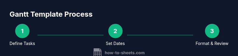
Steps
Estimated time: 60-90 minutes
- 1
Set up the data table
Create the task table with columns for Task, Start Date, End Date, Duration, and Status. Enter a few sample tasks to test the layout. This step establishes the data model you’ll visualize.
Tip: Use a header row and freeze it for easy scrolling. - 2
Define the timeline grid
Decide on a date granularity (day/week/month) and create a horizontal date header above the timeline. This grid will host the bar visuals.
Tip: Format date headers consistently and set locked columns. - 3
Add duration and calculation logic
Implement a Duration formula as End Date minus Start Date plus one. This keeps bars consistent when dates shift.
Tip: Test with edge cases like same-day tasks. - 4
Create the bar visualization with conditional formatting
Apply conditional formatting to the timeline cells so that dates within a task’s Start/End range are shaded. Color by status if desired.
Tip: Use a dedicated rule per status to keep visuals clear. - 5
Incorporate dependencies and highlighting
Add a Dependency column and use simple logic to reflect predecessor relationships. Highlight critical paths if needed.
Tip: Keep dependencies lightweight to avoid circular references. - 6
Test and sanitize the template
Fill in more sample projects, test edits to dates, and verify bars update correctly. Clean up any inconsistent data formats.
Tip: Validate data with a short checklist. - 7
Save, share, and reuse
Save as a template in Google Drive, share with your team, and establish a standard naming convention for new projects.
Tip: Create a README tab with usage notes.
FAQ
What is a Gantt chart template in Google Sheets?
A Gantt chart template in Google Sheets is a pre-built layout that combines a task list with a horizontal timeline. It shows when tasks start and end and visualizes overlaps. Templates save setup time and provide a consistent data model.
A Google Sheets Gantt template is a ready-made layout that shows tasks along a timeline to track when work starts and finishes.
Can I customize the template to fit different project sizes?
Yes. You can add or remove columns, adjust date granularity, and modify colors. Start simple and scale by adding dependencies and milestones as needed.
Absolutely. Start with a basic template and scale it up with dependencies and milestones.
How do I link tasks and dependencies in Sheets?
You can create a Dependency column that references a predecessor task. Use simple date formulas to adjust timelines when predecessors shift. Validate with test data.
You can link tasks by noting predecessors and updating dates automatically.
What are common pitfalls when using Gantt charts in Sheets?
Common issues include broken formulas from edits, merged cells in the timeline, and inconsistent date formats. Maintain data validation and keep the timeline separate from data cells.
Watch out for broken formulas and merged cells in the timeline area.
Which features help with multi-project planning?
Include a separate tab or section for each project, use named ranges, and create a master dashboard that links to individual project sheets. This keeps data scalable.
For multiple projects, keep separate sheets and link them to a master view.
Watch Video
The Essentials
- Plan data structure before visuals
- Automate dates with simple formulas
- Use conditional formatting for readability
- Test with real tasks and iterate
- Reuse templates for consistency