Google Sheets 3D Chart Guide: Create, Customize, and Interpret
Learn how to create and interpret a google sheets 3d chart with a practical, step-by-step approach. Explore when to use 3D visuals, best practices, and common pitfalls to avoid in dashboards and reports.

With this guide you will learn how to create a google sheets 3d chart and when to use it effectively in dashboards and reports. We'll cover selecting the right chart type, configuring 3D effects without clutter, and interpreting results accurately. You’ll also see practical examples, troubleshooting tips, and strategies to avoid misleading visuals.
What is a google sheets 3d chart?
According to How To Sheets, a google sheets 3d chart is a chart that applies a depth effect to standard charts within Google Sheets to create the illusion of three dimensions. In practice, Sheets offers 3D variations for several chart types, most commonly 3D column, 3D bar, or 3D pie. The effect is a visual styling choice rather than a true three-dimensional rendering. The goal is to make comparisons stand out, but it can also distort perception if misused or paired with complex data. When used thoughtfully, a google sheets 3d chart can capture attention on dashboards or slides while retaining enough clarity for quick interpretation. This section explains what distinguishes 3D visuals from flat charts and how to decide if a 3D approach fits your data story.
Pros and cons and design considerations
3D charts can add depth and emphasis, helping viewers identify orders of magnitude or top categories at a glance. They can be engaging in a presentation and can help when you want to highlight a single series. On the downside, depth cues can distort relative values, especially when there are many categories or when the axis scale isn't consistent. They require more horizontal space, and color and shading choices can become confusing on small screens. How To Sheets analysis shows that when 3D charts are overused, dashboards look busy and readers struggle to extract exact numbers. The advice is to reserve 3D visuals for limited contexts and prefer 2D charts for precision, especially in financial reports where exact comparisons matter.
Create and customize a google sheets 3d chart: a high-level workflow
To create a google sheets 3d chart, start with a clean dataset, select the range, insert a chart, then choose a 3D variant in the Chart Editor. The chart type you pick should reflect the story you want to tell: 3D column for category comparisons, 3D pie for market share, or 3D bar for long category lists. After selecting a 3D option, adjust 3D depth, angle, and corner rounding to maintain readability. Finally, verify axis scales and labels; if numbers look distorted, switch back to a 2D presentation for critical decisions.
Best practices for readability and accuracy
Key practices include labeling axes clearly, fixing axis min/max values when comparing groups, and avoiding more than a couple of data series in a single 3D chart. Use consistent color schemes and legible fonts, and always test charts on smaller screens to ensure readability. According to How To Sheets, use 3D visuals sparingly in dashboards and provide 2D alternatives for precise comparisons. Additionally, always cross-check numbers with a 2D chart to prevent misinterpretation.
Use cases: budgets, dashboards, and performance reports
In budgets and expense dashboards, 3D charts can draw attention to the biggest categories or variances, but they should not replace clean 2D charts for exact budgeting figures. For sales dashboards, a 3D column or 3D bar can illustrate rank order of products, regions, or periods when the dataset is compact. In performance reports, 3D visuals should be used to highlight a single insight or trend rather than to present a full data table. When in doubt, test multiple chart types and choose the one that communicates the intended message most clearly.
Authority sources
- https://www.census.gov
- https://nces.ed.gov
- https://www.w3.org
Troubleshooting common issues with 3D charts
If you notice distortion, check the axis range and data distribution. Confirm that the data isn't aggregated in a way that exaggerates differences. Try exporting the chart and comparing with a 2D chart, and consider simplifying the dataset to reduce clutter.
Tools & Materials
- Computer with internet access(Up-to-date browser)
- Google account(Access to Google Sheets)
- Sample dataset(At least 6-12 rows/columns)
- Optional: presentation software(If exporting charts)
- Screen capture tool(For sharing visuals)
Steps
Estimated time: 15-25 minutes
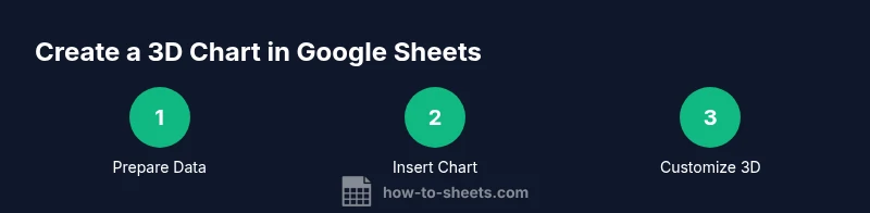
- 1
Select data range
Click and drag to highlight the cells to include, ensuring the first row contains headers for proper labeling.
Tip: Include the header row to auto-populate axis labels. - 2
Insert the chart
Open the menu and choose Insert > Chart to create a chart from the selected range.
Tip: If Sheets suggests a chart, you can switch type later in the editor. - 3
Choose a 3D chart type
In the Chart editor, switch to a 3D variant (e.g., 3D column or 3D pie) that suits your data story.
Tip: Not all types support 3D; pick one that matches your data shape. - 4
Tune 3D options
Adjust depth, tilt angle, lighting, and perspective to balance readability with visual appeal.
Tip: Avoid excessive depth that distorts value perception. - 5
Format axes and labels
Set fixed min and max where possible, enable essential data labels, and ensure category labels are legible.
Tip: Keep font size and color contrast consistent. - 6
Interpret and compare
Review the chart in the context of a 2D alternative to confirm conclusions are accurate.
Tip: Always cross-check critical figures with a 2D chart. - 7
Export or embed
Copy the chart into slides or export as an image for reports.
Tip: Verify resolution and legibility when exporting.
FAQ
Can Google Sheets create true 3D charts?
Google Sheets provides faux 3D visuals by applying depth effects to 2D charts. They are not true 3D renders, but they can still communicate a hierarchy when used carefully.
Google Sheets uses faux 3D visuals, not true 3D charts; use them cautiously.
When should you avoid using 3D charts?
Avoid 3D charts when accuracy and quick comparisons are important. Depth can distort values, especially when there are many categories or uneven scales.
Avoid 3D charts when precise comparisons are needed.
What are good alternatives to 3D charts in Sheets?
2D column, bar, or line charts are generally clearer. Heatmaps and small multiples can convey density without misleading depth.
Use 2D charts or heatmaps for clarity.
How do I ensure axes are properly scaled?
Set fixed min and max values for axis ranges when comparing groups; avoid relying on auto-scaling which can mislead.
Set fixed axis scales to compare fairly.
Can I export a 3D chart to Google Slides?
Yes. Copy the chart into Slides or export as an image; check resolution to maintain readability.
You can export charts to Slides as images.
Are 3D charts accessible?
3D visuals can be harder to read for some users. Provide alt text and offer simpler 2D alternatives when possible.
They may be hard for some users; offer alternatives.
Watch Video
The Essentials
- Use 3D charts sparingly and verify readability.
- Always label axes and fix scales for fair comparisons.
- Prefer 2D charts for precise numbers.
- Test visuals against a 2D chart before sharing.
- Export charts at adequate resolution to preserve clarity.