Google Sheets Progress Bar: A Practical Guide
Learn how to build a dynamic google sheets progress bar using conditional formatting and formulas. This How To Sheets guide covers setup, variations, tips, and best practices for dashboards that clearly show task completion and project progress.

You can create a dynamic progress bar in Google Sheets to visualize task completion, project progress, or goals directly in your data. This quick answer outlines the core idea, then the article explains step-by-step methods (data bars via conditional formatting, reusable formulas, and optional sparkline visuals) and best practices for teams and individuals.
What is a google sheets progress bar?
A google sheets progress bar is a visual indicator that represents completion as a horizontal fill, typically within a cell or a narrow column, to signal progress at a glance. It’s a practical way to convert numeric milestones into an immediately understandable graphic in dashboards, status reports, and task trackers. According to How To Sheets, this kind of progress indicator is most effective when data is numeric (0–100% or 0–1), consistently formatted, and combined with a clear label. The beauty of a google sheets progress bar is that you don’t need special software or add-ons to achieve a professional look; everything you need sits inside a standard Sheets document. For students, professionals, and small business owners, progress bars streamline reviews by converting complex spreadsheets into intuitive visuals. In addition to the core bar, you can layer text labels, color cues, and optional sparklines to capture trends. This section sets the stage for practical, repeatable implementations that scale with your data. The approach is data-driven and easy to adapt, so you can tailor the visuals to fit dashboards, weekly reports, or project timelines. By focusing on reliability and readability, you’ll avoid common traps like color-only cues or inconsistent data ranges that confuse readers. The How To Sheets team emphasizes building in maintainable structures from the start, so your progress bars keep reporting accurately as your data grows. As you read on, you’ll learn how to design bars that are both informative and accessible, even for readers with color-vision deficiencies.
Why use a google sheets progress bar?
Progress bars in Google Sheets offer a quick visual read of status, which reduces cognitive load and speeds decision-making. They are especially valuable in project dashboards, task lists, and goal-tracking sheets where multiple items are being monitored concurrently. A well-implemented progress bar communicates progress without forcing readers to interpret numeric values, making daily standups and weekly reviews faster and more consistent. According to How To Sheets, the use of progress bars helps teams focus on outcomes rather than raw numbers, so you can concentrate on bottlenecks and next steps rather than arithmetic. The benefit extends beyond visibility; progress bars can enforce data discipline because they rely on standard, repeatable formulas. In practice, you can combine a progress bar with a numeric percentage and a concise label to create a compact, readable summary. For managers and students alike, dashboards that include progress indicators tend to be more actionable, as stakeholders can immediately see which tasks are on track, at risk, or complete. When implemented thoughtfully, a google sheets progress bar enhances collaboration by providing a shared, at-a-glance reference point for the team’s efforts. How To Sheets’s analysis, 2026, suggests that teams relying on visual indicators report smoother status meetings and fewer misunderstandings about progress. This aligns with best practices for creating dashboards that communicate clearly to diverse audiences.
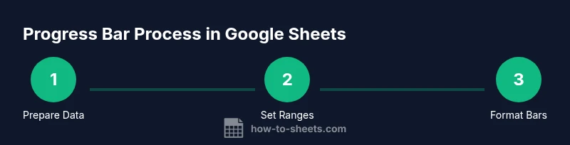
Core methods to implement a google sheets progress bar
There are several reliable approaches to implement a google sheets progress bar, each with its own trade-offs. The most common method is a data bar using conditional formatting, which fills a cell proportionally to a numeric value. An alternative approach uses sparklines or simple text-based bars created with repeat characters. A third option combines a numeric percentage with a colored bar for accessibility. The choice depends on your data structure, the audience, and whether you prefer a compact numeric read or a primarily graphical cue. Here are the core methods in practical terms:
- Data bars via conditional formatting: This is the go-to technique for most dashboards. You set a rule that fills a cell’s background color based on the value in a related cell (often a 0–100 percentage). The result is a clean, scalable bar that grows or shrinks with the data.
- Sparkline-based progress: A sparkline can visualize progress across time or across categories within a single cell or adjacent cells. This is useful for trend analysis or when you want a compact visual that sits alongside bars.
- Text-based progress: By using a combination of characters (for example, a filled block character) and the VALUE function, you can display a bar in a text cell. This method is lightweight and highly compatible across devices, but may be less accessible for some readers.
Each method has accessibility considerations, especially color contrast and legibility. If you rely on color alone, readers with color vision deficiencies may miss the cue. A robust solution pairs color with numeric labels or symbols to ensure readability. In addition to the technical approach, consider how you name your progress column, how you document the data source, and how you plan to update the bar when new data arrives. A consistent naming convention and clear documentation prevent confusion as your sheet grows. The overall goal is to deliver a visual indicator that readers can rely on without needing to decode spreadsheets. The progress bar should be a faithful reflection of the underlying data, updating automatically when inputs change and remaining stable in how it’s displayed across devices and export formats.
Tips for choosing a method:
- If your audience needs a quick glance, data bars offer the most immediate readability.
- If you track progress over time, sparklines provide a helpful temporal view alongside bars.
- If you’re sharing the sheet with others who use different devices, keep the visualization simple and accessible with text labels.
Step-by-step: Build a data-bar progress bar (conditional formatting) in Sheets
This section gives you a practical, repeatable workflow to implement a data-bar progress bar using conditional formatting in Google Sheets. It intentionally stays high-level so you can adapt it to your own data layout. The goal is to produce a robust, maintainable bar that updates automatically as data changes. Remember to verify that the underlying data stays within expected ranges (e.g., 0–100) and that any helper columns remain synchronized with the source data. The How To Sheets approach emphasizes modularity and clarity, so you can reuse the same setup for multiple sheets with minimal adjustments. While these steps are easy to replicate, the key is to maintain consistent data formats and to test with a small dataset before scaling up. This reduces the risk of misinterpretation or misalignment across dashboards and reports. If you want a more visual approach later, you can add sparklines or a textual indicator to complement the bars. The result should be a dashboard-ready visual cue that communicates progress at a glance, without requiring readers to parse numbers.
- Prepare your data: Identify the columns that store progress values (e.g., D2:D10 with values 0–100) and the cells that will display the bars (e.g., E2:E10). Ensure the progress values are numeric and within the 0–100 range. Tip: Use data validation to enforce numeric entries in the source column.
- Create a helper column if needed: If your progress values are in a percent format (0.0–1.0), you may want to convert them to 0–100 for display. Add a simple formula (e.g., =ROUND(B2*100,0)) in a helper column and reference that in the bar range. This keeps the bar logic separate from raw data.
- Apply conditional formatting for the bar: Select the target cells, then go to Format > Conditional formatting. Choose a Color scale or a custom gradient. Define the min and max as 0 and 100, or use a custom scale that matches your data. The fill will display a bar as the value increases.
- Ensure the bar is visually proportional: Use a gradient or two-color scale to convey progress smoothly. If you choose a two-color scale, set start color to light gray (low progress) and end color to a strong color (high progress). Consider adding a border to the bar cells for clarity.
- Add a numeric label (optional): Adjacent to the bar, display the exact percent value using a formula like =B2&
%" to provide a precise reference alongside the visual cue. This helps readers who need exact figures.
6) Test with sample data: Change values in the source range and verify that the bars update immediately. Check that edge cases (0% and 100%) render correctly and that the display remains legible on different devices. If necessary, adjust the gradient or font size for readability.
7) Polish and document: Create a short note in your sheet explaining how the progress bar works, including the data range and any helper columns. This ensures future editors understand the setup and can maintain it. If you later add more rows, ensure the conditional formatting covers the new rows or use a dynamic range.
8) Optional: add a legend or title: A small legend explaining the color scale helps readers interpret the bar quickly. You can place this in a separate header row or a compact legend cell to keep the main area uncluttered.
tip
Pro tip: Use a dynamic named range (e.g., progressData) so adding new rows automatically expands the bar range.
Tools & Materials
- Google Sheets document(A blank or existing sheet where you will implement the progress bar)
- Data range for tasks(e.g., A2:A12 for tasks; B2:B12 for progress values (0-100) or 0-1 if you convert to 0–100)
- Helper columns(Columns used to compute progress (optional if you keep 0–100 in one column))
- Conditional formatting capability(Access to the Format > Conditional Formatting menu in Sheets)
- Color palette or hex codes(Optional but recommended for consistent visuals in dashboards)
- Documentation template(A short description of the data source and setup for teammates)
Steps
Estimated time: 60-75 minutes
- 1
Prepare your data
Identify the columns that store progress values and the display range for the bars. Ensure values are numeric and within the 0–100 range. Create a plan for primary and helper columns if you need conversions between 0–1 and 0–100.
Tip: Use data validation to enforce numeric entries and keep data clean. - 2
Create a helper column (optional)
If your source data uses a 0–1 range, add a helper column to convert to 0–100. For example, =ROUND(B2*100,0). This keeps the bar logic separate from raw data and makes maintenance easier.
Tip: Keep helper columns clearly labeled (e.g., ProgressPct or PercentComplete). - 3
Apply conditional formatting for the bar
Select the target display cells, then apply a Color Scale or custom gradient with min 0 and max 100. Use a color ramp that communicates progress clearly (light to bold color).
Tip: Avoid using only color—include a numeric label for accessibility. - 4
Add a numeric label (optional)
In an adjacent cell, display the exact percentage value (e.g., =B2 & "%" ). This provides precise data alongside the visual bar.
Tip: Keep the label aligned with the bar for readability. - 5
Test with sample data
Change several values to ensure the bar updates automatically and remains legible across devices. Confirm 0% renders as nearly empty and 100% as full.
Tip: Test extreme values to verify edge cases behave correctly. - 6
Polish and document
Add a short description of how the progress bar works and which ranges it covers. If you plan to scale, consider a dynamic range to accommodate new tasks automatically.
Tip: Include comments or notes for future editors to reduce maintenance.
FAQ
What is a Google Sheets progress bar and when should I use it?
A Google Sheets progress bar is a visual indicator that shows task completion as a fill bar within cells or adjacent columns. It’s ideal for dashboards and status sheets where quick, at-a-glance progress is valuable. Use it when you want to communicate progress to multiple stakeholders without relying solely on numbers.
A Google Sheets progress bar shows how much of a task is done with a colored bar, great for dashboards and quick status checks.
Can progress bars update automatically when data changes?
Yes. When the bar relies on numeric progress values (0–100) or a computed helper column, changes to the source data automatically reflect in the bar. This keeps the dashboard current without manual edits.
Yes, as long as the bar uses a formula or conditional formatting tied to the data, it updates automatically.
Is a progress bar accessible for color-blind users?
Color-only indicators can be problematic for color-blind readers. Always pair color with text labels or symbols and use high-contrast color ramps. You can also provide a separate numeric percentage nearby for clarity.
Make sure there’s text or symbols with the color so everyone can read the progress.
How many tasks can a single progress bar track, and can I combine multiple tasks in one bar?
A single bar typically represents one task or a chosen milestone. For multiple tasks, use separate bars side by side or a stacked bar approach to show combined progress while preserving readability.
One bar per task works well; for many tasks, use a grid of small bars or stacked visuals.
What if my data isn’t 0–100?
If your data uses another scale, normalize it to 0–100 before applying the bar. This keeps visuals consistent and interpretable across the sheet.
Normalize data to 0–100 before making bars, so every bar reads the same way.
Can I export or print the progress bar without breaking formatting?
Yes. Ensure the print settings preserve the table layout and that conditional formatting is retained in the export. Consider a PDF export for dashboards to preserve visuals consistently.
You can export or print; just check the layout options so the bars stay clear in the output.
Watch Video
The Essentials
- Define the data range clearly
- Choose a method that matches your audience
- Combine color with text for accessibility
- Keep data and visuals synchronized
- Document setup for future maintenance