Stacked Bar Chart in Google Sheets: A Practical Guide
Learn to create and customize stacked bar charts in Google Sheets. From data layout to color selection and accessibility, this practical guide helps students, professionals, and small business owners present clear, compelling charts.

By following this guide, you will learn how to create and customize a stacked bar chart in Google Sheets, from organizing data to choosing colors and labels. You’ll understand when a stacked bar is appropriate, how to avoid common misinterpretations, and how to present clear, accessible visuals in reports and dashboards.
What stacked bar charts are and when to use them in Google Sheets
A stacked bar chart visually decomposes each category into subcomponents, with each subcomponent represented by a colored segment. In Google Sheets, this chart type lets you see both the total for a category and how that total is composed by part of the whole. This is especially useful for illustrating proportions, share of revenue by product line, or survey responses across multiple groups. Use stacked bars when you want to reveal both the overall size of categories and the internal makeup of those categories at a glance. By contrast, a simple bar chart shows totals alone, and a clustered bar chart highlights differences between series but not their internal structure. When you present data in dashboards or reports, stacked bars can quickly convey the relative impact of each segment without requiring the viewer to mentally sum pieces. The How To Sheets team has found that audiences often understand composition faster when stacks are properly labeled, color-coded, and scaled to a uniform baseline. This section explores real-world applicability, common configurations, and how to decide if a stacked bar chart is the right choice for your dataset.
Planning data for stacked bars: structure, ranges, and labels
Before you create a stacked bar chart in Google Sheets, plan data layout with clarity. The recommended structure places category labels in the first column, followed by one or more data series in adjacent columns. Each row represents a category or time point, and each column after the first represents a component of the whole. Keep the header row descriptive so Sheets can infer series names automatically and populate the legend accurately. If you anticipate negative values or require cumulative totals, decide how you will present them (for example, by splitting negative sections or using a paired chart). Ensure the data range is contiguous and free of blank rows or mixed data types, as gaps can cause misalignment or errors in the chart. Finally, validate your dataset with a quick sample view to confirm that the stacked heights add up to the intended total for each category. How To Sheets analysis shows that clean data layout reduces post-creation tweaking and improves final readability.
Design considerations: colors, accessibility, and labeling
Color choices strongly influence readability. Use a limited palette with high contrast between segments and maintain consistent color order across charts to help readers track series over time. Prefer color-blind friendly palettes (for example, palettes that avoid red-green pairs) and provide a descriptive legend placed in a location that does not obscure data. Labels are a double-edged sword: data labels on every segment can clutter bars, but a well-placed label on the top of each stack or on hover can add precision where needed. Axes should be clearly titled, and the chart title should describe the message rather than repeating data labels. For accessibility, include a short caption or alt text and ensure screen readers can interpret the chart. In practice, keeping the chart legible at small sizes and on different devices is as important as the exact numbers.
Real-world examples: scenarios where stacked bars improve insight
Example 1: A small retailer compares quarterly sales by product category. A stacked bar chart shows total quarterly performance while revealing which categories contributed most to each quarter. Example 2: A student survey asks respondents to rate multiple features on a five-point scale. A stacked bar chart can illustrate the distribution per feature, highlighting areas with strong consensus and those requiring attention. In both cases, the stacked bar enables quick comparison of totals and composition, supporting faster decision-making in meetings and documents. Even simple datasets can benefit from this visualization when the goal is to convey proportionate changes rather than single-point values.
Common pitfalls and how to avoid them
- Too many series: When there are more than five to seven series, stacks become difficult to read. Solution: group similar series or summarize into a single 'Other' category. - Small bars: Very narrow segments reduce legibility. Solution: limit categories or enable data labels with selective formatting. - Misinterpreting totals: Viewers may assume each stack equals the same total. Solution: explicitly include a chart caption or a small table of totals. - Inconsistent baselines: If stacks do not share a common baseline, comparisons become misleading. Solution: ensure your data scales to a shared base and enforce consistent axis ranges. These practices help maintain accuracy and comprehension.
How to prepare your data for a stacked bar chart (example templates)
Here is a practical template to adapt for many datasets. Start with a header row that spells out the series names. The first column lists categories. For example:
| Category | Q1 | Q2 | Q3 | |---|---:|---:|---:| | Product A | 120 | 135 | 150 | | Product B | 90 | 100 | 110 | | Product C | 60 | 75 | 95 |
In Google Sheets, select this range, insert a chart, and choose a stacked bar chart. If you prefer to show blocks of colors by category rather than by product, swap the rows and columns in the chart data range. For ongoing reports, consider templating this sheet so that you only replace values and headers. This example demonstrates a straightforward approach to data preparation that minimizes post‑creation edits and preserves readability for readers.
Advanced tweaks: combining stacked bars with data labels and secondary axes
After you have a basic stacked bar chart, you can enhance it with data labels, refined axis titles, and optional markers or lines. Enable data labels for segments that require precise values, and consider showing only a subset of labels to avoid clutter. If your data includes a related measure, you might add a secondary axis to juxtapose trends (for example, a line showing overall totals alongside stacked bars). Remember that more complexity can reduce readability, so balance detail with clarity. Finally, save your chart as a template to reuse across datasets.
Tools & Materials
- Google account(To access Google Sheets and save charts)
- Dataset prepared in Google Sheets(First column: categories; subsequent columns: stacked series)
- Web browser with internet access(Chrome recommended for best compatibility)
- Color palette (optional)(Prefer color-blind friendly options)
- Accessibility aids (optional)(Alt text or caption for screen readers)
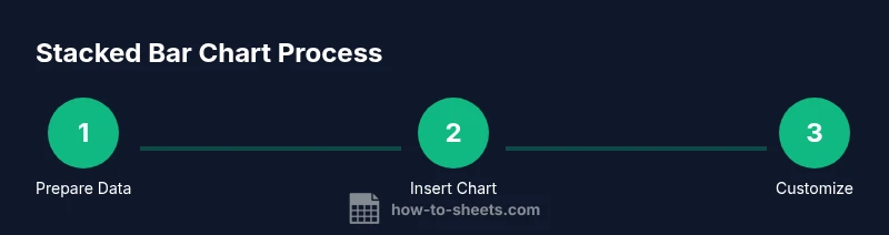
Steps
Estimated time: 20-30 minutes
- 1
Prepare data layout
Organize your data with a clear header row. The first column should contain category labels, and each subsequent column should hold values for a stacked series. This structure makes the chart data-driven and scalable.
Tip: Keep the data range compact and include a totals option if helpful - 2
Select data range
Highlight the full range including headers to ensure Sheets can infer categories and series automatically.
Tip: Include the header row in the selection to enable automatic series naming - 3
Insert chart and switch to stacked bar chart
Go to Insert > Chart, then in the Chart editor, choose a 'Stacked bar chart' under the Setup tab. If a column chart appears, switch to Bar chart type.
Tip: Floating legends can obscure data; position it outside the chart area if needed - 4
Tune data ranges and series order
Verify that each column represents a distinct series and that the first column is the category axis. Reorder columns if needed for your storytelling.
Tip: A logical color order helps comparison across categories - 5
Customize colors, labels, and axis
Apply a color palette, enable data labels, and adjust axis titles to improve readability. Avoid overly saturated colors that strain the eyes.
Tip: Use data labels only if the bars have enough width to remain legible - 6
Review accessibility and export
Check color contrast, provide alt text or a caption, and consider exporting as an image or PDF for reports.
Tip: Include a data table alongside the chart for screen reader users
FAQ
How do I create a stacked bar chart in Google Sheets?
Start with a data table where the first column lists categories and the next columns hold the values for each stacked series. Insert a chart and choose 'Stacked bar chart' in the Chart editor.
To create one, prepare your data, insert a chart, and set it to stacked bar chart in the editor.
Can I include negative values in a stacked bar chart?
Google Sheets supports stacking with negative values, but this can complicate interpretation. Consider alternatives if negatives dominate the stack or use separate bars for positive and negative values.
Yes, negatives can be stacked, but use caution as interpretation becomes trickier.
How do I add data labels to a stacked bar chart?
In the Chart editor, enable data labels for the series. If labels clutter the chart, limit to a single central label or show values on hover.
Turn on data labels in the editor and keep the chart readable.
Should I use stacked bars or a grouped bar chart?
Stacked bars show composition within categories, while grouped bars compare totals across categories. Choose based on whether you want to emphasize parts of a whole.
Choose stacked when you want to show composition; choose grouped to compare totals.
What common mistakes should I avoid?
Avoid too many series, cluttered legends, and tiny bars. Ensure axis labels are clear and provide a descriptive caption or table.
Avoid clutter and misinterpretation by simplifying the chart and adding context.
Watch Video
The Essentials
- Plan data layout before charting.
- Choose a color palette that preserves contrast.
- Keep the number of series manageable for readability.
- Verify accessibility with text descriptions.
- Use data labels sparingly for clarity.