Google Sheets Slicer vs Filter: A Practical Comparison for Data Filtering
Compare Google Sheets slicers and filters to decide when to use each. Learn setup, use cases, and best practices for dashboards and data filtering in real-world workbooks.

TL;DR: In Google Sheets, filters are ideal for quick, row-level filtering and one-off views, while slicers provide a visual, dashboard-friendly filter across multiple charts and ranges. If you need repeatable views shared with teammates, slicers shine; for simple, temporary views, filters are faster. This article compares both to help you pick the right tool.
What is google sheets slicer vs filter and why it matters
In practical terms, the choice between google sheets slicer vs filter hinges on scope and repeatability. Filters let you prune data in a single range or tab, offering fast, ad-hoc views perfect for quick analyses. Slicers, by contrast, introduce a visual control that applies across multiple charts, tables, and ranges in a dashboard. According to How To Sheets, choosing the right tool depends on whether your goal is a quick one-off view or a coordinated, cross-item filter across a workbook. This distinction matters for team collaboration, dashboard design, and data governance, because the right tool can reduce confusion and save time over repeated tasks. The rest of this article breaks down the two options, their strengths and weaknesses, and concrete decision points for common work scenarios.
How the two tools behave in practice
Filters and slicers behave differently when your workbook grows in complexity. A standard filter is attached to a data range or column, instantly hiding rows that don’t match the selected criteria. It’s fast to implement, easy to learn, and often sufficient for single-use analyses. A slicer, however, is a separate UI element that can drive multiple views at once: it sits on or above your data range and can be connected to several charts and pivot-like views. This makes slicers particularly powerful in dashboards where end users expect a single control to filter many visuals. The How To Sheets team notes that slicers, when configured correctly, can reduce the cognitive load on collaborators by providing a consistent filtering experience across charts and tables.
Visual filtering for dashboards: when to use which tool
Dashboards demand cohesion. If your workbook presents several charts or tables that should reflect a unified filter, a slicer is typically the better choice. Slicers create an at-a-glance, uniform control that users can interact with to explore different scenarios without manipulating each chart separately. For quick explorations or when you need to toggle a single dataset, filters are faster to set up and modify. In both cases, plan how filters propagate to charts, whether you’re using named ranges, dynamic ranges, or data validation controls. A well-structured approach helps prevent inconsistent filtering across visuals.
Step-by-step: setting up a slicer in Google Sheets
- Open the sheet with the data you want to filter. 2) Select the range that will feed the slicer (usually a column with category or date). 3) Insert → Slicer, then position it on the sheet. 4) Connect the slicer to the relevant charts and ranges by choosing “Connect slicer to data.” 5) Configure slicer options (single vs multi-select, date range, etc.). 6) Save and test by applying different selections to ensure all visuals update in sync. 7) Share access so teammates can use the slicer without altering core data.
Step-by-step: setting up a standard filter in Google Sheets
- Highlight the data range you want to filter. 2) Data → Create a filter (or use the Filter icon in the toolbar). 3) Click the filter dropdown in the column header and set criteria (values, text contains, numeric ranges, etc.). 4) Apply multiple criteria across columns as needed. 5) If you share the sheet, ensure collaborators understand how the filter applies to their views. 6) When you’re done filtering, you can clear the filter to restore the full dataset.
Performance considerations with large datasets
Filters are generally lightweight because they apply to a single data range. Slicers, while highly convenient for dashboards, can add a small overhead if multiple charts and ranges react to a single slicer event. In very large sheets, test performance by applying a slicer across several charts to see if interactions remain smooth. If you notice lag, consider trimming ranges, reducing the number of connected visuals, or using a slicer with fewer filter values. How To Sheets’s guidance emphasizes balancing usability with performance as your workbook grows.
Collaboration and sharing implications
When multiple people use a shared workbook, slicers help ensure consistency in filtering across visuals, which minimizes discrepancies in what different readers see. However, slicers introduce an extra UI element that some teammates may not expect. Provide brief onboarding notes or a short guide in the sheet explaining how to use the slicer and which charts it controls. Filters, while simpler, can lead to fragmentary views if users forget to apply them consistently. In collaborative environments, establishing a standard: use slicers for dashboards and filters for exploratory views.
Cross-sheet filtering and common limitations
One common question is whether a slicer can filter data across multiple sheets. In Google Sheets, slicers primarily affect the data ranges and charts they are connected to, which often means cross-sheet filtering requires careful design, such as mirroring data across sheets or consolidating data into a single dashboard sheet. Similarly, standard filters operate within the data range they’re applied to, and dragging or expanding the underlying range can disrupt existing filter setups. Planning data structure ahead of time reduces headaches later.
Common pitfalls and how to avoid them
Pitfalls with filters and slicers typically include over-filtering, which hides too much data; inconsistent data types that break filter logic; and accidental removal of a slicer or filter by collaborators who don’t understand the impact. Avoid these by documenting filter rules, using clearly labeled columns for filters, and testing with multiple user scenarios. Also consider creating a simple reference sheet that lists all active slicers and filters, their targets, and expected outcomes. This helps teams maintain predictable filtering behavior.
Real-world scenarios: templates and examples you can adapt
Scenario A: A marketing dashboard tracks campaign performance across channels. A single slicer filters by date range and channel, updating all charts simultaneously. Scenario B: A sales report shows daily orders; a quick filter lets analysts isolate orders by region, but the dashboard relies on slicers for a consistent cross-chart experience. By adapting these patterns, you can craft a practical filtering workflow that scales as your data grows.
How to decide: a practical decision framework
Ask: Do you need a single-filter control for multiple visuals, or a quick filter for a specific dataset? If you answered dashboard-wide and cross-chart, choose a slicer. If you need rapid, one-off views for individual tables, choose a filter. Consider data size, collaboration needs, and whether the workbook will be shared broadly. This framework helps you make the right choice without overcomplicating your sheets.
Authority Sources
- https://support.google.com/docs
- https://workspace.google.com
- https://cloud.google.com
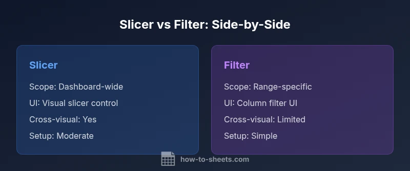
Comparison
| Feature | Slicer | Filter |
|---|---|---|
| Scope | Dashboard-wide control across multiple visuals | Range- or sheet-specific filtering on a single view |
| UI/UX | Dedicated slicer control attached to visuals | Column header dropdowns or the Data > Create filter UI |
| Cross-range filtering | Yes, across connected charts and ranges | Typically applies to the selected data range only |
| Setup time | Moderate; requires connecting slicer to visuals | Low; simple to apply to a data range |
| Maintenance | Requires managing a single control for multiple visuals | May require updating criteria per view as needs change |
| Shareability | Best for shared dashboards and consistent filtering | Good for ad-hoc analyses by individual users |
| Performance impact | Can impact multiple visuals if many are connected | Usually lighter since it targets a defined range |
The Good
- Slicers provide a unified filtering experience across charts and tables
- Filters are quick to set up for isolated, ad-hoc filtering
- Slicers simplify end-user interactions by presenting a single control for dashboards
- Filters keep sheets lean when you don’t need cross-chart coordination
The Bad
- Slicers add UI elements that can clutter the sheet
- Not all charts automatically respect slicers in complex workbooks
- Filters require manual updates for multi-visual consistency
- Slicers may be slower on very large datasets or highly interconnected dashboards
Choose slicers for dashboard-wide filtering and consistent cross-chart interactions; use filters for quick, range-specific filtering when dashboards aren’t required.
Slicers excel in coordinated filtering across visuals, making them ideal for dashboards. Filters shine in simple, fast, ad-hoc analyses. Use the recommended pairing to balance usability and performance.
FAQ
What is the fundamental difference between a slicer and a filter in Google Sheets?
A slicer is a visual control that filters multiple charts and ranges across a dashboard, providing a consistent, shareable filtering experience. A filter is a traditional data-filtering tool attached to a single range or column, used for quick, ad-hoc filtering of data within a sheet.
A slicer filters many visuals at once, perfect for dashboards; a filter is quicker and simpler for individual views.
Can I use slicers to filter data on multiple sheets at once?
Slicers in Google Sheets typically affect the visuals and ranges they’re connected to on a given sheet. To filter across sheets, you generally need a designed data model that mirrors data across sheets or consolidates data into a dashboard sheet. Plan connections carefully to ensure consistent filtering.
Slicers usually apply to the connected visuals on one sheet; cross-sheet filtering requires careful setup.
Are slicers available on mobile devices?
Support for slicers in the mobile app can vary by device and app version. In many cases, slicers appear as part of the web experience and may have limited functionality on mobile browsers. Always test on target devices during rollout.
Check your device and app version; slicers may behave differently on mobile.
When should I choose a slicer over a simple filter?
Choose a slicer when you need a single, consistent filter that covers several charts or data views in a dashboard. If you’re performing quick one-off analyses on a single range, a standard filter is usually faster to implement and modify.
If you need one control for many visuals, go slicer; for quick, local filtering, use a filter.
How do I migrate from a filter-based workflow to a slicer-based workflow?
Start by identifying the charts and ranges that should respond to a single control. Create a slicer and connect it to those visuals, then gradually remove individual filter controls. Verify that all visuals update correctly when you change the slicer selections and provide a short guide for collaborators.
Plan, connect the slicer to the visuals, then test and educate teammates on the new workflow.
The Essentials
- Define your goal: dashboard-wide vs ad-hoc filtering
- Use slicers to drive consistency across visuals
- Opt for filters when you need speed and simplicity
- Plan data structure to support cross-chart filtering
- Test performance with large datasets to avoid lag