Google Sheets Map: Your Step-by-Step Geo Chart Guide
Master mapping geographic data in Google Sheets with geo charts, My Maps, and simple automation. This How To Sheets guide covers data prep, visualization, and practical workflows for students, professionals, and small business owners.

With this guide you’ll learn to turn location data in Google Sheets into visual maps. You’ll prepare data correctly, create a Geo chart in Sheets, and optionally link to Google Maps or My Maps for richer visualization. The workflow emphasizes practical, repeatable steps you can adapt for projects, reports, or classroom assignments.
What a Google Sheets map can do
A Google Sheets map lets you visualize geographic patterns directly from your spreadsheet data. By combining location fields (country, city, or coordinates) with a geo chart or mapping tool, you can spot regional trends, disparities, and outliers at a glance. According to How To Sheets, integrating maps into your Sheets workflow saves time by keeping data and visuals in one place. This approach is especially helpful for students tracking school projects, professionals reporting regional performance, or small businesses evaluating market reach. While Sheets-focused maps aren’t a replacement for full GIS, they deliver fast, shareable insights within the familiar spreadsheet environment. Use them to complement dashboards, reports, and collaborative planning sessions.
Data you can map in Sheets
Not all geographic data maps equally well in Google Sheets map workflows. You can map broad regions (countries or states), cities, or precise coordinates (latitude and longitude). The most reliable configuration uses a single geographic field (like country) paired with a metric (such as sales, visitors, or growth rate). If you have city-level data, combine city with country for better accuracy. You can also map density-like values to a color scale for quick visual interpretation. In practice, a simple country-level geo chart often communicates trends clearly, while city-level charts reveal local hotspots. Remember to standardize names so Sheets can resolve locations consistently.
Preparing your data for mapping
Before you map anything, clean and organize your data for consistency. Ensure column headers are clear, spelling is uniform, and there are no extraneous characters in location fields. If you have addresses, you may need to geocode them into country, city, or latitude/longitude pairs. For a reliable google sheets map, place the geographic field in the first column and the numeric measure in the next column. Remove rows with missing location data and fill in gaps where possible. Finally, keep a clean backup of the original data so you can experiment without risking your primary dataset.
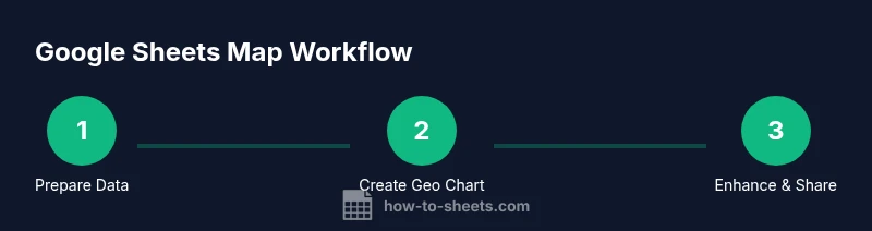
Creating a Geo chart in Google Sheets
To create a geo chart, select your geographic field and the associated values, then insert a chart and switch the type to Geo chart. The chart editor lets you choose region granularity (country, state, or province) and adjust color scales. The resulting visualization will place each region on a world map with color intensity corresponding to your values. If your data includes multiple metrics, consider creating separate geo charts or a composite dashboard. For the best clarity, start with one simple metric and validate the results before layering additional data.
Customizing chart visuals for clarity
Effective maps rely on clean visuals. Use meaningful color scales (e.g., greens for growth, reds for decline) and include a legend that explains what colors mean. Reduce clutter by limiting the number of regions displayed or by aggregating data at a consistent granularity. Add data labels only if they improve comprehension, otherwise keep the map clean. You can also add a title and subtitle that explain the geographic scope and the metric being visualized. This is where a well-tuned google sheets map shines in presentations and reports.
Using named ranges and dynamic data
If your data grows over time, dynamic ranges help keep your map up to date. Define named ranges for your geographic column and your metric, then set the geo chart to reference those ranges. As you append new rows, the chart will auto-refresh (if you’re using a dynamic range). This approach is especially valuable for ongoing projects or monthly reporting cycles, where you want a reproducible process without reconfiguring the chart each period.
Extending mapping with Google Maps and My Maps
For more precise point-level mapping beyond country or city aggregates, export your data to a CSV and import it into Google Maps or My Maps. Create a new map, import the file, and choose the appropriate fields for location and labeling. My Maps supports place markers, routes, and layers, offering richer interactivity than a geo chart. If privacy matters, share only the map links with intended collaborators and avoid publishing raw location data publicly.
Practical templates and worked example
Imagine a small dataset with columns: Country, City, Latitude, Longitude, and Value. A google sheets map workflow would map the Value by country or by point locations if you supply coordinates. Start by cleaning coordinates, then create a geo chart using Country or coordinates as the geographic field. This worked example demonstrates how to scale from a single country map to multi-country dashboards while maintaining data integrity and readability. The goal is to show how a simple dataset can produce meaningful geographic visuals without needing advanced GIS software.
Troubleshooting, limitations, and privacy
Geo charts in Google Sheets are powerful but have limits. They handle aggregated statistics well but aren’t a full GIS replacement for complex analyses. If locations are missing or misnamed, the map may misrepresent geography. Privacy matters when mapping real addresses; avoid sharing raw location data publicly and use aggregated or anonymized values where possible. By planning data governance and validating inputs, you’ll maximize the reliability of your google sheets map workflows. The How To Sheets team also recommends testing your map with sample data before publishing widely, to ensure accuracy and confidence.
Tools & Materials
- Google Sheets access(A Google account with Sheets enabled)
- Dataset with location fields(Country/City or latitude/longitude columns)
- Internet connection(For live Google Sheets features)
- Optional: Google My Maps account(For advanced overlays and point mapping)
- Optional: geocoding tool or Apps Script(If addresses require geocoding beyond coordinates)
Steps
Estimated time: 45-75 minutes
- 1
Prepare your data
Review your dataset and ensure location fields are consistent. Remove rows with missing location data and standardize country/state names to avoid mis-mapping. This step sets the foundation for a reliable google sheets map.
Tip: Use data validation to prevent inconsistent location entries. - 2
Open a new sheet and select data
Open Sheets, create a new workbook, and select the geographic field and the metric you want to visualize. A clean selection helps prevent misinterpretation of map colors.
Tip: Sort data by the geographic field to keep rows orderly for review. - 3
Insert a Geo chart
Choose Insert > Chart, then switch the Chart type to Geo chart in the Chart Editor. Confirm that the geographic field is your primary axis and adjust the region granularity.
Tip: Start with country-level granularity to verify mapping accuracy. - 4
Customize visuals
Customize colors, legend labeling, and the chart title. Ensure the color scale conveys the intended meaning and that the legend clearly explains the metric.
Tip: Keep contrast high to improve readability on slides or reports. - 5
Add dynamic ranges
Create named ranges for your geography and metric, then bind the geo chart to those ranges so updates are automatic as you add data.
Tip: Document the named ranges for teammates and future edits. - 6
Extend with maps overlays
If you need point-level mapping, export the data and import into My Maps or Google Maps. Use markers and layers to convey additional attributes.
Tip: Hide sensitive location details; use aggregated identifiers when sharing publicly. - 7
Share and maintain
Share the Sheets map or the My Maps overlay with teammates. Establish a routine to refresh data and review the map’s accuracy after data updates.
Tip: Set permissions to control who can edit the source data.
FAQ
What is a Google Sheets map and what can I visualize with it?
A Google Sheets map uses geographic data to create a visual geo chart or map overlay. It can show regional totals, distribution, or density by country, state, or city. This approach is great for quick insights directly from your spreadsheet without specialized GIS software.
A Google Sheets map visualizes geographic data with geo charts. It’s ideal for quick, location-based insights straight from your spreadsheet.
Can I map addresses directly in Sheets without geocoding?
Sheets maps work best with standardized geographic fields like country or city, or with latitude and longitude coordinates. If you have raw addresses, you’ll typically geocode them first, then use the coordinates or city-country pairs for mapping.
If you have addresses, geocode them to coordinates or city-country pairs before mapping for better accuracy.
What’s the difference between Geo charts and My Maps?
Geo charts visualize aggregated values by region within Sheets, while My Maps provides point-level mapping with markers, layers, and routes. Use Geo charts for quick summaries and My Maps when you need precise locations and interactive features.
Geo charts summarize data by region; My Maps gives you detailed markers and layers for interactive mapping.
Are there privacy concerns when mapping in Sheets?
Yes. When sharing maps or exporting data, avoid exposing raw location data. Favor aggregated or anonymized values and use restricted sharing settings to control who can view the maps.
Be mindful of privacy—use aggregated data and limit who can view the map.
Can I automate updates to my google sheets map?
Yes. You can use named ranges and Apps Script to refresh data or pull data from connected sources. Automations help keep your map current with minimal manual effort.
Automation via Apps Script or dynamic ranges keeps maps up to date with little manual work.
Watch Video
The Essentials
- Map geographic data directly from Sheets using geo charts
- Choose the right geographic granularity for clear insights
- Use named ranges to keep maps current and reproducible
- Consider My Maps for point-level overlays when needed
- Protect privacy by sharing aggregated views and avoiding raw data