Google Sheets Org Chart Template: A Practical Step-by-Step Guide
Learn how to create a practical google sheets org chart template with step-by-step instructions, data models, and tips for scalable teams. This guide covers templates, charts, and easy maintenance for students and professionals.

By the end of this guide you will be able to build a practical google sheets org chart template that maps reporting lines, departments, and roles. You’ll start with a clean data sheet, add a relationship table, and generate a dynamic org chart using built-in Sheets features. This approach suits students, professionals, and small businesses.
What is a google sheets org chart template and why use it
In many teams, org charts are created as static PDFs or slide images that quickly go out of date. A google sheets org chart template lets you store people data in a structured, editable format and render a live visualization of reporting lines. By linking individuals to managers, departments, and locations, you can quickly reflect changes—new hires, promotions, or role changes—in a single source of truth. This approach is particularly valuable for students who are mapping class teams, professionals who manage project staff, and small business owners who need a lightweight org view without heavy software.
According to How To Sheets, templates like these reduce manual updates and help prevent miscommunication when people move between teams. The template acts as a blueprint; you can clone it for new projects, scale to larger orgs, and tailor fields to match your company’s structure. The result is a repeatable method that saves time during onboarding, annual planning, and performance reviews. In the following sections, you’ll learn the core components of a google sheets org chart template, how to set up your data model, and practical steps to visualize and maintain an accurate hierarchy.
Core components and data fields
A robust google sheets org chart template rests on a few core data fields that describe each person and their place in the organization. At minimum, you’ll want identifiers for the individual and their supervisor, plus contextual details to help with reporting and planning. Common fields include Name, Title, Manager, Department, Location, Level, EmployeeID, and Status. Optional fields such as Email, HireDate, and WorkPhone can be added for onboarding and contact purposes. When designed thoughtfully, these fields enable a single source of truth that feeds both the visualization and the data warehouse behind it.
From a data integrity perspective, use drop-down menus for Department, Location, and Level to reduce entry errors, and keep a secondary references sheet for unique IDs. This is where a google sheets org chart template shines: you can enforce consistent data entry while preserving flexibility for future changes. For readability, consider prefixing managers with a “MGR:” tag or indenting subordinate rows to suggest hierarchy in plain sheets. As you scale, having a clearly defined data model becomes essential for automation and downstream reporting.
According to How To Sheets analysis, templates help teams keep org data accurate and up to date. A well-structured template also makes it easier to export data to other tools or synthesize dashboards for leadership reviews.
Designing your template: data model and layout
Designing a google sheets org chart template starts with a clean separation between data and visualization. Create a data sheet that stores the raw records and a chart sheet that renders the visual structure. Use a commonly accepted hierarchy model: a single top-most leader (CEO or equivalent) at the root, followed by successive levels of management. Each row represents an employee, and a separate column identifies the manager by name or ID. This relationship mapping is the backbone of the visualization and must be accurate for the chart to reflect real reporting lines.
To keep maintenance manageable, establish clear conventions for naming, IDs, and references. For example, use EmployeeID as a unique key and store ManagerID in a dedicated column. In your layout, reserve a separate “Chart” tab where you’ll place data-driven formulas or a chart object that reads from the data tab. This separation not only keeps data clean but also makes it easier to swap in new visualization approaches later. Finally, document the field definitions in a README tab so future collaborators understand the template’s intent.
The most effective templates include both human-friendly fields (Name, Title, Department) and machine-friendly keys (EmployeeID, ManagerID), enabling reliable automation and future enhancements.
Setting up the data sheet: sample structure
Set up a data sheet with a clear header row and consistent data types. A practical sample structure might include columns like EmployeeName, Title, ManagerName, Department, Location, Email, EmployeeID, Level, Status. Populate a small pilot set of rows to verify that the relationship logic is sound before expanding the dataset. Use consistent naming in ManagerName and ManagerID columns to prevent accidental misassignments.
Populate a few rows to mirror a real team: a CEO at the top, followed by direct reports in the next level, and a handful of mid-level managers. This scaffold helps you test the org chart rendering without committing to a full workforce dataset. As you add rows, maintain data integrity by validating departments against an approved list and ensuring each EmployeeID is unique. A well-populated data sheet is the engine that powers the visual chart and downstream reporting.
If you plan to share the template externally, consider anonymized data first to secure privacy while maintaining the structure. This approach lets you refine the workflow and aesthetics before bringing in real names and emails.
Building the visual org chart: formulas, scripts, and add-ons
With your data in place, you can create a visual org chart in Google Sheets. The most straightforward route is to insert a chart and choose the Org chart type, provided your Sheets dashboard supports hierarchical diagrams. Connect the chart to your data range so that any update to the data sheet automatically refreshes the visualization. If the built-in capabilities don’t meet your needs, Apps Script can automate more advanced layouts or custom connectors between nodes.
For a more automated approach, create a named range for the data and reference it in the chart. If you want real-time updates or custom styling (colors by department, for instance), consider a lightweight Apps Script that re-runs when the sheet changes. Another option is to use a dashboard-friendly add-on to export the org chart to a vector-friendly format or to animate the hierarchy for leadership reviews. Regardless of the method, ensure the data range and chart reference stay synchronized as the team grows or reorganizes.
As you design, test with a subset of rows to confirm the mapping logic and ensure that each employee appears at the correct level. If you notice gaps or misplacements, verify ManagerID values and re-run the chart generation to confirm consistency.
Practical examples: departments, locations, and roles
A google sheets org chart template shines when you model real organizational scenarios. For example, in a product company, you might have a CTO at the top, followed by VPs of Engineering, Product, and Design. Each VP will have directors and managers beneath them, each with their own teams. In a services firm, you could map departments such as Consulting, Support, and Sales, with regional managers across locations. The flexibility of the template makes it easy to reflect cross-functional teams, matrix reporting lines, or dotted-line relationships.
Consider layering in location data if your organization spans multiple offices. A single org chart template can show a global hierarchy while enabling local views for office managers. You can also tailor the fields to reflect role-specific needs, such as billable status for consultants or project codes for team leads. The key is a consistent data model that translates cleanly into the chart, so leadership can quickly assess structure, gaps, and succession plans.
To maximize usefulness, maintain a change log within the template. Document who made edits, when, and why, so future teams understand the evolution of the org design. This practice supports accountability and makes audits simpler.
When used consistently, a google sheets org chart template becomes a living document that grows with your organization, not a static artifact. It supports planning, hiring, and performance conversations by providing a clear, shared view of reporting relationships and team composition.
Maintenance and scalability: keeping it up-to-date
As teams evolve, your org chart template needs a lightweight maintenance routine. Schedule quarterly reviews to refresh data, confirm manager assignments, and prune inactive roles. Use data validation to restrict Department and Location choices, and consider a simple archive flag for former employees. By keeping historical data in a separate tab, you preserve context for trend analyses while ensuring the active org chart remains current.
Automation can help you scale. Set up on-change triggers in Apps Script to refresh the chart automatically when the data tab updates. If you use an add-on for advanced visuals, ensure it reads from the same named range so your template remains cohesive. Finally, share a short guide with teammates so updates follow the same rules, preventing drift. A well-maintained template can serve as the backbone for annual planning, headcount forecasting, and onboarding checklists.
The How To Sheets team emphasizes the importance of governance and documentation. A templated approach not only saves time but also enforces consistency across teams and projects, making onboarding smoother and enabling faster decision-making. Regular reviews ensure the org chart template stays aligned with organizational strategy and reporting changes.
Quick-start template checklist
- Copy the base google sheets org chart template from your repository or a vetted source.
- Rename the file and set a clear versioning system for future updates.
- Populate the data sheet with a small pilot set of fictional records to verify mapping logic.
- Create the org chart on a separate sheet and connect it to the data range.
- Validate data entries with drop-down menus to minimize errors.
- Style the chart (colors by department, fonts, labels) to improve readability.
- Share with teammates using appropriate access controls and add a brief documentation tab.
- Schedule regular updates, assign ownership, and log changes for transparency.
Tools & Materials
- Google account with Google Sheets access(Must have permission to create, edit, and share sheets.)
- Sample data set (fictional employees)(Use for initial testing; replace with real data after review.)
- Department, Location, and Level reference lists(Bind using data validation to ensure consistency.)
- Access to Google Apps Script (optional)(Useful for auto-refresh and advanced layouts.)
- Internet connection(Needed for real-time collaboration and updates.)
Steps
Estimated time: 45-60 minutes
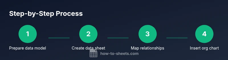
- 1
Prepare your data model
Define the core fields (Name, Title, Manager, Department, Location, EmployeeID, Level) and decide on a unique ID system. This solid foundation prevents mapping errors later and supports scalable organization charts.
Tip: Document field meanings in a README tab to help future collaborators. - 2
Create a data sheet and header row
Set up a dedicated tab for employees with a clear header row. Use consistent data types and drop-downs for fields like Department and Location to reduce entry mistakes.
Tip: Use Data Validation to enforce allowed values. - 3
Populate sample data for top levels
Enter a small pilot set that includes the top leader and at least two direct reports. This seed data tests the mapping logic and visualization flow.
Tip: Keep sample data anonymized if sharing externally. - 4
Map reporting relationships with a managers table
Create a separate mapping that links each employee to their ManagerID. This helps the chart render correct parent-child relationships.
Tip: Prefer IDs over names to avoid ambiguity when two employees share a name. - 5
Add level and path helpers
Add helper columns that indicate hierarchy level and a path string (e.g., CEO > VP > Director) to streamline sorting and filtering.
Tip: Use a consistent delimiter in path strings (e.g., “ > ”). - 6
Create a named range and connect to the chart
Define a named range for your data and use it as the data source for the org chart. This ensures the chart updates with data changes.
Tip: Name the range clearly, e.g., data_EmployeeOrg. - 7
Insert the org chart and customize
Insert a chart and select the Org Chart type. Bind it to your data range and adjust colors to reflect departments or locations.
Tip: Choose colors that maximize contrast for accessibility. - 8
Test, share, and maintain
Test the chart with different edits, share with stakeholders, and establish a maintenance cadence for quarterly updates.
Tip: Document who owns updates and how changes are requested.
FAQ
What is a google sheets org chart template?
A google sheets org chart template is a pre-formatted data model and visualization scheme that maps employees to managers, departments, and locations. It provides a live visual of reporting lines that updates as you modify the underlying data.
A google sheets org chart template is a ready-made data model plus a chart that updates when you change the data.
Do I need Apps Script to make it dynamic?
Not necessarily. Built-in charts in Sheets can render an org chart from your data, but Apps Script can automate updates, enforce data integrity, and enhance visualization for larger teams.
Apps Script isn’t required, but it can automate updates and improve visuals for bigger teams.
Which data fields are essential?
Name, Title, Manager (or ManagerID), Department, Location, and EmployeeID are essential. Additional fields like Email, Level, and Status improve usability and reporting.
Key fields are name, title, manager, department, location, and a unique ID.
Can I share the chart with others?
Yes. Google Sheets charts and data can be shared with appropriate permissions. Use view or edit rights based on roles and ensure sensitive data is protected.
Yes, you can share with appropriate permissions and protect sensitive data.
How do I update the org chart when staff changes?
Update the data sheet (names, managers, and roles). If the chart is linked to the data, it will refresh automatically or with a quick manual refresh.
Update the data sheet; the chart will reflect changes if linked to that data.
Are there security concerns with employee data in Sheets?
Storing employee data in Sheets requires careful access control. Use shared drives, restricted access, and avoid publishing sensitive information publicly.
Be mindful of access controls and avoid sharing sensitive data publicly.
Watch Video
The Essentials
- Implement a data-driven org chart template to scale with teams
- Use built-in Org Chart in Sheets to visualize structure
- Keep data sources and outputs in separate tabs for clarity
- Automate updates with Apps Script when possible
- Regularly review and archive inactive roles