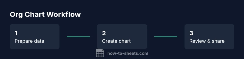
How to Build an Org Chart in Google Sheets: Step-by-Step Guide
Learn to build a clear org chart in google sheets with a simple data table, hierarchical mapping, and optional diagrams. This step-by-step guide covers data setup, chart creation, customization, and maintenance for students, professionals, and small business owners.

By the end of this guide you'll be able to build a clear organizational chart in Google Sheets. You’ll set up a basic data table with employee, title, and manager columns, choose the right chart type or diagram, and apply simple formulas to show reporting lines. The steps cover structure, visuals, and ongoing maintenance.
Why an Org Chart in Google Sheets Matters
An org chart visually communicates reporting lines, roles, and how teams connect. In fast-moving projects or growing organizations, a single chart acts as a living map that reduces confusion and accelerates decision-making. This guide shows how to create an org chart in google sheets. Using Google Sheets for this task offers several advantages: everyone with access can view, comment, and propose updates in real time; changes propagate instantly to all linked views; and you can automate parts of the data entry and formatting.
From a practical standpoint, an org chart in Sheets works best when you start with a clean data table that captures each employee and their relationship to a manager. This approach mirrors how many HR systems structure data and makes it easy to import or export as needed. The How To Sheets team has found that teams frequently start with a simple three-column schema (Employee name, Title, Manager) and then layer in additional attributes such as department, location, or level. A well-maintained chart becomes a reliable reference during onboarding, performance reviews, and project planning.
Note: If you plan to share the chart publicly or within a large organization, consider who can edit and who can only view. Use sheet protection and versioning to prevent accidental edits, while still enabling collaboration. In practice, a living org chart grows with your team; keep it lean at first and expand as requirements become clearer. This guide also demonstrates how to create an org chart in google sheets so you can leverage real-time collaboration.
Data Setup: What to Include
The first step is to define the data model. A minimal, robust structure makes it easy to maintain and extend. Start with a dedicated data sheet or a clearly separated area in your workbook. Core columns include:
- Employee: Full name as shown in the org chart
- Title: Official role or job subtitle
- Manager: The direct supervisor’s full name (must match an Employee entry)
- Department: Functional area to color-code or group
- Location or Team: Optional but helpful for larger orgs
- Status/Level: A simple tier indicator (e.g., IC, Manager, Director)
Rules for quality:
- Keep names consistent (no trailing spaces; consistent capitalization)
- Ensure every employee’s Manager exists as a row in the dataset
- Use data validation for Manager to reduce typos
- If you have contractors or dotted-line reports, handle them with additional columns or notes rather than forcing the main hierarchy to capture every nuance
Best practices:
- Freeze the header row for quick scanning
- Use a named range for the data so your chart can adapt if rows are added
- Maintain a small, stable set of attributes to avoid chart clutter
By preparing a clean dataset, you set yourself up for a chart that’s both accurate and scalable. The goal is to reflect reporting relationships clearly while keeping the data easy to audit and update. This data setup lays the groundwork for an org chart in google sheets that is both simple and scalable.
Creating the Chart: Step-by-Step Visual
Google Sheets supports several ways to visualize hierarchies, including the Org chart option in the chart editor and, if necessary, alternative methods like Drawings for more complex layouts. The following steps assume you have a data table with Employee, Title, and Manager.
- Select your data range (include header row) and insert a chart.
- In the Chart editor, pick the Org chart type (if available). Some accounts display a hierarchy option named "Tree" or "Hierarchy".
- Configure the data range to map Employee as the node label and Manager to establish parent-child relationships. If the interface uses separate columns, follow the mapping prompts to set the role, manager, and leaf nodes.
- Tweak labels and colors. Use department-based colors to differentiate teams and adjust label font size for readability.
- If Org chart is not available, build a fallback using Google Drawings or Apps Script:
- Draw a connected set of shapes for each employee
- Use lines to indicate supervisor relationships
- Keep a legend for departments and levels
- Refresh and validate the structure. Check that every employee appears under the correct manager and that there are no orphan nodes.
- Share and maintain. Use protected ranges to prevent accidental edits and invite collaborators to review.
Why this matters: the chart is only as good as the underlying data. Small typos or missing managers break the visualization. When you update the data, the chart should reflect the changes, so you avoid manual rework each time the team shifts. This process ensures you can produce an org chart in google sheets that is both accurate and easy to maintain.
Using Shapes & Diagrams in Sheets
Even when you can render an org chart directly, you might want to augment the view with diagrams for clarity. Google Drawings offers flexible connectors and custom shapes that you can embed next to the data or in a separate sheet. Practical tips:
- Create a quick legend: Use colors to represent departments, and use bold fonts for titles
- Use connectors to illustrate cross-functional relationships if needed
- Keep the diagram in a dedicated sheet so the data table remains clean
- Use the “Publish to the web” option for a static, shareable version
For teams needing a high-fidelity representation, the combination of a data-driven chart in Sheets plus a separate, designed org diagram in Drawings can deliver both accuracy and aesthetics. If you prefer automation, Apps Script can assemble shapes and labels from the data automatically, though that requires some scripting knowledge.
This approach lets you create an org chart in google sheets that doubles as a polished, presentable artifact for executives and stakeholders.
Alternatives and When to Use Google Drawings or Apps Script
Sometimes the built-in Org chart type isn’t available in your Sheets environment or you need more complex topology. In those cases:
- Google Drawings: Build a custom diagram with connectors. It’s excellent for matrix structures or multi-root organizations. It allows manual placement and precise alignment.
- Apps Script: Automate chart creation and updates. You can generate a diagram from the data, refresh it on schedule, and export PNGs for reporting.
- External tools: If your org is exceptionally large or heavily regulated, consider exporting the data to a dedicated diagram tool or HR software export and import back after alignment.
Tips:
- Start simple: begin with a basic one-root chart; scale gradually
- Document dependencies: store a mapping between employees and their managers to facilitate updates
- Back up data: keep a versioned copy before major restructures
Using these methods gives you resilience: you’ll be able to communicate hierarchy in a way that matches your organization’s size and complexity. This flexibility is essential when building an org chart in google sheets that may need to scale.
Best Practices for Maintenance
A living org chart should survive team changes and reorganizations. Adopt a maintenance rhythm that balances accuracy with overhead.
- Establish a data governance routine: decide who can edit, who can review, and how often the chart is updated
- Version control: save versions or snapshots of the sheet to track changes
- Consistent naming conventions: define rules for prefixes and suffixes in job titles
- Periodic data validation: use drop-down menus and data validation to keep names, titles, and manager fields clean
- Import/export readiness: keep a clean CSV or Excel export path for sharing with HR or executives
- Accessibility: share with view-only access for most stakeholders to protect integrity
If you apply these practices, your org chart will remain a trustworthy reference, not a dated artifact. The result is a living document that mirrors the real organization and supports better planning, onboarding, and alignment across teams.
Tools & Materials
- Google account with access to Google Sheets(Needed to create and save the chart)
- Google Sheets(Ensure you have the latest Sheets features)
- Org chart data template(Columns: Employee, Title, Manager, Department)
- Optional: Google Drawings or Apps Script(For advanced visuals or automation)
Steps
Estimated time: 30-60 minutes
- 1
Prepare data table
Create a table with columns for Employee, Title, Manager, Department, and any other attributes. Ensure every employee's manager exists in the dataset.
Tip: Use Data Validation to prevent typos in the Manager column. - 2
Normalize manager references
Standardize manager names to match exact employee names in the table to avoid broken hierarchies.
Tip: Trim extra spaces and use consistent capitalization. - 3
Insert and configure the chart
Select the data range, insert a chart, and choose the Org chart type if available. If not, use Drawings or Apps Script to simulate hierarchy.
Tip: If Org chart type isn't available, position the data in a way that a manual hierarchy is clear. - 4
Customize labels and colors
Add department-based colors, show titles in node labels, and adjust font sizes for readability.
Tip: Add a helper column to display initials for compact labels. - 5
Enable updates and maintenance
Link the chart to your data so updates reflect automatically. Consider Apps Script for automation.
Tip: Set a review schedule and lock key cells to prevent accidental edits. - 6
Share and iterate safely
Share with stakeholders with view/edit permissions and collect feedback for refinements.
Tip: Version your sheet to track changes over time.
FAQ
Does Google Sheets have a built-in org chart tool?
Yes, some Sheets chart editors include an Org chart type. If not available, use Google Drawings or Apps Script to build a hierarchy.
You can use the Org chart option if it's shown in the chart editor, otherwise try Drawings or Apps Script for hierarchy visuals.
How do I handle employees with multiple managers?
Google Sheets org charts typically model a single reporting line per employee. For matrix structures, maintain separate charts or use notes column to indicate multi-reporting.
Most org charts show one manager per person; for multiple reporting lines, add notes or separate visuals.
Can I auto-update the org chart when the team changes?
Yes, with data-linked charts and simple formulas, or use Apps Script to refresh the chart as data changes.
You can set up automatic updates with linked data and optional scripting.
What if a person moves to a new department?
Update the data table (employee, title, manager, department) and refresh the chart. Use data validation to minimize errors.
Update the data row and refresh the chart to reflect the new org structure.
When is it better to use Drawings instead of Sheets charts?
Drawings offer flexible layout and connector lines; Sheets charts are quicker for simple hierarchies. Choose based on complexity and collaboration needs.
Drawings for complex visuals; Sheets for quick, data-driven org charts.
Watch Video
The Essentials
- Plan data structure before charting.
- Use built-in Org chart type when available.
- Maintain data and chart with a regular refresh.
- Label clearly and color-code for readability.