Google Sheets Graphs: Understanding Graph Types for Data Visualization
Explore how to choose and create the right graph in Google Sheets. This practical, data-driven guide covers common chart types, best-use scenarios, step-by-step creation, and tips for dashboards. How To Sheets Analysis, 2026.

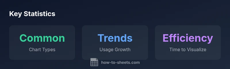
Google Sheets offers multiple chart types—bar, column, line, pie, scatter, area, and combo charts. Each type serves different storytelling needs, from quick category comparisons to trend analysis. For students, professionals, and small business owners, choosing the right graph improves clarity, supports data-driven decisions, and reveals insights that tables alone may hide. This guide explains where each graph shines and how to use them effectively.
Why graph types in Google Sheets matter
According to How To Sheets, using the right graph type is essential for turning raw data into a clear, actionable narrative. In Google Sheets, you can visualize trends, distributions, and comparisons in a fraction of the time it takes to interpret rows and numbers. The phrase google sheets types of graphs captures the variety of visuals available, from simple bar charts to more nuanced scatter plots. When you select the appropriate chart, you make patterns pop, outliers easier to spot, and decisions faster to justify. For students, professionals, and small business owners, this choice matters because visuals compress complexity into an instant, shareable story. As you explore the different chart families, remember that the ultimate goal is to illuminate your data—not decorate it. How To Sheets’s guidance emphasizes alignment between your data structure and the chosen graph type, ensuring accurate interpretation by your audience.
To begin, define your audience and the question your data should answer. If you need to compare categories, a bar or column chart generally works best. If you’re tracking performance over time, a line chart or area chart can reveal velocity and momentum. For composition, a pie chart or donut chart works when there are a few meaningful segments. If you’re examining the relationship between two quantitative variables, a scatter chart is often the most informative. Keep in mind that Google Sheets can auto-suggest chart types, but you should override suggestions when they don’t match your analytical intent. This practice keeps your visuals honest and compelling.
Overview of common graph types in Google Sheets
Google Sheets supports a diverse set of graph types, each with a unique storytelling strength. Bar and column charts excel at clear category comparisons, while line charts illuminate trends over time. Pie charts show proportions, and scatter plots reveal correlations between two variables. Area charts emphasize magnitude of change, while combo charts combine multiple series for a layered view. The choice hinges on your data’s structure and the question at hand. For dashboards and executive summaries, you’ll often default to clean, uncluttered visuals that communicate quickly. Remember that consistency in color and labeling across charts strengthens your narrative and reduces cognitive load. By understanding the core families, you can rapidly select candidates for any given dataset and then tailor formatting to maximize readability.
When to use each graph type
Choosing the right graph type is a function of data type and audience. Use bar or column charts for discrete categories and side-by-side comparisons; they make absolute and relative values easy to judge. Line charts shine when you want to show trends across time or continuous intervals, and they scale well with multiple series if you keep the dataset manageable. Pie charts are suitable for displaying parts of a whole when there are a small number of segments with meaningful differences. Scatter plots reveal relationships and clusters between two quantitative variables, making them ideal for correlation analyses. For dashboards that combine several signals, a combo chart can convey multiple metrics in a single frame, but avoid overloading with too many series. How To Sheets recommends starting with a simple chart, then iterating to add context like trendlines or data labels as needed.
How to create a chart in Google Sheets: step-by-step
Creating a chart in Google Sheets is straightforward. First, select the data range that you want to visualize. Then go to Insert > Chart to open the Chart Editor. In the Setup tab, pick the desired chart type from the Type dropdown. The Chart Editor’s Customize tab lets you adjust titles, axis labels, legend position, and color. To keep things readable, limit the number of series and use contrasting colors. If your dataset updates regularly, ensure the chart range expands automatically and consider using named ranges for stability. Finally, place charts on a dedicated dashboard sheet, aligning charts by size and axis scales for consistent comparisons.
Chart formatting and dashboard considerations
Formatting is a critical part of chart effectiveness. Use consistent color palettes across related charts to reinforce connections. Label axes clearly with units, and provide a concise chart title that answers the data question. For dashboards, minimize clutter by hiding gridlines or adjusting their weight, and keep font sizes readable at various screen sizes. Accessibility matters too: use high-contrast colors, descriptive alt text for images, and avoid relying solely on color to distinguish categories. When sharing, consider exporting to PDF or embedding charts in Google Data Studio or Slides for broader distribution. These practices help readers interpret visuals quickly and accurately.
Pitfalls to avoid and best practices
Avoid common traps that undermine chart clarity. Don’t overuse 3D effects, as they distort perception; keep axis scales consistent to avoid misleading comparisons; and don’t crowd a single chart with too many series. If your data contains many categories, consider grouping or filtering to reduce clutter. Always verify data integrity before charting—misaligned ranges or blank cells can produce misleading visuals. Best practices also include annotating key data points, using sparklines for inline trends, and testing charts with a sample audience to ensure the message comes through. How To Sheets emphasizes ongoing refinement: charts should evolve with your understanding of the data, not remain static.
Advanced tips for effective data storytelling
Take advantage of advanced features to elevate your visuals. Add trendlines or moving averages to highlight trajectories, and use dual axes within a combo chart to compare disparate scales. For large datasets, consider sampling or aggregating data to maintain readability. Sparklines can provide quick embedded trends within cells, while filter views allow readers to explore slices of data without altering the chart. Finally, document your assumptions and data sources alongside each chart to boost trust and repeatability. Implementing these techniques can transform raw numbers into stories that inform decisions.
Comparison of common Google Sheets graph types and their best-use scenarios
| Graph Type | Best Use Case | Key Considerations |
|---|---|---|
| Bar chart | Comparing categories | Good for discrete categories; ensure axis scales are consistent |
| Column chart | Similar to bar but vertical | Useful when time/order matters; watch label density |
| Line chart | Tracking trends over time | Best with few series; avoid clutter with too many lines |
| Pie chart | Proportions of a whole | Limit to few slices; not ideal for precise comparisons |
| Scatter chart | Relationships between two variables | Requires numeric data; watch for outliers |
| Combo chart | Multiple metrics in one view | Use sparingly; ensure scales align for readability |
FAQ
What graph types does Google Sheets support?
Google Sheets offers bar, column, line, pie, scatter, area, and combo charts, among others. Each type serves a different storytelling purpose.
Sheets provides a range of chart types like bar, column, line, pie, scatter, area, and combo charts.
Which chart type is best for comparing categories?
Bar and column charts are typically best for comparing categories side-by-side, making differences easy to judge at a glance.
Bar or column charts are ideal for comparing categories.
Can I switch chart types after creating a chart?
Yes. The Chart Editor lets you switch the chart type without recreating the chart from scratch.
Yes, you can change the chart type in the Chart Editor at any time.
Do charts update automatically when data changes?
Yes, charts in Google Sheets reflect data changes in real time, helping you keep visuals in sync with the source data.
Yes, charts update automatically as data changes.
How can I format charts for dashboards?
Use consistent colors, concise titles, readable axis labels, and minimal clutter. Consider exporting or embedding for a unified dashboard.
Format with consistent colors, clear labels, and compact design for dashboards.
Are there limitations to Google Sheets charts?
Charts in Sheets are powerful but not as feature-rich as specialized BI tools. For advanced interactivity, consider pairing with Sheets add-ons or BI platforms.
Sheets charts are great, but for advanced interactivity you might need extra tools.
“Choosing the right graph type makes data meaning clear at a glance. The right visualization in Google Sheets can reveal trends and outliers that tables alone miss.”
The Essentials
- Choose the chart that matches your data type
- Line charts excel at trends; bar charts excel at comparisons
- Keep visuals simple for dashboards and quick insights
- Label clearly and maintain consistent colors across charts
- Test charts with your audience to ensure clarity