Graph in Google Sheets: A Complete Guide to Charts
Learn how to graph data in Google Sheets with charts—from selecting data to customizing axes, colors, and titles. A practical, step-by-step guide for students and professionals.

To graph data in Google Sheets, first organize your data in columns with clear headers. Select the data range, then go to Insert > Chart and choose the chart type that fits your data (line, bar, column, pie, or scatter). Customize the series, axes, and colors in the Chart editor, and add a descriptive title and legend. Share or export as needed.
Why graphing in Google Sheets matters
Graphs transform raw numbers into clear visuals. According to How To Sheets, charts in Google Sheets help students, professionals, and small business owners communicate insights quickly and confidently. A well-chosen chart reveals trends, comparisons, and outliers at a glance, supporting better decisions in budgeting, project tracking, and reporting. When your data is paired with a good graphic, stakeholders grasp the narrative faster and with less cognitive load.
In practical terms, a chart can turn a spreadsheet full of numbers into a story. For someone learning graphing concepts, charts illustrate how changes over time relate to business outcomes. For teams, charts become a shared frame of reference during meetings, aligned on a single visual cue rather than scattered rows and cells.
According to How To Sheets, mastering charts is not about fancy graphics; it’s about choosing the right visual to answer a question. Start with a question like “What is the trend?” or “Which category leads?” and then select a chart that answers that question clearly.
Chart types and use cases
Google Sheets offers a spectrum of chart types. Use line charts to show trends over time, column or bar charts to compare categories, and pie charts to illustrate shares of a whole. Scatter plots reveal relationships between two variables, while area charts emphasize magnitude of change. Combo charts mix two types to compare different data series. For readability, avoid crowding a chart with too many series and choose colors with strong contrast.
When you track performance over months, a line or area chart provides a clean view of direction and velocity. If you need to compare multiple categories side by side in a single view, a column chart often communicates differences more effectively than a line chart. For composition analysis, a pie chart can be useful when categories are few and mutually exclusive. Remember: the goal of a chart is quick inference, not exhaustive data inspection.
Based on How To Sheets analysis, the best charts align with the underlying data relationship. Time-based data favors line or area charts; discrete categories benefit from bar or column charts; relationships between two numeric variables suit scatter plots. Keep the end user in mind: what questions should the chart answer at a glance?
Data preparation for graphs
A reliable chart starts with clean data. Place headers in the first row, and keep data in neat, contiguous blocks without merged cells. Ensure numeric columns are truly numeric (no stray text), and format dates consistently. If you plan to chart over time, arrange data in columns with a date column and corresponding values. Remove blank rows, and consider creating a named range if your dataset updates regularly.
Consistency is key: use the same units, the same decimal precision, and the same category labels throughout. If you need to combine data from multiple sheets, use functions like IMPORTRANGE or QUERY instead of copying values, so your chart stays up to date automatically. Also, avoid hidden columns or filters that could inadvertently alter what the chart displays.
Building your first chart: a guided example
Suppose you track monthly sales for Product A over six months. In a Google Sheet, place headers: Month and Sales. Enter data: Jan 100, Feb 120, Mar 130, Apr 125, May 140, Jun 150. Select the range, then Insert > Chart. Google Sheets suggests a chart type based on the data; for this dataset, a line chart works well to show monthly progress. The Chart editor appears on the right, where you can tweak type, range, and labels.
To make this chart more informative, add a descriptive title like “Product A — Monthly Sales.” Label the horizontal axis as “Month” and the vertical axis as “Sales (units).” If you add a second series, such as Product B sales, consider a dual-axis or a combo chart to compare performance clearly. Preview changes by switching chart types to see which presentation reveals the story most effectively.
Customizing charts for readability
Make charts easy to read by customizing axes, titles, and colors. Add a descriptive chart title, label the horizontal axis with months, and ensure the vertical axis has a clear unit. Use high-contrast colors for data series and avoid gradient fills that hinder legibility. Enable data labels sparingly for emphasis on key values, and position the legend where it won’t obscure data.
Adjust gridlines and tick marks to minimize clutter, and consider formatting numbers (e.g., currency, decimals) to match your data context. For accessibility, ensure sufficient color contrast and use descriptive axis titles. If you expect the data to grow, set your axis to accommodate future values or switch to a dynamic range.
Common mistakes and fixes
Common pitfalls include relying on a single chart type for diverse data, ignoring data labels, or failing to align axis scales with the data. Mismatched data ranges between the chart and source data can hide outliers or create false trends. Always verify that the chart updates when you edit the sheet and avoid overcrowding with more than 3–4 data series.
Another frequent error is neglecting axis titles or legends, which leaves viewers guessing what they’re seeing. Check that your units are clear and that numbers are not truncated by too-small axis scales. Finally, avoid charts that imply precision you don’t have; stacked or multi-series visuals can mislead if the data is noisy.
Extending charts with advanced features
As you grow comfortable with basic charts, explore trendlines, secondary axes, and conditional formatting within charts. Trendlines reveal long-term directions, while a secondary axis helps compare series with different units. You can add data labels, adjust decimal places, and use custom number formats. For collaboration, you can insert charts into Google Docs or publish them to shareable links.
Advanced users may create interactive charts with slicers or filters to let viewers focus on specific categories or date ranges. If your data is live, consider connecting Sheets to external data sources with importrange or a data query to keep charts up to date. Always validate that advanced features maintain clarity and don’t introduce cognitive load for the reader.
Tools & Materials
- Computer or tablet with internet access(Any modern browser; Google account required)
- Google account(Required to access Google Sheets)
- Prepared data in Google Sheets(Headers in first row; clean numeric columns)
- Optional: sample dataset template(Helpful for practice)
Steps
Estimated time: 20-40 minutes
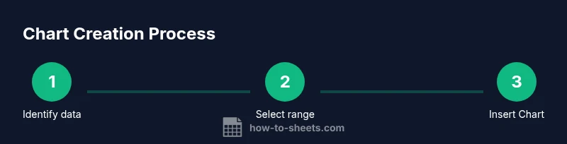
- 1
Identify the data to graph
Define the question your chart should answer and select the relevant columns (e.g., dates, values, categories). This focused approach prevents chart clutter and misinterpretation.
Tip: Start with a single primary metric and a single dimension to keep the chart simple. - 2
Select the data range
Highlight the cells that contain headers and data for the chart. Include headers so the Chart editor can automatically label axes and data series.
Tip: Include headers in the selection; avoid including unrelated columns. - 3
Insert the chart
Go to Insert > Chart. Sheets will insert a default chart based on your data, which you can customize further.
Tip: If Sheets picks a type you don’t want, you can easily change it in the Chart editor. - 4
Choose the chart type
In the Chart editor, switch among line, bar, column, pie, scatter, or combo to find the best fit for your data relationship.
Tip: Prefer line or bar for time-series or category comparisons; avoid pie for many categories. - 5
Customize axes, colors, and labels
Edit titles, axis labels, data labels, colors, and legend placement for readability and context.
Tip: Use high-contrast colors and consistent units to improve accessibility. - 6
Review and share/export
Check updates as data changes; share the chart with teammates or export it as an image or PDF for reports.
Tip: Consider exporting to PNG or embedding directly in Google Docs for a polished report.
FAQ
What chart types are available in Google Sheets?
Google Sheets supports line, column, bar, area, pie, scatter, and combo charts. Each type highlights different data relationships. Choose one that best answers your main question.
Sheets offers line, column, bar, area, pie, scatter, and combo charts. Pick the one that best shows your data relationship.
How do I switch chart types after creating one?
Click the chart to open the Chart editor, then select a new type in the Setup tab. The chart updates instantly to reflect the change.
Click the chart, use the Chart editor, and switch the type.
Can I link charts to live data in Google Sheets?
Yes. Charts update automatically as you edit the underlying data; you can also use named ranges and filters to shape what’s displayed.
Charts update automatically with changes to the data.
How do I add data labels to a chart?
In the Chart editor, go to Customize > Series > Data labels, then choose the labels you want. This helps viewers quickly read values.
Use the Chart editor to add data labels.
How can I export or embed a chart?
Click the chart’s three-dot menu, choose Download to save as PNG or PDF, or copy-paste into documents or slides.
Download or copy your chart for use in reports.
Watch Video
The Essentials
- Choose the right chart type for your data
- Prepare clean, labeled data before graphing
- Use the Chart editor to adjust axes and colors
- Label axes, titles, and legend for clarity
- Share, export, or embed charts in reports