Google Sheets Line Chart: A Practical Step-by-Step Guide
Master creating and customizing a google sheets line chart with clear axes, readable colors, and practical tips for reports and dashboards. A comprehensive, student-friendly guide.

By the end of this guide, you will be able to create a google sheets line chart from your data, customize series and axes, and apply formatting that makes trends easy to read. You’ll prep clean data first, insert the chart, refine settings, and interpret results for both daily dashboards and quarterly reviews, with quick tips on sharing and collaboration.
Why Google Sheets Line Charts Matter
In data-driven work, a google sheets line chart makes trends instantly visible. The google sheets line chart is particularly effective for time-series data, where you want to show how values change across days, weeks, or months. According to How To Sheets, line charts balance simplicity with clarity, letting your audience grasp patterns at a glance. When used correctly, they highlight seasonality, growth, and variability without overwhelming readers. This practical guide explains why this chart type is a staple in student reports, professional dashboards, and small-business analyses, and how to set expectations for what viewers should notice. You’ll learn actionable steps to prepare data, choose the right options, and avoid common misinterpretations that undermine your message. The guidance also reflects How To Sheets’ approach to teach-by-doing, ensuring you gain confidence as you chart.
Data Preparation for a Line Chart
Line charts depend on clean, time-ordered data. Start by organizing your data in two or three columns: a time column (dates, months, or periods) and one or more numeric series. Use explicit headers (Date, Revenue, Visitors) and ensure dates are actual date values, not text. Normalize missing data by leaving blank cells or using a placeholder like 0 only if you intend to show gaps. Remove extra columns that do not contribute to the trend. For best results, keep the time axis evenly spaced and avoid using different time scales in the same chart. Finally, validate data with a quick sparkline or a mini-check that all numbers align with their labels. As you prepare, consider how viewers will interpret the axis scale and the legend, since these choices influence perceived trends.
Inserting a Line Chart in Google Sheets
Select your data range, then go to Insert > Chart. Google Sheets will default to a chart type; switch the Chart type to Line chart in the Chart Editor. Confirm that the first row contains headers and the first column contains time values; adjust 'Use row 1 as headers' and 'Use column A as labels' settings as needed. Name your series clearly, and give your chart a descriptive title. Consider placing the chart on a separate sheet for larger datasets, and enable the option to show the legend so readers can distinguish multiple lines. If your data changes, the chart will update automatically—no extra steps needed. This block is a practical check-in: ensure the data range includes all series you plan to compare, and avoid including totals that can skew interpretation.
Customizing Visuals: Colors, Axes, and Gridlines
With the chart selected, use the Setup and Customize tabs to tailor the display. Pick contrasting colors for each series to enhance readability, and ensure the axis labels are legible with a suitable font size. For time-based x-axes, show dates at reasonable intervals (e.g., every month) to avoid crowding. Enable gridlines only if they improve legibility, and adjust the chart size to fit your layout. Add min and max bounds if necessary to keep trends within frame, and format numbers with appropriate units (currency, percentages) to avoid ambiguity. Consider enabling data labels only for a few key points to reduce clutter. By aligning visuals with your narrative, you help your audience extract insights quickly.
Interpreting and Communicating Insights
A line chart communicates trends, seasonality, and volatility. When presenting, point viewers to the starting point, major inflection points, and the direction of change. Use annotations to call out anomalies, and consider a small multiple or overlay if you compare metrics. Remember to check for scale distortion: identical slopes can look different if axes are mis-scaled. The How To Sheets team emphasizes keeping visuals honest and straightforward, with clear captions that summarize the takeaway. If you’re sharing, include a brief narrative in the caption that states the dataset, time period, and the observed trend to guide interpretation.
Practical Examples and Use Cases
Sales over time, website visits, production output, and student grades are common line chart candidates. A two-series line chart can show revenue and cost trends side by side, while a three-series variant helps compare regions. For educational contexts, plot assignment scores across weeks to monitor progress. Each example benefits from consistent intervals, aligned baselines, and a succinct narrative in the chart title. When plotting multiple series, ensure the legend remains readable and the color choices clearly differentiate lines. This section demonstrates how a well-crafted line chart conveys patterns at a glance, which is especially valuable in presentations and dashboards.
Best Practices for Readability and Accessibility
- Use a high-contrast color palette (dark text on light background).
- Label axes with units (e.g., USD, visits) and include a readable legend.
- Keep data points uncluttered; consider removing markers if there are many points.
- Provide alt text when sharing via documents or dashboards.
- Prefer a simple line style over heavy decorative effects to preserve legibility. Accessibility-minded colors ensure that people with color vision deficiencies can still distinguish lines. Always test your chart on a small screen to ensure readability on mobile devices.
- Use descriptive titles and captions to convey the chart’s purpose before the viewer examines the data.
Common Pitfalls and Troubleshooting
- Missing or non-date values can break the x-axis; fix by converting to date types.
- Mismatched ranges between axes create misleading slopes; ensure consistent scales.
- Overlapping lines in crowded charts confuse interpretation; reduce series or use a small multiple.
- If a chart is blank, confirm the data range and the chart type selection.
- When exporting, some formats truncate labels; verify on the destination platform. If a dataset expands, consider converting to a dynamic named range so the chart updates automatically.
- Remember that charts are a visual aid—avoid overstating conclusions; accompany charts with captions that describe the data source and context.
Chart Maintenance and Collaboration
Charts are living documents in Google Sheets. Regularly refresh data ranges as new rows are added, adjust charts when new categories appear, and share with collaborators with appropriate permissions. Use named ranges to simplify updates, and publish charts to dashboards or Google Data Studio if you need broader distribution. Document the data source and assumptions in a caption to avoid misinterpretation. Regular reviews help ensure your chart remains accurate as data evolves, and keeping a changelog can help teammates track edits over time.
Tools & Materials
- Computer or mobile device with internet access(You’ll access Google Sheets in a browser or app.)
- Google account(Required to create and save sheets and charts.)
- Dataset with time-based column(At least one numeric series and a date/time column.)
- Headers for data columns(Clear, concise labels (e.g., Date, Revenue, Visits).)
- Optional: sample data for practice(Great for hands-on learning and testing chart options.)
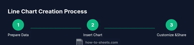
Steps
Estimated time: 25-40 minutes
- 1
Prepare the data table
Organize your data with a time column and one or more numeric series. Ensure headers are present and dates are real date values. This step sets a reliable foundation for accurate charting.
Tip: Use Data > Data cleanup to standardize date formats before charting. - 2
Select the data range
Highlight the entire range that includes headers and all series you want to plot. Do not include totals or unrelated columns that could skew the chart.
Tip: Include the date column and all series in a single contiguous range to avoid broken links. - 3
Insert the chart
Go to Insert > Chart. In the Chart Editor, switch Chart type to Line chart. Verify headers are recognized as labels and that all series are checked for display.
Tip: If Sheets creates a different default, use the Chart type dropdown to switch to Line chart quickly. - 4
Adjust chart settings
Tweak titles, axis labels, and legends. Ensure the x-axis shows a readable time interval and the y-axis uses a sensible scale.
Tip: Turn on 'Smooth' lines sparingly; it can obscure small but meaningful fluctuations. - 5
Format visuals for readability
Choose high-contrast colors, define number formats, and reduce clutter by hiding or simplifying markers when many data points exist.
Tip: Use a consistent color scheme across charts in the same workbook for familiarity. - 6
Interpret and share
Add a caption explaining the data source, time frame, and main takeaway. Share with teammates with appropriate permissions.
Tip: Link to the underlying data or a named range to ensure others can update the chart automatically.
FAQ
What is a google sheets line chart?
A line chart in Google Sheets visualizes changes in one or more numeric series over time. It highlights trends, seasonality, and relative differences between series.
A line chart shows how values change over time and compares multiple series at a glance.
Can you compare multiple series on a single line chart?
Yes. Include each series as its own line. Use distinct colors and a legend to keep them distinguishable.
Yes, you can compare several series on one line chart with colors and a legend.
How do I format the x-axis with dates?
Ensure the first column is dates stored as date type values. In the chart editor, set the horizontal axis to display dates at a reasonable interval (e.g., monthly).
Make sure your dates are actual date values and choose a monthly or weekly interval for the axis.
Why is my line chart showing only one line?
This usually happens if Google Sheets misinterprets the second series as text or if the data range excludes other columns. Recheck the data range and series selections.
Most likely the range or series selection didn’t include all data; adjust the range and add the missing series.
How can I export or share the chart?
Charts can be copied into documents, downloaded as image files, or published to dashboards. Include captions and source notes for context.
You can export as an image or copy into a document, with a caption explaining the data.
How do I handle missing values in a line chart?
Missing values create gaps. You can leave blanks to show gaps or interpolate sparingly if appropriate for your data story.
Leave blanks to show gaps, or interpolate only if it preserves your intended message.
Watch Video
The Essentials
- Prepare clean, labeled data before charting.
- Use line charts to show trends over time.
- Prioritize readability with color, labels, and concise captions.
- Annotate key points and maintain honest scales for accurate interpretation.