How to Add a Line of Best Fit in Google Sheets
Learn how to add a line of best fit in Google Sheets using scatter charts and trendlines. Step-by-step instructions, practical tips, and alternatives like LINEST for precise data visualization.

In Google Sheets, you add a line of best fit by creating a scatter chart from your data and enabling a trendline. This guide covers when to use a trendline, how to display its equation and R-squared, and how to interpret the result for quick data insights.
Understanding the concept of a line of best fit in Google Sheets
A line of best fit, typically a linear regression line, summarizes the overall relationship between two variables. In Google Sheets, you plot your data as a scatter chart and then add a trendline to reveal the direction and strength of that relationship. The equation shown on the chart expresses the slope and intercept, while R-squared indicates how much of the variation in Y is explained by X. This is a quick, visual way to assess correlation and predict values within the observed range. Remember, a linear trend assumes a straight-line relationship; if data curves, a non-linear fit or data transformation may be more appropriate. Outliers can skew the line, so inspect residuals and consistency across the data range.
When a line of best fit helps your data
Trendlines are most helpful when you want to quantify a relationship between two numeric variables and make simple predictions. They are commonly used for forecasting, budgeting, or evaluating whether a variable tends to rise or fall as another changes. If you have multiple data groups, you can compare trendlines side by side by plotting separate series in the same chart. Use R-squared to gauge fit strength, but avoid over-interpreting it in small datasets. For non-linear patterns, a straight-line fit might be misleading; consider transforming data or using a different model.
Quick setup: prepare your data for a trendline
Before charting, ensure your data is clean and structured. Place the independent variable (X) in one column and the dependent variable (Y) in another, with clear headers. Remove or impute missing values consistently. If you plan to compare multiple series, arrange each series in its own column. Having at least 8–12 data points typically provides a meaningful trendline, though you can explore with smaller sets as a teaching example. Label axes clearly to avoid misinterpretation.
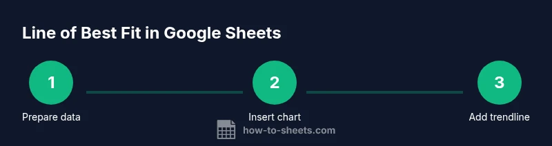
Step-by-step: add a trendline to a scatter chart
- Select your X and Y data ranges (including headers).
- Insert a chart (Insert > Chart) and switch the chart type to Scatter if needed.
- Open the Chart Editor and go to the Customize tab; expand the Series section.
- Enable Trendline, choose Linear, and adjust thickness/color for readability.
- Check Show equation and Show R-squared so the chart displays these metrics.
- Review the data range; resize or edit ranges if the trendline seems off.
- Interpret the results in the context of your data. If you have multiple series, repeat steps 3–6 for each series.
Advanced options: display equation and R-squared, customize appearance
Displaying the trendline equation gives you the slope (how much Y changes per unit of X) and the intercept. R-squared indicates the proportion of variance explained by the line. Tweak the line’s color and width to ensure it remains legible over the data points. If you plan to publish the chart, add a descriptive title and axis labels to improve clarity for readers.
Alternative: using LINEST for more control
For advanced analyses, you can use the LINEST function to compute regression statistics directly in cells. This approach lets you extract slope, intercept, and additional metrics to build your own trendline in the sheet or to feed into other calculations. It also supports multiple regression if you extend the data model. Start with =LINEST(known_y's, known_x's, const, stats) and interpret the returned array carefully.
Common mistakes and tips
- Don’t apply a linear trendline to clearly non-linear data without checks. Consider curve fitting or data transformation first.
- Ensure data ranges are correct; shifting ranges can produce misleading lines.
- Include the equation and R-squared for transparency when sharing results.
- Use descriptive axis labels and a concise chart title to aid interpretation.
- If you hide data points, the trendline still relies on the visible data range; keep the dataset representative.
Tools & Materials
- Google Sheets-ready dataset (two numeric columns: X and Y)(Include headers in row 1 for easier labeling)
- Browser with Google Sheets access(Google Chrome recommended for best compatibility)
- Stable internet connection(To load charts without interruptions)
- Optional: additional data series for comparison(If you want to compare multiple trends in one chart)
- Notes or annotation tools(To mark key observations on the chart)
Steps
Estimated time: 20-25 minutes
- 1
Select your data
Highlight the two columns you will plot: the X values (independent variable) and the Y values (dependent variable). Include headers if present to label the axes clearly.
Tip: Ensure there are no missing values in the middle of a column to avoid skewed results. - 2
Insert a scatter chart
Go to Insert > Chart. If Sheets doesn’t auto-select a scatter chart, open Chart Editor and choose Scatter as the chart type.
Tip: If the chart appears in a different tab, click it to activate Chart Editor for edits. - 3
Configure the chart type
In Chart Editor, set the Chart type to Scatter to visualize individual data points rather than connected lines.
Tip: Scatter charts are essential when you plan to add a trendline. - 4
Add a trendline
In the Chart Editor under Customize > Series, enable Trendline and select Linear. This adds the best-fit line to your scatter plot.
Tip: If you have multiple data series, apply a trendline to each series separately. - 5
Display equation and R-squared
In the same panel, toggle Show equation and Show R-squared so the chart shows the regression details.
Tip: R-squared helps you gauge fit quality; values closer to 1 indicate a better linear fit. - 6
Format the trendline
Adjust the trendline color, thickness, and dash style for readability against the data points.
Tip: Use a high-contrast color and a slightly thicker line for publication-quality visuals. - 7
Interpret and validate
Read the equation to understand the slope and intercept. Check whether residuals suggest non-linearity or outliers.
Tip: If the data shows curvature, consider transforming Y or using a polynomial trendline.
FAQ
What is a line of best fit, and when should I use it in Google Sheets?
A line of best fit is the regression line that best summarizes the relationship between two numeric variables. Use it when you want to quantify correlation and make simple predictions within the observed data range. For non-linear patterns, explore other models or data transformations.
A line of best fit summarizes the relationship between two numbers and helps with simple predictions. Use it when the relationship looks linear; for non-linear data, consider other models.
Can I add more than one trendline to compare series?
Yes. Add separate data series to the chart and apply a trendline to each one. This lets you compare slopes and fit across groups within the same chart.
Absolutely. You can add multiple trendlines to compare different data series in one chart.
Why isn’t my trendline showing on the chart?
Common causes are selecting the wrong chart type, not enabling the trendline in the Chart Editor, or data range issues. Ensure the chart is a scatter plot and that Trendline is turned on for the correct series.
If the trendline doesn’t appear, check that you’re using a scatter chart and that the trendline option is enabled for the right data series.
How do I display the trendline’s equation and R-squared?
In the Chart Editor under Customize > Series, toggle Show equation and Show R-squared. The values update dynamically as you adjust the data range or formatting.
Turn on Show equation and Show R-squared in the chart’s settings to see the regression details.
Is LINEST a better option for trendlines in Sheets?
LINEST provides more control and statistics for regression beyond the built-in trendline. It’s useful when you need explicit parameters for further calculations, but it requires careful interpretation.
LINEST gives you more control and math details, but it’s a bit more advanced to use correctly.
Do trendlines imply causation?
No. A trendline indicates association, not causation. Consider the broader context, potential confounders, and domain knowledge before drawing causal conclusions.
No, a trendline shows correlation, not cause. Use caution when interpreting results.
Watch Video
The Essentials
- Create a scatter chart for trend analysis.
- Enable a linear trendline to summarize relationships.
- Display equation and R-squared for interpretation.
- Assess linearity and consider alternatives if needed.