How to Make a Pie Chart in Google Sheets
Learn how to create a pie chart in Google Sheets with a practical, step-by-step approach. This guide covers data preparation, chart creation, labeling, color customization, and interpretation to help students, professionals, and small business owners visualize category shares clearly.

By the end of this guide you’ll be able to create a clean, readable pie chart in Google Sheets. You’ll prepare a two-column data set (category and value), insert a chart, and switch the type to Pie. You’ll learn how to display percentages, customize slice colors, adjust the legend, and interpret the results for clear data storytelling.
Why pie charts matter for data storytelling in Google Sheets
Pie charts are a concise way to show how parts relate to a whole, especially when you have a small number of categories. In Google Sheets, they empower you to move from raw numbers to visual narratives quickly. When used correctly, a pie chart highlights dominant shares and helps readers grasp proportion at a glance. The How To Sheets team has found that students, professionals, and small business owners benefit from pie charts that emphasize relative weights rather than exact figures. Use them to answer questions like “Which category dominates the pie?” or “What share does each segment represent in the whole dataset?” If you routinely share charts in reports, dashboards, or presentations, pie charts offer a familiar visual language that your audience will intuitively understand.
Data visualization best practices for pie charts
- Keep the number of categories small (ideally 5 or fewer) to avoid clutter. More slices reduce readability and make it hard to compare shares.
- Order slices from largest to smallest to help readers quickly grasp relative importance. A natural reading flow from left to right improves comprehension.
- Include clear labels or a legend. Choose a labeling style that matches your audience and purpose—percentages, absolute values, or both.
- Use accessible color palettes. Ensure high contrast between slices and maintain sufficient contrast for readers with color vision deficiencies. If needed, add data labels in plain text with percentages to reinforce understanding.
Common chart alternatives and when to use them
If your dataset has many categories or the percent differences are subtle, consider a stacked bar chart or a donut chart as alternatives. Stacked bars can compare proportions in a compact horizontal space, while donut charts can emphasize a central total. Remember that not all data benefits from a pie chart; for precise comparisons across many categories, a horizontal bar chart often communicates more effectively.
Tools & Materials
- Google account with Sheets access(Needed to open Google Sheets and save the chart.)
- Dataset prepared in two-column format (Category, Value)(Column A = categories, Column B = numeric values. Include a header row.)
- Device with internet access(Desktop or laptop recommended for editing; mobile works but is less convenient.)
- Color palette reference (optional)(Use accessibility-friendly palettes (e.g., colorblind-safe options) if sharing publicly.)
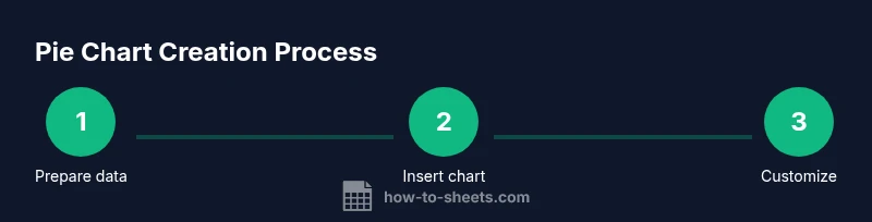
Steps
Estimated time: 12-15 minutes
- 1
Prepare your data
Create a two-column table with categories in the first column and their values in the second. Ensure all values are positive and there are no blank rows in the data range. Use a header row to make the chart labeling clearer.
Tip: Create a named range for your data to simplify future updates. - 2
Select the data range
Highlight both columns, including the header row. This ensures the chart will have proper labels for each slice. If there are any totals, remove them from the range to avoid distortion.
Tip: Tip: Include the header to automatically generate the legend. - 3
Insert the chart
Go to Insert > Chart. Google Sheets will insert a chart and open the Chart Editor on the right. If a chart filmstrip appears, you can switch to Pie in the Chart Editor.
Tip: If the chart defaults to a bar chart, you can change it in the Chart Editor’s Setup tab. - 4
Choose Pie chart type
In the Chart Editor, under Setup, select Pie chart (or Donut chart if you prefer a hollow center). The chart will instantly reflect your data with a circular representation of shares.
Tip: Donut charts emphasize the center; choose this if you want to place a total label in the middle. - 5
Enable data labels (percentages)
In the Chart Editor, switch to Customize > Pie slice > Label and choose Percentage (and optionally Value). This displays each share directly on the chart for quick interpretation.
Tip: If labels overlap, toggle Donut mode or reduce the number of visible slices by grouping small categories. - 6
Adjust slice colors and legend
Paint each slice with distinct colors that maintain contrast. Place the legend where it’s most readable (right side or bottom). Consistent color mapping across charts helps familiarity.
Tip: Use a color palette that aligns with your brand or dashboard design for consistency. - 7
Rename the chart and title
Add a descriptive title that clearly communicates what the pie chart represents. Avoid vague titles like 'Chart 1'. A concise subtitle can improve context.
Tip: Keep the title under 10-12 words for readability in dashboards. - 8
Review and share
Check that all labels are readable, the values are accurate, and the colors convey the intended meaning. Share or export as needed for reports, slides, or dashboards.
Tip: Consider exporting to PNG for external reports to preserve formatting.
FAQ
What is a pie chart and when should I use it in Google Sheets?
A pie chart displays parts of a whole as slices of a circle. Use it when you have a small number of categories and you want to compare their shares visually.
A pie chart shows parts of a whole as slices; use it for a quick share comparison when you have a few categories.
How do I show percentages on a pie chart in Google Sheets?
Open the Chart Editor, go to Customize > Pie slice, and enable Label. Choose Percentage for the label type to display each slice’s share.
Open the Chart Editor, enable data labels, and set them to show percentages.
Can I customize colors of pie slices?
Yes. In the Chart Editor, go to Customize > Pie slices and assign distinct colors to each category. Use accessible palettes for readability.
Yes, you can customize each slice’s color in the chart editor.
What if I have many categories?
If there are many categories, consider grouping small values into an 'Other' category or using a different chart type like a stacked bar chart for better comparison.
Group small categories or switch to a bar chart for many categories.
Why aren’t my slices displaying correctly?
Check that the data range is correct and all values are numeric and positive. Ensure the header row is included if you want an automatic legend.
Verify data range and numeric values; include headers for a clean legend.
Is a donut chart different from a pie chart?
A donut chart is a pie chart with a blank center. It can accommodate a central total label and is often easier on the eyes in dashboards.
A donut chart is a pie chart with a hole in the center for a total label.
The Essentials
- Start with a clean two-column dataset.
- Use the Pie chart type for simple category shares.
- Label slices with percentages for clarity.
- Choose accessible colors and placement for readability.
- Consider alternatives when you have many categories.