Line of Best Fit in Google Sheets: A Practical Guide
Master a line of best fit (trendline) in Google Sheets with step-by-step instructions, interpretation tips, and practical examples to improve data-driven decisions.

By the end of this guide you will add a line of best fit to a scatter chart in Google Sheets, interpret the slope and R-squared value, and customize the trendline for clear insights. You’ll learn step-by-step actions, common pitfalls, and practical tips for datasets of any size. This includes choosing display options and understanding when a linear model is appropriate.
Understanding the line of best fit in Google Sheets
A line of best fit, also known as a trendline, is a simple linear model that summarizes the relationship between two variables. When you plot x on the horizontal axis and y on the vertical axis, the trendline reveals whether increases in X tend to accompany increases or decreases in Y. In Google Sheets, the phrase line of best fit google sheets often appears with the option to display a trendline on a chart. This practical guide explains how to apply this concept to real data so students, professionals, and small business owners can draw meaningful conclusions without specialized software. Throughout, you’ll learn to interpret the slope, understand what R-squared means in plain terms, and customize the line for readability on dashboards and reports. How To Sheets emphasizes practical, do-this-not-that guidance you can apply today.
Note that a trendline is a tool, not a guarantee. It captures linear relationships, but most real-world data include noise, nonlinearity, or outliers. The goal is to gain insight and communicate it clearly, not to pretend data behaves perfectly. The How To Sheets approach blends theory with concrete steps you can replicate in your own workspace.
When to use a trendline
Trendlines are most valuable when you want to quantify the direction and strength of a relationship between two numeric variables. If you have a dataset that suggests linear behavior—such as hours studied versus test score, or advertising spend versus sales—a line of best fit helps you estimate how a unit change in X affects Y. It’s also useful for quick forecasting within a reasonable range of your data. However, avoid overreliance on a trendline for causal claims; correlation does not imply causation, and outliers or heteroscedasticity (changing variance) can mislead. In practice, use trendlines as a diagnostic and communication tool rather than a final verdict. How To Sheets analysis shows that a well-applied trendline supports data-driven decisions when paired with domain knowledge and data quality checks.
Preparing your data for a trendline
Before adding a line of best fit, ensure your data is clean and organized. Remove non-numeric values from the X and Y columns, fill missing values thoughtfully (e.g., with a reasonable estimate or by excluding incomplete rows), and check for obvious outliers that may distort the trend. Label your columns clearly (e.g., X_input and Y_output) to avoid misalignment when selecting data for the chart. If your data contains multiple series, consider isolating them or creating separate charts to avoid conflating relationships. A tidy dataset makes the trendline interpretation straightforward and reduces confusion during the chart editing process. Remember: clean data saves time and improves reliability.
Creating a scatter chart in Google Sheets
To begin, select your data range that includes both the X and Y values. Then, insert a chart by navigating to Insert > Chart. Google Sheets will usually pick a default chart type, so switch it to a Scatter chart in the Chart editor. Confirm that the X-axis uses your X values and the Y-axis uses your Y values. If the data includes headers, ensure the axis titles reflect the correct fields. A well-configured scatter chart lays the groundwork for a clear trendline and accurate interpretation.
For readability, adjust the chart size and gridlines so data points are clearly visible. You can also add data point labels sparingly to enhance context, but avoid clutter that distracts from the trendline.
Adding a trendline in Google Sheets
With your scatter chart selected, open the Chart editor and switch to the Customize tab. Expand the Series section and choose Trendline. Select Linear (the default for most datasets). If you want the exact equation and fit quality, check the options to Display equation on chart and Display R-squared value. These additions provide quick, at-a-glance interpretation: the equation reveals the relationship with units, while R-squared shows how much of the variability is explained by the line. Note that some datasets may benefit from a polynomial or exponential trendline; for linear insights, start with the linear option and compare.
Interpreting slope, intercept, and R-squared
The slope tells you how much Y changes for each one-unit change in X. A positive slope indicates a direct relationship, while a negative slope signals an inverse relationship. The intercept is the expected value of Y when X is zero, which can be informative but often far from the data’s meaningful range. R-squared (R2) indicates the proportion of Y’s variance explained by the trendline. A higher R2 suggests a better fit, but context matters: even a high R2 doesn’t prove causation. Use these metrics together with domain knowledge to draw reliable conclusions. How To Sheets recommends comparing the trendline’s slope and R2 across related datasets to assess consistency.
Customizing the trendline for readability
Make the trendline stand out without overwhelming the chart. Change the color to contrast with data points, increase line thickness to improve visibility, and adjust the dash style for distinction. If you display the equation, ensure the font size is legible. Consider adding a small legend entry for the trendline, especially in dashboards with multiple charts. Keep axis scales aligned with your data range to avoid misleading visual cues. Remember: readability is as important as accuracy when communicating results.
Common pitfalls and how to avoid them
Beware of nonlinearity: a straight line may fit poorly if the true relationship is curved. Outliers can heavily influence the slope and R-squared, so review unusual points and justify any exclusions. Small sample sizes can produce unstable estimates; ensure you have enough observations to support conclusions. Do not infer causation from correlation, and avoid overfitting by testing alternative trendlines or validating with independent data. Finally, don’t rely solely on the chart’s trendline; corroborate findings with calculations, summaries, and visual diagnostics.
Practical examples and templates
Illustrative scenarios help solidify the concept. Example 1 might track study hours (X) against test scores (Y). Example 2 could relate advertising spend (X) to revenue (Y). In each case, you can compute SLOPE and INTERCEPT using built-in functions to double-check the chart’s trendline: =SLOPE(Y_range, X_range) and =INTERCEPT(Y_range, X_range). You can also compute RSQ with =RSQ(Y_range, X_range) for a numeric measure of fit. Use these formulas to validate what you see on the chart and to create reusable templates for future datasets.
If you’re building dashboards, replace hard-coded ranges with dynamic named ranges to keep your trendlines up to date as data grows.
Best practices for teams and dashboards
When sharing trendline analyses with others, attach a short interpretation note and a summary of assumptions. Maintain version control for datasets and charts so stakeholders can trace how conclusions evolved. For collaborative projects, create a standard template that includes a scatter chart, trendline options, and a ready-to-copy set of formulas for slope, intercept, and RSQ. This consistency reduces errors and speeds up review cycles for managers, educators, and analysts alike.
Authority: In practice, trendlines are most effective when integrated into broader data storytelling and governance practices.
Tools & Materials
- Computer or device with internet access(Chrome, Edge, or Safari; Google Sheets compatible environment)
- Google Sheets access(Signed in to a Google account with permission to create/edit sheets)
- Dataset arranged with numeric X and Y columns(Label columns clearly (e.g., X_values, Y_values))
- Sample data for practice (optional)(Use to test trendline behavior before applying to live data)
- Screen capture or export tool(For sharing results in reports or presentations)
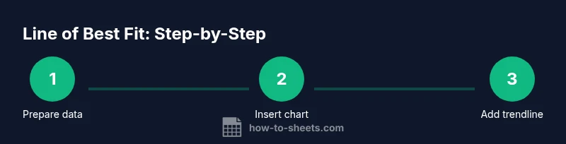
Steps
Estimated time: 20-40 minutes
- 1
Open and prepare your data
Open your Google Sheet and ensure there are two numeric columns for X and Y. Remove non-numeric values and label columns clearly. Verify there are at least several dozen data points for a stable trendline interpretation.
Tip: Keep data in a single contiguous range to simplify chart creation. - 2
Select data and insert a scatter chart
Highlight the two columns (including headers) and choose Insert > Chart. In the Chart editor, switch the Chart type to Scatter chart to visualize the relationship between X and Y.
Tip: If Sheets auto-selects a different chart, manually change the type in the Chart editor. - 3
Add a linear trendline
In the Chart editor under Customize > Series, enable Trendline and select Linear. This displays a straight line that best fits the data points. If needed, adjust the line color for contrast.
Tip: Start with Linear; you can compare with other trendline types later. - 4
Display the equation and R-squared
Check options to Display equation on chart and Display R-squared value. These tools provide quick numeric interpretation of the trendline's slope and fit quality.
Tip: Place the equation away from data points to avoid overlap and keep the chart readable. - 5
Interpret the slope and R-squared
Read the slope to understand the rate of change in Y per unit of X. Use R-squared to gauge how well the line explains variability in Y. Remember, high R-squared is not proof of causation.
Tip: Compare slope and R-squared across related datasets to assess consistency. - 6
Customize for readability
Adjust line thickness, color, and legend labels. Ensure the trendline is visually distinct from data points. Keep axis limits aligned with the data range for accurate interpretation.
Tip: Avoid over-formatting; clarity matters more than style. - 7
Validate with RSQ
Use the RSQ(y_range, x_range) function to compute a numeric R-squared value that you can compare with the chart's R-squared. This cross-check helps confirm the fit quality.
Tip: If RSQ is close to the chart value, results are robust; if not, re-check data alignment. - 8
Assess for outliers
Identify points that deviate markedly from the trend. Decide whether to exclude them based on domain knowledge, then re-check the trendline. Document any exclusions for transparency.
Tip: Use scatter plots with outliers highlighted to evaluate impact visually. - 9
Apply to a dashboard
Export the chart or embed it in a dashboard. Add a short interpretation note and the key numbers (slope, intercept, R-squared) to summarize insights for non-technical audiences.
Tip: Use named ranges so the trendline updates automatically when new data is added. - 10
Extend to multiple series
If you have more than one data series, create separate charts or add multiple trendlines where supported. Compare slopes to see which series has stronger linear relationships.
Tip: Label each trendline clearly to avoid confusion.
FAQ
What is a line of best fit?
A line of best fit, or a trendline, summarizes the relationship between two numeric variables by showing the overall direction and strength of their association. It’s a linear approximation used to gauge how Y changes with X.
A line of best fit is a trendline that shows the overall direction of the data. It helps you estimate how Y changes as X increases.
How do I add a trendline in Google Sheets?
Create a scatter chart from your data, open the Chart editor, and enable Trendline under the Series options. Choose Linear, and optionally display the equation and R-squared for quick interpretation.
Make a scatter chart, enable the trendline, and show the equation and R-squared if you want quick numbers.
How should I interpret R-squared?
R-squared measures the proportion of variance in Y explained by the linear model. Higher values mean a better fit, but correlation does not imply causation and context matters.
R-squared tells you how well the line explains the data. Higher is better, but beware of causation assumptions.
Can I show the equation on the chart?
Yes. In the Chart editor, check the option to Display equation on chart. This reveals the slope and intercept right on the visualization.
Yes—enable the chart option to show the equation directly on the chart.
What if I have multiple data series?
You can add a separate trendline for each series in the same chart, or create individual charts to compare slopes and R-squared values side by side.
You can add multiple trendlines for different series or separate charts for comparison.
What are common pitfalls?
Ignore nonlinearity, outliers, and small samples. Misinterpreting correlation as causation is a frequent mistake; always validate with domain knowledge and additional analyses.
Watch out for nonlinearity, outliers, and assuming causation from correlation.
Watch Video
The Essentials
- Read slope to gauge direction and steepness
- R-squared indicates fit quality, not causation
- Display the equation for quick reference
- Cross-check with RSQ for validation
- Clean data before interpreting results