Google Sheets Chart: Create, Customize & Visualize Data
Learn how to create compelling Google Sheets charts, choose the right types like line, bar, and pie, customize axes and colors, and share visuals that clearly communicate insights for school, work, and personal projects.

To create a chart in Google Sheets, select your data, go to Insert > Chart, and customize the chart type, axes, and colors. This quick guide covers setup, the best chart types for common data patterns, and how to tailor visuals for reports and presentations. Whether you’re tracking sales, grades, or project timelines, charts help you spot trends at a glance.
Why Google Sheets charts matter
Charts transform raw numbers into immediate, actionable visuals. In Google Sheets, charts summarize data patterns, show shifts over time, and highlight contrasts that tables alone can obscure. This makes it easier for teammates, instructors, and managers to understand performance, trends, and outliers at a glance. According to How To Sheets, integrating charts into regular reporting improves communication and decision speed, especially when multiple stakeholders rely on the same data source. For students, charts make homework and projects clearer; for professionals, they shorten review cycles; for small business owners, they aid in quick strategic discussions. When used consistently, charts become a shared language for data.
Choosing the right chart type
Different data patterns call for different visuals. Line charts excel at showing trends over time, bar charts compare categories side by side, and column charts emphasize magnitude differences. Pie charts reveal proportional shares, while area charts illustrate cumulative totals. For data with multiple measures, combo charts mix line and bar series to convey several narratives simultaneously. How To Sheets analysis shows that aligning chart type with the underlying question (trend, comparison, composition) improves comprehension. Always start with the question you want the chart to answer, then pick a type that communicates that answer at a glance.
Preparing data for charts
Good charts start with clean data. Ensure headers are clear, data ranges are contiguous (no gaps between rows/columns), and numeric columns contain numbers rather than text. Remove stray spaces, unify date formats, and consider using named ranges for stability when data changes. Sort data logically to prevent misinterpretation; for example, time-series should be sorted chronologically. If you plan to filter data, create a copy of the source range for charting or use query functions to preserve the original data. Clear headers and well-structured ranges help the chart editor auto-detect labels, series, and axes.
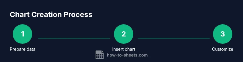
Step-by-step: create a basic chart
- Identify the data range you want to visualize. 2) Select the range including headers. 3) Insert > Chart to open the editor. 4) Choose a chart type that fits your data pattern (e.g., line for trends). 5) Adjust the data range or series as needed. 6) Resize and move the chart on the sheet. Pro tip: keep the chart visible in dashboards by anchoring it to a dedicated sheet tab. The more you reuse a consistent layout, the faster you’ll produce meaningful visuals.
Customizing charts: axes, colors, and labels
Customize chart titles to reflect the message, rename axes for clarity, and adjust gridlines to reduce clutter. Use distinct, color-safe palettes to avoid misinterpretation, especially for color-blind viewers. Add data labels only when they add clarity, not when they clutter the view. Align fonts and sizes with your report’s style guide for consistency. Use the legend position strategically so that it doesn’t obscure data. Simple, well-labeled charts are often more persuasive than complex visuals.
Advanced chart options: combo charts, sparklines, and embeddings
Combo charts blend two chart types (e.g., bars with a line) to show related measures on one axis, ideal for comparing revenue against growth rate. Sparklines provide compact visuals inside cells for quick trend checks. Charts from Sheets can be embedded in Google Docs and Slides, maintaining a live link to the source data so updates propagate automatically. For dashboards, consider using slicers to filter multiple charts simultaneously and create interactive storytelling around the data.
Sharing, exporting, and collaborating on charts
Charts can be shared within Google Sheets with collaborators who have access to the file. You can export charts as PNG or SVG images for reports, or copy charts into documents and slides with links that update when the source data changes. When presenting, enable the chart editor’s
style and axes options to quickly adapt visuals for audiences in meetings or class sessions. Remember to review permissions when sharing sensitive data to protect privacy.
Common pitfalls and how to avoid them
Avoid overloading a single chart with too many data series; this confuses rather than clarifies. Ensure axis scales are appropriate and consistent across charts in a dashboard. Don’t rely on color alone to convey differences—add labels, tooltips, or data-ink ratio considerations for accessibility. If a chart looks unusual, double-check the data range, hidden rows, or filters that might be affecting the visualization. Keeping charts simple, labeled, and aligned with your data story minimizes misinterpretation.
Real-world examples: budgeting, analytics, and timelines
Budget charts often combine actuals vs. budgeted values using a column chart with a line overlay to show variance. In analytics, line and area charts reveal seasonality and growth trajectories. For project timelines, Gantt-like visuals can be approximated by stacked bars showing progress against milestones. By tailoring colors and annotations to your audience—stakeholders, students, or team members—you make charts more actionable and memorable.
Best practices for accessibility and readability
Choose high-contrast colors and large, legible fonts. Add descriptive chart titles and accessible axis labels. When sharing publicly, provide text explanations or data sources to accompany visuals for readers who rely on assistive technologies. Use consistent formatting across a report so readers don’t have to relearn color schemes or legend positions from chart to chart. Accessibility should be considered at the planning stage, not as an afterthought.
Troubleshooting: chart not updating or data range issues
If a chart doesn’t reflect new data, verify that the chart’s data range includes the latest rows and columns. Clear any filters that exclude data from the chart’s range. If you frequently add rows, consider using a dynamic range (e.g., using INDIRECT or a named range with a dynamic end). Check that the correct sheet is referenced and that you’re not viewing a filtered subset. Finally, ensure the chart is not pinned to a previous version of the data in a shared file.
Quick-start checklist for your first chart
- Prepare a clean data table with headers. - Select the data range including headers. - Insert a chart and choose an appropriate type. - Customize titles, axes, and colors for clarity. - Save and share or export as needed. By following this checklist, you’ll produce clear visuals quickly and reliably.
Tools & Materials
- Computer or laptop with internet access(Any modern browser (Chrome/Edge) works well with Google Sheets)
- Google account with Sheets access(Sign in to Google to access Google Sheets and share charts)
- Data set prepared in Google Sheets(Include headers and a clean range for charting)
- Color palette for accessibility(Helpful for consistent visuals; ensure good contrast)
- Mouse or trackpad(Useful for precise selections and adjustments)
Steps
Estimated time: 20-30 minutes
- 1
Prepare data
Review your data, remove blanks in the range, and ensure headers clearly describe each column. This reduces confusion when the chart editor maps series and axes.
Tip: Use a single data table with headers; avoid mixing text and numbers in the same column. - 2
Select range
Highlight the data range you want to visualize, including headers. The range should be contiguous with no empty rows between data points.
Tip: If you expect to add rows, consider a dynamic range or named range to simplify future updates. - 3
Insert chart
Go to Insert > Chart to open the Chart Editor and see a starter chart based on your selection.
Tip: Don’t overthink the initial type—change it later if the pattern isn’t clear. - 4
Choose chart type
In the Chart Editor, switch to a type that matches your data story (line for trends, bar for comparisons, pie for shares).
Tip: When in doubt, test two types side by side to see which communicates best. - 5
Customize visuals
Edit titles, axis labels, legend position, and colors. Keep fonts legible and colors accessible.
Tip: Turn on data labels only if they add clarity; avoid clutter. - 6
Share or export
Share the chart with collaborators or export as PNG/SVG for reports. If using in Docs/Slides, embed with a live link for automatic updates.
Tip: Test the share permissions to ensure teammates can view the chart.
FAQ
What is the best chart type for my data?
The best chart type depends on your data pattern: use line charts for trends over time, bar or column charts for comparisons, and pie charts for proportions. For multiple measures, consider a combo chart.
Line charts show trends, bar charts compare categories, and combo charts mix measures for clarity.
How can I keep charts updated automatically?
Charts in Sheets automatically refresh when the underlying data range is updated. Ensure your data range includes new rows, or use a named/dynamic range to accommodate growth.
Charts will refresh as you update the data; just keep the range inclusive of new rows.
Can I embed Sheets charts in Docs or Slides?
Yes. You can copy or insert charts into Docs or Slides with a live link to the Sheet so updates propagate automatically. This keeps presentations aligned with the source data.
Charts can be embedded and stay linked to your Sheet for automatic updates.
Why isn’t my chart showing all data?
Check the data range, ensure headers are included, and verify there are no hidden rows or filters restricting the range. Re-select the range if needed.
Make sure the range includes all rows you want to show and there are no filters blocking data.
How can I export a chart as an image?
Right-click the chart and choose Save image or Copy chart. You can also export the sheet as a PDF/PNG depending on the platform.
You can save or copy the chart image for use in documents.
Are sparklines or compact visuals supported in Sheets?
Yes, you can use in-cell sparklines for quick trend checks, and you can pair them with full charts for deeper analysis.
Sparklines are available for quick trends inside cells, alongside full charts.
Watch Video
The Essentials
- Define a clean data range before charting.
- Choose the right chart type for your data pattern.
- Label axes clearly and maintain consistent styling.
- Keep charts accessible with good contrast and concise titles.
- Embed or share charts to keep visuals up to date with data.