Histogram in Google Sheets: A Practical Step-by-Step Guide
Learn to create, customize, and interpret histograms in Google Sheets with practical steps, bin tuning, and data preparation for clear distribution visuals.

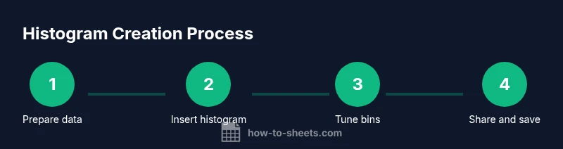
You will learn to create a histogram in Google Sheets by preparing data, inserting the chart, and adjusting bins and axis labels for clarity. You’ll need a numeric data column and optional category labels. The quick guide covers selecting the data range, choosing Histogram in the Chart Editor, and fine-tuning bin sizing.
What is a histogram and why it matters
A histogram is a visual summary of data that shows how often each range of values occurs. It helps you see the shape of the distribution, identify skewness, outliers, and saturation points, and compare groups at a glance. In Google Sheets, histograms are a specific chart type that automatically bins numeric data and draws bars to represent frequencies. This makes it easier to interpret large datasets than a list of numbers. When you master histograms, you can quickly answer questions like: Is this score distribution symmetric, skewed left or right, or bimodal? Are there concentrations around a particular value, and do different cohorts follow similar patterns? Beyond pure counting, histograms are a stepping stone to deeper analyses such as calculating central tendency and dispersion measures. They fit into broader data visualization workflows used by students, analysts, and managers who need to communicate distribution shapes clearly. According to How To Sheets, histograms shine when you need quick comparisons across groups, or when you are building dashboards for reports.
Preparing data for histogram in Google Sheets
Before you create a histogram, clean and organize your data. Ensure the column you plan to chart contains numeric values only, with any text or blanks removed or converted. If you have headers, place them in a header row and exclude them from the range you chart. Use the VALUE function to convert text numbers, and consider trimming spaces to avoid misreads. Create a helper column for validity checks if needed, such as a TRUE/FALSE confirmation next to each row. Sorting data is optional but can help you spot anomalies. Finally, decide whether you will compare multiple groups; if yes, you may need an additional column that labels each data item. With tidy data, the histogram will reflect the true distribution rather than a mislabeled mess.
Creating a histogram in Google Sheets
To create a histogram, first select the numeric data you want to visualize. Then choose Insert > Chart from the Sheets menu. The Chart Editor appears on the right; by default Sheets may propose a column chart. In the Setup tab, change the Chart Type to Histogram. The histogram will bin your data automatically and display a frequency axis. If your data spans multiple groups, you can add a second data series to compare distributions. Don’t worry if the initial bins aren’t perfect—bin counts and sizes can be tuned in the Chart Editor for clarity.
Customizing bins and axis labels
(bin size and count) In the Chart Editor, open the Customize tab and locate the bucket controls. Adjust the bucket size or the number of bins to reveal the distribution more clearly. A too-fine binning can create noise; a too-coarse binning can obscure detail. (labels) Add axis titles to the X axis to indicate what the values represent (for example, Test Scores or Revenue Brackets) and label the Y axis with Frequency. Consider removing gridlines if they distract from the bars, and ensure a readable font size for dashboards.
Interpreting the histogram: reading the distribution
Read a histogram by examining the height of bars, which reflects the frequency of values within each bin. Look for skewness: a longer tail on one side suggests a bias in the data. Identify the center of gravity by locating the tallest bars, and notice whether the distribution is unimodal or multimodal. Compare histograms across groups to spot differences in dispersion, central tendency, or the presence of outliers. Remember that a histogram shows distribution shape, not precise single values, so pair it with summary statistics for a fuller picture.
Common pitfalls and how to avoid them
Avoid mixing text with numbers in the chart range, as non-numeric values distort bin counts. Exclude header rows from the data range or enable the option to treat the first row as header. If histogram options are unavailable, verify that you are using numeric data and update your browser or Sheets version. Don t overdo bin counts; start with 5–15 bins for small datasets and increase gradually for larger ones. Finally, avoid overestimating precision; histograms convey distribution shape, not exact values.
Alternatives and related visualizations
If you need more control, create a frequency distribution with a helper column that buckets data into defined ranges, then chart the counts with a column chart. You can also layer histograms with other charts to compare distributions across categories. For audiences requiring exact percent composition, compute relative frequencies and plot a stacked histogram. Pivot tables can summarize data by bin and category for quick dashboards.
Practical tips for presentation-ready histograms
Use a single neutral bar color and apply a contrasting accent color to highlight the tallest bin. Add concise axis titles, and keep the legend to a minimum if you include multiple series. Align font sizes with your report styling and ensure the chart fits within the allocated space. Export options, such as copying the chart to slides or exporting as PNG, help integrate histograms into presentations and dashboards.
Real-world example: education and business use
In an education setting, a histogram of test scores helps a teacher identify learning gaps and adjust instruction. In a sales context, a histogram of daily revenue reveals peak performance periods and seasonal trends. In manufacturing, histograms expose defect rate distributions, guiding quality control decisions. By combining histograms with average and standard deviation, teams gain a fuller view of performance and consistency.
Quick workflow recap: from data to dashboard
Start with clean numeric data, insert a histogram chart, tune bins, label axes, and test readability. When satisfied, place the chart in dashboards or reports and accompany it with summary statistics like mean, median, and standard deviation. This workflow supports clear data storytelling and faster decision making.
Tools & Materials
- A numeric data column in Google Sheets(One column with numeric values (no text).)
- Data cleaning steps(Remove non-numeric rows or convert text numbers to numeric.)
- Histogram chart in Sheets(Insert > Chart, then set Chart Type to Histogram.)
- Optional bins/bucket guidance(If you want manual control over bin boundaries.)
- Browser and Google account(Ensure access to Google Sheets and the internet.)
Steps
Estimated time: 15-25 minutes
- 1
Select data range
Highlight the numeric data you want to visualize, including a header if you plan to exclude it from the chart. Ensure there are no non-numeric values in the range; if there are, clean or convert them first. If you plan to compare groups, keep a second column with labels to assign each value to a category.
Tip: Include a separate header row and avoid mixing text with numbers in the range. - 2
Insert chart
From the menu, choose Insert and then Chart. The Chart Editor will appear on the right. By default Sheets may propose a column chart, which is not yet a histogram.
Tip: If the histogram option doesn’t appear, switch the chart type in the Chart Editor. - 3
Choose histogram type
In the Setup tab, change the Chart Type to Histogram. The histogram bins your data automatically and updates in real time. If you have multiple groups, consider adding a second data series.
Tip: If histogram is not visible due to data structure, create a helper column with buckets and use a column chart instead. - 4
Adjust bucket size
Open the Customize section in the Chart Editor and adjust Bucket size or Bin count. Start with a moderate number of bins and increase or decrease based on readability.
Tip: Begin with 5–15 bins for small datasets; larger datasets may benefit from 20–30 bins. - 5
Label axes clearly
Add axis titles in the Customize section, labeling the X axis with the data value meaning and the Y axis with Frequency. Keep labels concise and avoid clutter.
Tip: Use consistent units and avoid excessive abbreviations. - 6
Format bars for readability
Choose a readable color scheme and ensure bars are evenly spaced. For dense charts, consider a vertical orientation with a larger chart height.
Tip: A single accent color highlighting the tallest bar improves quick comprehension. - 7
Add data labels
If precise counts help your audience, enable data labels to show frequencies on top of bars. Use them sparingly to avoid clutter.
Tip: Turn off labels for very large datasets to maintain clarity. - 8
Compare groups
For multiple groups, add a second data series or create separate histograms. Use legend and color to differentiate groups clearly.
Tip: Place the chart on a dedicated dashboard panel for easy comparison. - 9
Validate with stats
Compute mean, median, and standard deviation to supplement the histogram. Compare these metrics to the histogram shape for deeper interpretation.
Tip: Remember histograms describe distribution shape, not precise values alone. - 10
Save and share
Save your sheet, share with teammates, or export the chart for reports. Copy the chart to slides or export as PNG or PDF for dashboards.
Tip: Use duplicate charts to experiment with bin changes without altering the original. - 11
Accessibility and review
Check color contrast and readability for all viewers. Consider adding alt text and a short caption explaining the distribution.
Tip: Test the chart on a smaller screen to ensure legibility. - 12
Document assumptions
Record any decisions about bin boundaries, data exclusions, or grouping logic so others can reproduce the histogram.
Tip: Keep a brief note in the sheet or a companion doc.
FAQ
Can I create a histogram in Google Sheets without a separate data column?
Yes. You can chart a numeric column directly and adjust bins in the Chart Editor. If your data includes headers, exclude them from the range.
Yes. You can chart a numeric column directly and adjust bins in the Chart Editor. Exclude headers from the range.
What should I do if my histogram options are missing in Sheets?
Ensure you are using a numeric column and select Histogram in the Chart Editor. If unavailable, update your browser or use a bucketed column with a bar chart.
Make sure you're using numeric data and select Histogram in the Chart Editor. If missing, try updating or use a bucketed column with a bar chart.
How many bins should I use for a typical dataset?
There is no one size fits all. Start with 5 to 15 bins for small datasets and adjust based on data range and readability.
Start with 5 to 15 bins and adjust for readability.
Can I compare two groups in one histogram in Google Sheets?
Yes, you can build separate histograms for each group or use a second data series for a two group comparison with a legend.
Yes, build separate histograms or use two series with a legend.
Which stats should accompany the histogram?
Mean, median, and standard deviation complement a histogram by describing central tendency and dispersion.
Mean, median, and standard deviation complement the histogram.
How can I export histograms in Google Sheets?
Copy the chart and paste into slides or export the sheet as a PDF or PNG. Use File Download for image formats.
Copy the chart to slides or export as PDF or PNG.
Watch Video
The Essentials
- Prepare clean numeric data
- Insert histogram via Chart Editor
- Tune bin count for clarity
- Label axes and legend for readability
- Use histograms to compare distributions