How to Make a Gantt Chart in Google Sheets
Learn how to build a dynamic Gantt chart in Google Sheets using a clean data structure, a date axis, and conditional formatting. This guide covers setup, formulas, visuals, and best practices for students, professionals, and small businesses.

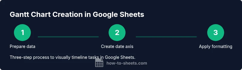
With this guide, you will learn how to make a gantt chart in google sheets by structuring your data, defining a date axis, and applying conditional formatting to visualize timelines. You’ll need Google Sheets, a task list, start and end dates, and a basic formula setup. The steps, tips, and real-world examples in this article will help you build a dynamic timeline quickly.
how to make a gantt chart in google sheets
According to How To Sheets, mastering a gantt chart in google sheets enables clearer project planning for students, professionals, and small business owners. This guide translates a traditional project timeline into a spreadsheet-friendly visualization, leveraging Google Sheets’ built-in tools without expensive add-ons. You will learn the core concepts of tasks, dates, and progress while keeping the structure simple enough to adapt for personal projects, classroom assignments, or client work. By the end, you’ll be able to create a functional Gantt view that updates when you modify start or end dates and automatically reflects changes across the timeline. The approach balances accessibility with practicality, so you can reuse the same template for multiple projects while maintaining a clean data source for reporting.
Data structure basics for Gantt charts
A solid Gantt chart starts with a well-planned data structure. In Google Sheets, define columns for Task Name, Start Date, End Date, and Status (or Percent Complete). Optional columns like Assigned To, Milestone, and Priority help with coordination. The key is to keep dates in proper date format and ensure all rows have a defined start date. For example, End Date should always be on or after the Start Date. A simple duration column (End Date minus Start Date plus one) helps you reason about the length of each task. How To Sheets analysis shows that having a consistent data model reduces errors when you scale the chart to larger projects.
Building the timeline grid
The timeline grid is the horizontal axis that represents calendar days or weeks. Start with a header row containing date units (e.g., Mon 1, Tue 2, 2026-02-01, etc.). Each subsequent row corresponds to a task. The grid cells will later become colored bars, showing when a task runs. A practical approach is to create a date axis that begins at the project start date and ends at the project end date. Use the date values to drive the bar visibility, which makes the grid easy to scan and compare across tasks. This layout also simplifies printing and sharing, as the axis can be adjusted to fit your viewing preferences.
Entering tasks and dates
Start by listing every task in your project with clear, concise names. Enter the Start Date and End Date for each task, and be sure to keep the date format consistent. If a task has not yet started, you can leave the End Date blank or set it to a tentative date. A small tip is to include a milestone flag (Yes/No) to mark critical dates. When you’re done, review the logic: Start Date should precede End Date for every row, and there should be no gaps in the overall timeline that would misrepresent the schedule. This step creates the foundation for the visual timeline that follows.
Calculating durations and dependencies
Durations help you gauge the overall workload and planning needs. A simple duration formula is End Date minus Start Date plus one day. Dependencies, while not native to Sheets, can be modeled by ordering tasks and using conditional formatting to reflect predecessors. If a task depends on another, you can visually indicate this by adjusting the color logic or by adding a separate dependency column and using a lookup to reflect shifts in start dates. Keeping durations sane (e.g., avoid overly long tasks without milestones) improves readability and reduces error risk. How To Sheets emphasizes keeping the dependency logic transparent to collaborators.
Applying conditional formatting for bars
Conditional formatting is the heart of the Gantt visualization in Sheets. Create a rule that turns on when the date in the header column falls between Start Date and End Date for a given task row. Use a custom formula like =AND(D$1>=[$Start], D$1<=[$End]) where [$Start] and [$End] refer to the task’s date boundaries. Apply a color fill to the entire bar region for that row. This approach produces a continuous bar across the date axis and makes progress visually obvious. Test with a few sample rows to confirm the bars align precisely with the dates.
Adding progress indicators and milestones
Progress can be shown by a separate progress column and a second set of formatting rules. For example, you can fill a portion of the bar with a lighter color based on Percent Complete. Milestones can be represented with a small diamond character or a distinct color to stand out from regular task bars. This combination communicates both timing and status at a glance, improving communication with teammates and stakeholders. Keeping milestone indicators consistent across tasks helps maintain visual coherence in your chart.
Using a stacked bar technique to simulate bars
For more advanced visuals, you can implement a stacked bar approach. Use a hidden offset column to create the left margin (the delay before a task starts) and a visible bar column for the duration. This technique enables precise alignment of bars with the date axis and allows you to apply different colors for planned versus actual progress. The offset column’s value is derived from the difference between the project start date and each task’s Start Date. This method yields a clean, scalable chart that remains legible as you add more tasks.
Automating updates with formulas and named ranges
Named ranges help when you want to reuse the same chart template for multiple projects. Define a named range for the task table and for the date axis. Formulas can then pull data from these ranges to refresh the timeline automatically when you insert new rows or adjust dates. This reduces manual editing and minimizes drift between the data and the visualization. Keeping the model modular makes maintenance easier and supports future enhancements like filters or status indicators.
Testing your Gantt chart for accuracy
Validation is critical. Check that each task’s bar aligns with Start and End Dates across the entire date axis. Verify that the duration calculations match the colored bars, and review edge cases such as tasks with identical start and end dates or missing dates. Try updating a date and confirm the visual returns to consistency. Do a quick peer review to catch logical gaps you might miss after staring at the sheet for too long. Regular checks prevent miscommunications in project timelines.
Common mistakes and how to fix them
Common errors include inconsistent date formats, misaligned headers, and broken conditional formatting rules. Keep dates standardized with the ISO-like format (YYYY-MM-DD) whenever possible. Freeze the top row and the first column so you can scroll without losing your context. If bars don’t align, double-check the header date values, formula anchors, and absolute references in your conditional formatting rules. Regularly review dependencies and milestones to avoid misleading visuals that erode trust.
Best practices and next steps
As you finalize your Gantt chart in Google Sheets, consider exporting a printable version and sharing a live link for collaboration. Build a reusable template with a clean data sheet, a fixed header, and a dynamic date axis so urgent updates don’t disrupt the layout. Document the data sources and formulas so teammates can onboard quickly. The goal is to keep the chart easy to understand, adaptable, and reliable as projects evolve over weeks or months. The How To Sheets team recommends focusing on clarity, consistency, and maintainability when you scale up the chart for larger initiatives.
Tools & Materials
- Google account with access to Google Sheets(Needed to create and save the Gantt chart)
- Google Sheets document(Use a clean template or new sheet)
- Task list (CSV or manual input)(Columns: Task, Start Date, End Date, Status, Milestone)
- Date format consistency checker(Ensure all dates use a consistent format like YYYY-MM-DD)
- Named ranges (optional)(Helps to reuse the chart template)
- Color palette for bars(Choose 2-3 colors for progress and milestones)
- Print-friendly settings(Set margins and page orientation for reports)
- Optional add-ons (not required)(If you prefer built-in tools, skip this)
Steps
Estimated time: 60-90 minutes
- 1
Create a clean task list
Enter each task with a concise name. Add Start Date and End Date columns, and include optional fields like Assigned To and Milestone. Freeze the header row for easier navigation as you scroll. This step establishes the backbone of your chart.
Tip: Use a single header row and apply data validation to dates. - 2
Add date columns
Create a horizontal date axis across the top row that covers the project's date range. Use a date for the project start and end, and populate intermediate day or week labels. The axis will drive the visibility of the bars.
Tip: Format dates consistently (YYYY-MM-DD) to prevent parsing errors. - 3
Compute duration
In a duration column, calculate the length of each task as End Date minus Start Date plus one. Validate results to ensure no negative durations exist. Duration helps confirm the overall workload.
Tip: Drag the formula down to fill all rows and maintain consistency. - 4
Create a date axis
Prepare the header row with the dates and ensure each date cell corresponds to a proper date value. This axis will be used by the conditional formatting rules to render the bars.
Tip: Keep a separate helper row for quick date checks if needed. - 5
Apply initial conditional formatting
Set a rule to color a cell if the date in the header falls within a task's Start Date and End Date. Use absolute references for the date header and relative references for the task's date range.
Tip: Test with a few sample tasks to validate alignment. - 6
Fine-tune bar colors
Assign distinct colors for planned vs. actual progress. Use a second set of conditional rules to fill a portion of the bar according to Percent Complete.
Tip: Limit palette to 2-3 colors for readability. - 7
Add a progress bar
Include a Percent Complete column and apply a secondary rule that fills a fraction of the bar based on that value. This provides at-a-glance status across tasks.
Tip: Keep Percent Complete values between 0 and 100. - 8
Mark milestones visually
Use a special symbol or color to differentiate milestones from regular tasks. This helps stakeholders identify critical deadlines.
Tip: Consistency in milestone markers is key for quick scanning. - 9
Make the chart dynamic with named ranges
Name the task table and date axis ranges so formulas and formatting update automatically when rows are added or removed.
Tip: Document the named ranges for future collaborators. - 10
Prepare a print-friendly view
Adjust page layout, orientation, and margins to ensure the Gantt chart prints cleanly. Consider a landscape orientation for wider date axes.
Tip: Preview before printing to catch cut-off bars. - 11
Share and collaborate
Use Google Sheets sharing settings to control who can view or edit. A live link helps teammates stay aligned and update in real time.
Tip: Enable commenting for quick feedback without altering data. - 12
Maintain and update regularly
Schedule periodic reviews to adjust dates, durations, and progress. A well-maintained chart remains a reliable planning tool.
Tip: Set a recurring reminder to review the chart weekly.
FAQ
What is a Gantt chart and why should I use it in Google Sheets?
A Gantt chart is a visual timeline of tasks and milestones across a project. In Google Sheets, you can create one with a data table, a date axis, and conditional formatting to render colored bars. It helps teams see timelines at a glance and track progress.
A Gantt chart shows tasks over time in a visual timeline, built in Google Sheets with a date axis and colored bars.
Can I create dependencies between tasks in Sheets?
Google Sheets doesn’t have built-in dependency tracking like dedicated PM tools, but you can model dependencies with logic in formulas and by ordering tasks. This creates a pseudo-dependency view that updates when dates shift.
You can approximate dependencies with formulas and a fixed task order.
Do I need add-ons to create a Gantt chart?
No. You can build a fully functional Gantt chart using built-in features like a date axis and conditional formatting. Add-ons may offer extra templates or automation, but they’re not required.
Not necessarily—built-in features are enough for a solid Gantt chart.
How do I update the chart when dates shift?
Update the Start Date or End Date cells; the color bars will automatically reflect the new timelines thanks to the conditional formatting rules.
Change the dates in the table; the bars update automatically.
Can I share the Gantt chart with collaborators?
Yes. Use Google Sheets sharing settings to grant view or edit access. Real-time collaboration ensures everyone stays aligned.
Share the sheet with teammates to collaborate in real time.
Is a Google Sheets Gantt chart suitable for large projects?
Google Sheets works well for small to medium projects. For very large programs, consider migrating to a dedicated PM tool or exporting to a printable report.
Great for small to medium projects; consider a PM tool for larger ones.
Watch Video
The Essentials
- Plan data structure before visualization.
- Create a clear date axis and consistent date formats.
- Use conditional formatting to render bars accurately.
- Incorporate progress indicators for clarity.
- Test, iterate, and maintain the chart for long-term usefulness.