How to Make a VS Chart in Google Sheets
Learn how to create a VS chart in Google Sheets to compare two data series side by side. This step-by-step guide covers data layout, chart types, customization, and practical tips for clear, compelling visuals in 2026.

If you're wondering how to make a vs chart in google sheets, this approach uses a clustered bar or column chart to compare two data series side by side. Start with categories in the first column and two data series in adjacent columns, then insert a chart and choose the clustered type. This quick guide covers data setup, chart creation, and essential formatting.
Why a VS Chart Helps
A VS chart (versus chart) is ideal when you want to show two datasets across a shared set of categories. By placing the two series side by side, readers can quickly judge which category favors one series over the other. According to How To Sheets, VS-style comparisons are among the most effective visuals for quick decision-making in spreadsheets. The How To Sheets Team notes that careful data layout and clear labeling dramatically improve comprehension. A well-designed VS chart balances readability and precision, avoiding clutter while preserving the nuance of the data. In practice, a VS chart can support business decisions, student projects, and analytical reporting by making differences immediately obvious. When you’re teaching an audience how to interpret contrasts, a VS chart is a straightforward, instructive choice. The 2026 How To Sheets analysis highlights a preference for simple, intuitive visuals for side-by-side comparisons, reinforcing the approach outlined in this guide.
Data Setup for a VS Chart
To build a clean VS chart, start with a simple layout in Google Sheets. Put the category labels in the first column (A), then place the first data series in the adjacent column (B) and the second series in the next column (C). Ensure the categories line up exactly in both data series so the chart can plot each pair correctly. Keep numeric data as numbers (not text) to prevent formatting glitches. If you anticipate large value differences between the two series, consider normalizing or using a consistent scale to avoid misleading visuals. Label the columns clearly (e.g., Category, Series A, Series B) and freeze the header row for easy reference while you work.
Chart Types and When to Use Them
For side-by-side comparisons, clustered bar and clustered column charts are the most intuitive. A clustered column chart emphasizes vertical category labels, which is helpful when categories have descriptive names. A clustered bar chart (horizontal) can be easier to read when category names are lengthy or when you have many categories. In Google Sheets, you can switch between these two types in the Chart Editor under Setup. If the two series have very different scales, you might explore a secondary axis, but use this sparingly to avoid confusing your audience.
Step-by-Step Overview (High-Level)
This section provides a high-level roadmap without the granular actions so you can understand the flow before the details. Begin with data preparation, then insert a chart, choose a clustered type, and finally refine the axis labels, legend, and colors. The goal is to present two data series in a way that makes comparisons immediate and accurate for any reader, whether a student or a professional. Remember to verify alignment of data rows and ensure the chart remains legible at the intended display size.
Styling for Clarity and Accessibility
Clarity comes from thoughtful styling. Use high-contrast colors for Series A and Series B, then assign descriptive axis titles (e.g., Category, Value A, Value B). Place the legend in a consistent position, and consider data labels for key values only to avoid clutter. Use bold fonts for axis titles and ensure font size is readable on screens and projectors. If presenting to a multilingual audience, keep labels short and avoid abbreviations. Accessibility is enhanced by ensuring color choices meet contrast guidelines and that the chart is translatable to screen readers.
Common Pitfalls and Troubleshooting
Common issues include misaligned data rows, mismatched category names between columns, and accidentally treating numbers as text. If the chart disappears or shows errors, re-check the data range and ensure there are no blank rows within the series. When labels become crowded, switch to a vertical layout or abbreviate category names. Avoid stacking data labels densely; instead, use axis titles and a clean legend to convey meaning.
Real-World Example: Sales vs Budget
Imagine a quarterly snapshot where Category = Product Line, Series A = Actual Sales, and Series B = Budget. A VS chart lets you visually compare actual performance against the budget for each product line. If actuals exceed budget in several categories, the clustered chart will show the deviations side by side, making it easy to spot areas that met or underperformed against expectations. This practical setup works well in classrooms, small teams, or client reports where quick interpretation matters.
Accessibility and Exporting
To maximize accessibility, add axis titles and a legend, ensure contrast ratios meet readability standards, and avoid relying solely on color to distinguish series. Google Sheets charts can be exported as PNG, SVG, or copied into Docs or Slides; consider embedding the chart in reports or presentations to maintain context. If you share the Sheet, ensure that viewers can interact with the chart when possible, or provide a brief caption describing what viewers should notice.
Tools & Materials
- Google Sheets account(Use a Google account with access to Google Sheets.)
- Data table (categories + two series)(Categories in column A, Series 1 in column B, Series 2 in column C; keep order consistent.)
- Insert > Chart feature(Open Chart Editor and select the clustered chart type.)
- Color palette (optional)(Choose high-contrast colors for readability.)
- Axis and legend labels (optional)(Add descriptive titles for clarity.)
- Caption or export tool (optional)(Helpful if you plan to share or embed the chart.)
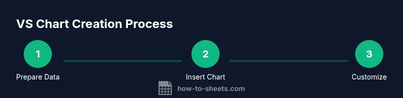
Steps
Estimated time: 15-25 minutes
- 1
Prepare Your Data
Arrange categories in column A and place two data series in columns B and C. Ensure all rows align correctly so each category has a paired value in both series.
Tip: Check for stray blanks that could skew the chart. - 2
Insert the Chart
Select the data range and choose Insert > Chart to open the Chart Editor. Google Sheets will suggest a chart type based on your data.
Tip: If the default isn't clustered, switch the Chart Type to Clustered column or bar. - 3
Choose the VS Chart Type
In the Setup tab, select Clustered column chart (or clustered bar chart) to show side-by-side comparisons.
Tip: Verify that both series are displayed for every category. - 4
Refine Axes and Labels
Add axis titles (e.g., Category, Value A, Value B) and customize the legend for quick identification of Series A vs Series B.
Tip: Keep labels concise and the font legible. - 5
Fine-Tune Colors and Data Labels
Choose distinct colors for each series and enable data labels only for the most important values to prevent clutter.
Tip: Use data labels sparingly to highlight key points. - 6
Review and Share
Double-check data alignment and readability. Copy, export, or embed the chart as needed for reports or slides.
Tip: Test the chart on different screen sizes to ensure legibility.
FAQ
What is a VS chart in Google Sheets?
A VS chart compares two data series across the same categories, typically using a clustered bar or column chart for side-by-side visuals.
A VS chart shows two series side by side for easy comparison.
Which chart type is best for VS comparisons?
For most cases, a clustered column or clustered bar chart works best to show two series side by side across categories.
Clustered column or bar charts are ideal for VS comparisons.
How should I prepare data for a VS chart?
List categories in one column and place the two data series in adjacent columns with matching category order. Ensure values are numeric.
Organize categories in one column and two series in the next columns.
How do I customize colors and labels?
In the chart editor, adjust series colors, add axis titles, and enable data labels as appropriate for readability.
Adjust colors and add axis titles in the chart editor.
What are common mistakes to avoid?
Mismatched data ranges, missing category alignment, and overloading with labels can confuse readers. Keep it simple and accurate.
Watch for misaligned data and cluttered labels.
Can I auto-update the chart as data changes?
Yes. Google Sheets charts update automatically when the underlying data changes, so you don’t need to recreate the chart.
Yes, charts update automatically with data changes.
Can I export the chart to other apps?
Charts can be copied into Docs or Slides, or exported as image files for embedding in reports.
You can export or paste the chart into other apps.
Watch Video
The Essentials
- Organize data clearly in columns
- Use clustered charts for VS comparisons
- Label axes and legends for clarity
- Review data alignment before charting