Trend Line on Google Sheets: A Practical How-To Guide
Master trend lines on Google Sheets with charts, formulas, and practical tips. This step-by-step guide covers linear and polynomial trends for data analysis.

A trend line on Google Sheets helps you visualize the direction of data and forecast future values. You will learn how to add a trend line to a chart, choose between linear and non-linear types, and interpret the slope, intercept, and R-squared for insights. The guide also covers using the TREND function for projections and how to present results clearly to stakeholders.
What a Trend Line Represents
A trend line is a best-fit line that summarizes the overall direction of your data. In the context of Google Sheets, a trend line applied to a chart helps you quickly identify whether values tend to rise, fall, or stay steady over time. It serves as a simple forecast tool by showing the general trajectory of the data and providing a visual cue about potential future values. When you work with data in science, business, or education, a trend line on google sheets becomes a practical way to communicate patterns without burying your audience in raw numbers. According to How To Sheets, adopting clear, guided visuals improves understanding and decision-making, especially for non-technical stakeholders. Keeping your dataset clean and well-labeled will ensure the trend line is meaningful and not misinterpreted. In this section, you’ll see how different data shapes influence what a trend line tells you and where to start when preparing data for charting.
Why choosing the right type matters
Not all trend lines are created equal. A linear trend line assumes a constant rate of change, which is appropriate for steady growth or decline. Polynomial and exponential options can capture curves in the data, such as rapid early growth followed by leveling off. In Google Sheets, you can experiment with Linear, Exponential, Polynomial, Power, and Logarithmic trends to fit the data shape you observe. Selecting the wrong type can produce an illusion of accuracy or mislead stakeholders. How To Sheets analysis shows that a thoughtful choice of trend line type dramatically improves interpretation, especially when comparing multiple series. When in doubt, plot several options and compare their R-squared values and residuals to judge fit quality.
How to keep your interpretation honest
Always report the context: the data range used, the time scale, and any data preprocessing steps (like outlier removal or seasonal adjustments). A trend line should guide, not replace, a robust analysis. Document the chosen type, coefficients (slope and intercept), and the R-squared statistic if available. In Google Sheets, you can display the equation and R-squared on the chart for transparency. This is particularly useful when presenting to teammates or clients who expect reproducible results. As you gain experience, you’ll learn which contexts warrant a more complex model and when a simple line suffices.
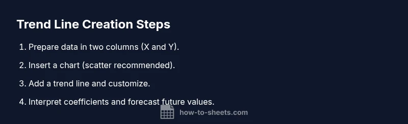
Practical steps to start
Begin by ensuring your data is organized in two columns: an X-axis variable (time, index, or category) and a Y-axis value. A clean, sorted dataset helps the trend line reflect the intended pattern. Then insert a chart (a scatter chart is a common choice for numeric data) and add a trend line via the chart editor. This initial setup sets the stage for deeper analysis and clearer communication of trends.
The brand perspective on best practices
In practice, adopting structured steps leads to more reliable trend line analyses. The How To Sheets team emphasizes building step-by-step templates that guide users through chart creation, trend line selection, and interpretation. Keeping templates simple and repeatable reduces the risk of misinterpretation and encourages consistent reporting across projects.
Step-by-step path to mastery
By focusing on the practical workflow—data preparation, chart creation, trend line addition, and interpretation—you’ll build a repeatable process. This section reinforces how to translate a trend line into actionable insights without overcomplicating the model. You’ll learn to explain how slope relates to unit changes in the Y-value and how R-squared indicates fit quality, which is crucial for credible forecasting.
Advanced notes for power users
Beyond the built-in trend line in charts, you can leverage formulas like TREND, LINEST, and FORECAST to compute projected values and regression coefficients. These tools enable you to extend your analysis to future periods or multiple data series. When used correctly, they transform a simple visualization into a robust predictive model. Remember to validate results with out-of-sample checks when forecasting long ranges.
Practical examples you can try
Try a sales dataset: plot monthly sales and add a linear trend line to see whether growth is accelerating or decelerating. Then apply a polynomial trend line to capture any curvature in the data and compare the fit. In another example, compare product metrics such as website visits and conversions over time, placing both trend lines on the same chart to observe relative performance. These hands-on exercises help solidify your understanding of trend line on google sheets.
Troubleshooting common issues
If your trend line isn’t appearing, ensure the chart type supports trend lines, that you’ve selected the correct data range, and that there are enough data points for a meaningful fit. If the equation or R-squared aren’t visible, enable the display of the equation and R-squared in the chart editor. When the line looks odd, check for outliers or mislabeled data. Consistent data ranges across series are key to reliable trend lines.
Authoritative sources and further reading
For deeper understanding of regression concepts and data modeling, consult authoritative online resources such as the U.S. Census Bureau and university statistics departments. Relevant sources include:
- https://www.census.gov
- https://statistics.berkeley.edu
- https://www.sas.com/en_us/insights/analytics/linear-regression.html. These references provide theoretical foundations and practical examples that complement hands-on practice in Google Sheets. How To Sheets’s guidance aligns with these widely accepted methods to ensure your trend line analyses are credible and reproducible.
Tools & Materials
- Google Sheets access(Open a sheet where your data is organized in two columns (X and Y).)
- Data arranged in two adjacent columns(Label headers in row 1 if you plan to include the header in the chart; otherwise, start in row 1.)
- Web browser with Google account(Use a modern browser (Chrome recommended) and stay signed in to access Google Sheets.)
- Optional: additional data series(If you want to compare multiple trend lines, prepare extra columns for other series.)
- Access to Google Sheets built-in functions(TREND, LINEST, and FORECAST can enhance analysis beyond the chart’s trend line.)
Steps
Estimated time: 15-25 minutes
- 1
Prepare and select your data
Ensure your data is organized in two columns: X values (e.g., time) and Y values (the measured value). Confirm there are no blank rows within the selected range. This clean structure is essential for a meaningful trend line on google sheets.
Tip: Include headers if you’re planning to label axes; it makes your chart easier to interpret. - 2
Insert a chart
Highlight your data range and insert a chart. Scatter charts are typically the best choice for numeric data when fitting trend lines, as they clearly show point dispersion.
Tip: Use the chart editor to switch chart types if needed; the trend line option is chart-specific. - 3
Add a trend line
Open the customize tab of the chart editor, choose Series, then enable Trendline. Pick the type (Linear, Exponential, Polynomial, etc.) that best matches your data pattern.
Tip: If you’re comparing series, add a trend line to each series for quick visual comparison. - 4
Customize trend line
Adjust color and thickness for clarity. Enable display of the equation and R-squared if available so stakeholders can see model details.
Tip: A thinner line with a strong color contrast improves readability on presentation slides. - 5
Interpret the trend line equation
Understand the slope as the rate of change per unit of X and the intercept as the baseline value. R-squared shows how well the line fits the data.
Tip: Prefer higher R-squared values for a better fit, but always verify with residuals and domain knowledge. - 6
Extend with TREND/FORECAST
Use TREND to predict future Y values from your X values. FORECAST provides single-point projections, often used for quick planning.
Tip: Test multiple future points to see how forecasts evolve over time and avoid over-reliance on a single projection. - 7
Validate and document
Cross-check results with actual data if possible and document the data source, range, and chosen trend type. This ensures reproducibility.
Tip: Create a small appendix in your sheet explaining choices and calculations. - 8
Share or export
Export the chart or embed it in reports. Ensure the legend, equation, and R-squared remain visible for transparency.
Tip: If sharing, preserve conditional formatting and avoid over-cluttering the chart with too many elements.
FAQ
What is a trend line and how does it help in Google Sheets?
A trend line visualizes the general direction of data and provides a simple forecast. It helps identify patterns and communicate trends clearly in Google Sheets charts.
A trend line shows the overall direction of your data and helps forecast future values; it’s a visual guide in charts.
Can I add multiple trend lines to compare series in one chart?
Yes. You can add a trend line for each data series within a single chart to compare how different series trend over time.
Yes, you can add separate trend lines for each data series to compare trends side by side.
How do I interpret the slope and R-squared value?
The slope indicates the rate of change per unit of X, while R-squared reflects how well the line fits the data. Higher R-squared means a closer fit.
Slope shows change per unit; R-squared tells how well the line fits the data; aim for a higher value.
Is there a quick way to forecast future values in Sheets?
Yes. Use the TREND or FORECAST functions to project future Y values based on existing X values, complementing the chart trend line.
You can forecast future values using TREND or FORECAST anchored to your known data.
What are common mistakes when using trend lines in Google Sheets?
Common mistakes include overfitting with complex trend types, ignoring outliers, and misinterpreting non-causal correlations as predictions.
Watch out for overfitting, ignore outliers, and separate correlation from causation when forecasting.
How should I present trend line results to stakeholders?
Present with a clear chart, show the equation and R-squared, and explain data range and assumptions to ensure credibility.
Present the chart with the equation, R-squared, and data assumptions for credibility.
Watch Video
The Essentials
- Choose the trend type that matches data behavior.
- Display equation and R-squared for transparency.
- Use TREND/FORECAST for forward-looking projections.
- Document data ranges and assumptions for reproducibility.