Where is Google Sheets Timeline: A Practical Guide
Learn where to locate or build a timeline in Google Sheets. This educational guide covers data setup, chart options, and step-by-step techniques to visualize events over time using Sheets.

Google Sheets does not include a dedicated Timeline feature. To create a timeline, prepare date-based data and visualize it with charts such as a bar, stacked bar (for durations), or line chart. This quick guide outlines how to structure data, pick a chart type, and customize the axes to display events chronologically.
Understanding the timeline concept in Google Sheets
A timeline in Google Sheets is a visual story of events along a chronological axis. While Sheets does not expose a single built-in “Timeline” button, you can still build a clear, scroll-friendly timeline by combining date-data with charts. The goal is to map each event to a date (or a date range) and then render those points as bars, lines, or markers on a timeline axis. This approach lets students, professionals, and small business owners communicate schedules, project milestones, or historical events directly in Sheets. According to How To Sheets, the core idea is to treat dates as the primary axis and use chart types that expose horizontal time progression clearly, even when the app doesn’t offer a dedicated timeline tool.
Is there a built-in Timeline feature in Google Sheets?
No, Google Sheets does not offer a standalone Timeline feature like some specialized project management tools. However, you can replicate a timeline by using data tables paired with chart visualizations. The chart acts as the timeline visualization, while the data table ensures you can filter, sort, and update events efficiently. This separation of data and chart gives you flexibility to tailor the visualization to your needs, without relying on an external add-on.
Data you need to prepare for a timeline
A clean timeline starts with well-structured data. Create at least three core columns: Date (or Start Date), Event (description), and Duration or End Date (optional). If you want to show event length, add a Duration column or a separate End Date column. Additional columns like Category or Priority help with color-coding and filtering in charts. Ensure dates are recognized as actual date values (not text) and format them consistently (e.g., YYYY-MM-DD) so Google Sheets can sort and scale the axis correctly.
Build your first timeline chart: a practical workflow
Start by selecting your date and event columns, then insert a chart (Insert > Chart). For a basic timeline, a stacked bar or a line chart with time on the horizontal axis works well. If you include a Duration column, use a stacked bar to visualize both start position and duration. Configure the horizontal axis to reflect dates in ascending order, and customize the series colors to emphasize different event types. This section provides a practical workflow you can replicate on any new sheet, and it can be saved as a reusable template.
Chart types for timeline visualization: choosing the best fit
- Bar/Stacked bar: Great for showing duration alongside start dates, especially in Gantt-like views.
- Line chart: Useful when events are discrete and you want a smooth, continuous time progression.
- Scatter chart: Best for irregular intervals or when you have multiple categories that you want to compare visually.
Each option has strengths depending on your data layout. The choice hinges on whether you need duration, overlapping events, or category-based coloring.
Templates and reusable patterns for timelines in Sheets
Create a reusable timeline template by fixing the data columns (Date, Event, Duration, Category) and a chart area that reads from those cells. Save the sheet as a template to share with teammates or students. You can add named ranges for data, which makes it easier to update charts automatically when you add new events. Consider embedding drop-downs for Category to keep visuals consistent across multiple timelines.
Common mistakes and how to fix them
- Incorrect date formats: Sheets may treat dates as text, breaking sorting and scaling. Fix by applying Date format (Format > Number > Date) and using DATEVALUE when necessary.
- Overlapping events without clear separation: Increase axis padding or use a different chart type (e.g., Gantt-style stacked bars) to reduce visual overlap.
- Inconsistent data ranges: Use named ranges or dynamic formulas (e.g., OFFSET) so charts update as you add data.
- Ignoring accessibility: Use high-contrast colors and clear labels to ensure the timeline is readable in presentations or reports.
Authority sources and further learning
For a deeper dive into charting in Google Sheets and best practices for timelines, consult official resources and recognized publications. This article consolidates methods suitable for students, professionals, and small business owners. How To Sheets provides practical, step-by-step guidance to help you master Google Sheets timelines and reusable templates.
Quick-start checklist and next steps
- Verify data is date-formatted and consistent across all rows.
- Choose a chart type that matches your timeline goals (duration, categories, frequency).
- Customize axis: set date scale, min/max dates, and label density for readability.
- Save a template: reuse structure for future projects without rebuilding from scratch.
- Explore color-coding and filters to enhance usability for different audiences.
Tools & Materials
- Google account with Google Sheets access(Sign in to your Google Drive to create or edit a sheet)
- Dataset containing at least Date and Event columns(Dates must be real date values; events should be concise descriptions)
- Optional: Duration or End Date column(Used to visualize event length in a Gantt-like timeline)
- Color-coding scheme or category list(Helps readability when multiple event types are present)
- Template sheet or sample data(Starting point for faster timeline creation)
Steps
Estimated time: 30-45 minutes
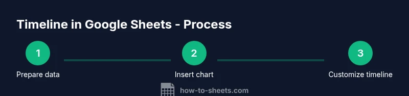
- 1
Prepare your data
Create a sheet with at least three columns: Date, Event, and Duration (optional). Ensure the Date column contains real date values and sort the rows by date ascending. This creates a clean foundation for the timeline visualization.
Tip: Use data validation for the Date column to prevent invalid dates. - 2
Insert a chart
Highlight your data and choose Insert > Chart. Google Sheets will propose a chart type; you can change it later if needed. The chart will be the visual timeline, so select a type that best represents the data (bar, line, or scatter).
Tip: Start with a bar or line chart to keep the layout straightforward. - 3
Configure the axis
In the Chart editor, set the Horizontal axis to use your Date column. Ensure the axis is scaled chronologically and that the events align with their dates. This ensures a true timeline progression.
Tip: If the axis looks cramped, adjust the min/max date or reduce the label density. - 4
Incorporate duration for length
If you have a Duration column, switch to a stacked bar chart or add a helper series to represent length. This makes the visual show not just when events happen, but how long they last.
Tip: Add a second series for duration, and set a distinct color for clarity. - 5
Customize colors and labels
Apply a color scheme that distinguishes categories or priority, and label each event clearly. Consider adding data labels to the bars or points to improve readability in presentations.
Tip: Keep color contrast high and avoid color pairings that are hard to distinguish in grayscale. - 6
Save and reuse as a template
Once your timeline looks right, save the sheet as a template or copy it to another project. Use named ranges so future timelines update the chart automatically when you add data.
Tip: Document the data structure in a hidden sheet so collaborators understand the layout.
FAQ
Is there a built-in Timeline feature in Google Sheets?
No dedicated Timeline feature exists in Google Sheets. Timelines must be built manually using chart visualizations, with data organized by date and event. This approach provides flexibility for different data sets.
There isn’t a built-in timeline feature in Sheets; you create one with charts based on your date data.
What data do I need to create a timeline?
You need at least a Date column and an Event column. A Duration or End Date column helps visualize length. Optional Category or Priority columns improve filtering and color-coding.
You need dates and events, with optional duration and category fields for better visuals.
Which chart type works best for timelines?
Bar charts (including stacked bars) are great for Gantt-style timelines showing duration, while line or scatter charts work well for discrete events over time. Choose based on your data layout.
Bar charts work well for durations; line charts for discrete events over time.
Can I automate timeline updates with formulas?
Yes. Use formulas to pull in dates, sort data automatically, and create dynamic named ranges. This keeps the chart updated as you add or modify events.
Yes, with formulas and named ranges you can keep timelines updated automatically.
Are there ready-made timeline templates for Google Sheets?
There are templates and example sheets you can adapt. Start with a simple dataset and a basic chart, then expand with duration, categories, and color coding.
Yes, you can start from templates and customize from there.
Watch Video
The Essentials
- Choose a chart that matches your data (bar, line, or scatter).
- Structure dates, events, and durations for clear timelines.
- Format dates correctly and use consistent labeling for readability.
- Save as a reusable template for future timelines.