How to add trendline in Google Sheets: A Practical Guide
Learn how to add a trendline in Google Sheets to visualize data trends, choose the best type, display the equation, and interpret R-squared for forecasting. A step-by-step guide with tips and real-world examples.

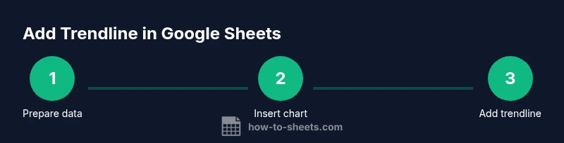
How to add a trendline in google sheets? Follow these steps to visualize data trends on your chart and gain quick insights. According to How To Sheets, start with a clean data range, insert a chart, add a linear or polynomial trendline, and customize its color and label for clarity. Step 1: Prepare data. Step 2: Insert chart. Step 3: Add trendline. Step 4: Customize. Step 5: Interpret.
What is a trendline and why it matters in Google Sheets
A trendline is a straight or curved line that represents the general direction of your data on a chart. In Google Sheets, trendlines help you identify patterns, forecast future values, and quantify relationships between variables. When you add a trendline, you can choose between several types (linear, polynomial, exponential) depending on how well the line fits your data. For anyone learning how to add trendline in google sheets, the key is to pair the line with a clear chart that displays your data points so the trendline’s slope and fit are easy to interpret. This makes it easier to communicate insights in reports, dashboards, or class projects.
In practice, a trendline complements your data visualization by providing a concise summary of the overall trend, rather than requiring readers to eyeball every data point. By the end of this guide, you’ll be able to decide which trendline best fits your data, enable the display of the equation, and interpret the R-squared value for fit quality.
Prerequisites: data quality and chart readiness
Before you add a trendline, make sure your data is clean and well-structured. Each data series should be numeric where it matters, with no stray text values that could break the chart. Organize your data into a simple two-column range: an independent variable (x) and a dependent variable (y). If you’re analyzing time-based data, a date or time column can serve as the x-values. Ensure there are enough data points; trendlines perform best with multiple observations (a common rule of thumb is at least 10 points). Finally, choose a chart type that supports trendlines—Scatter charts are usually the most straightforward when the relationship is not strictly linear.
Step-by-step overview: what you’ll do
This section outlines the high-level process so you know what to expect before diving into the step-by-step instructions. First, select your data range in Google Sheets and decide which column represents the x-values and which represents the y-values. Next, insert a chart that can display data points clearly, typically a Scatter plot for non-linear relationships or a Line chart for straightforward trends. Then, open the Chart Editor, add a trendline from the Series options, and choose the trendline type that best fits your data (linear, polynomial, exponential, or logarithmic). Finally, customize the trendline’s appearance and decide whether to display the equation and R-squared on the chart to facilitate interpretation.
How to pick the right trendline type: linear, polynomial, or exponential
Choosing the correct trendline type depends on the underlying pattern of your data. A linear trendline is appropriate when the data roughly follows a straight line, indicating a constant rate of change. Polynomial trendlines can capture curves and inflection points, which helps when the data accelerates or decelerates over time. Exponential trendlines model rapid growth or decay, useful for datasets that grow multiplicatively. If you’re unsure, start with linear, then try polynomial with increasing degree to see if the fit improves. Compare the R-squared values and visually inspect how well the line follows the data points.
Customization: labeling, color, and display of the equation
After adding a trendline, customize its style so it’s easy to understand in your charts and dashboards. Adjust color, thickness, and dash pattern to differentiate multiple series. Consider turning on the trendline’s label to display the equation and, optionally, the R-squared value, which helps communicate how well the line fits the data. Position the label in a non-obtrusive corner of the chart and ensure it remains legible against the chart background. These tweaks improve readability in reports and presentations.
Common pitfalls and how to avoid them
One common pitfall is using trendlines with insufficient data points, which can produce misleading results. Always verify that the data range used for the chart contains only numeric values and that blanks or zeros aren’t skewing the line. Another mistake is selecting a chart type that doesn’t support trendlines or misinterpreting the slope as causation rather than correlation. Finally, avoid overfitting by choosing overly complex trendlines for small datasets; simplicity often yields more reliable forecasts.
Practical example and real-world use cases
Consider a small business tracking monthly sales over a year. With data in two columns—Month (as x) and Sales (as y)—you can create a Scatter chart, add a linear trendline, and display the equation to estimate future sales. If you see a curved pattern, switch to a polynomial trendline with degree 2 or 3 to capture acceleration or plateau effects. In educational settings, trendlines help illustrate relationships between variables, such as study hours versus test scores, reinforcing the concept of correlation vs causation. This practical walkthrough aligns with how to add trendline in google sheets and demonstrates how small changes in the data range can affect the trendline.
Advanced options and caveats
Advanced users may explore polynomial trendlines with higher degrees to model complex patterns, but beware of overfitting. Use polynomial degrees sparingly and compare multiple fits using R-squared values. When forecasting, remember that a trendline extrapolates based on historical data and assumes future behavior follows the same pattern. Always contextualize trends within domain knowledge and consider confidence intervals if available in the chart editor. In Google Sheets, some options appear only after selecting a compatible chart type, so if you don’t see a Trendline section, switch to a recommended chart type like Scatter or Line.
Tools & Materials
- Google account with Sheets access(Open Google Sheets in a modern browser)
- Data range ready for x and y values(Two numeric columns with headers preferred)
- Scatter or line chart option(Chart type that supports trendlines)
- Optional: notebook or notes app(For jotting observations or notes)
Steps
Estimated time: 12-20 minutes
- 1
Prepare data range
Identify your x-values (e.g., time or sequence) and y-values (the metric you want to analyze). Ensure all cells in these columns are numeric and remove blanks that could disrupt the chart. A clean range makes the trendline more reliable.
Tip: Include headers if you plan to reference them later in the chart editor. - 2
Insert the chart
Select the data range, then go to Insert > Chart and choose a Scatter or Line chart. This step lays the foundation for adding a trendline and visualizing the relationship between variables.
Tip: Scatter charts are often the best starting point for non-linear patterns. - 3
Open the Chart Editor
Click the chart to activate the Chart Editor. Navigate to the Series section to enable Trendline, selecting the type that fits your data (linear, polynomial, etc.).
Tip: If Trendline isn’t visible, switch the chart type to a Scatter or Line chart. - 4
Add the trendline
Turn on Trendline for the target series and pick the desired type. You can also display the equation and R-squared on the chart for quick interpretation.
Tip: Start with linear to assess basic direction before trying more complex types. - 5
Customize appearance
Adjust color, width, and style of the trendline to ensure it’s clearly visible. Label the equation and R-squared if helpful for your audience.
Tip: Choose contrasting colors and place labels where they won’t obscure data points. - 6
Interpret and apply
Use the slope to understand rate of change and the R-squared value to gauge fit quality. Apply the trendline to forecast and justify decisions with data.
Tip: Remember that extrapolation assumes historical patterns continue.
FAQ
What data should be used for a trendline in Google Sheets?
Use numeric x- and y-values with enough data points and ensure there are no blanks or non-numeric entries in the series.
Use numeric data with enough points, and avoid blanks.
Which chart types support trendlines in Sheets?
Scatter plots and line charts support built-in trendlines in Google Sheets.
Trendlines work with scatter or line charts.
Can I show the trendline equation on the chart?
Yes. In the chart editor, enable the option to display the equation and R-squared on the chart.
You can show the equation on the chart.
Why isn’t the trendline appearing after adding it?
Ensure you selected a compatible chart type and that the data range contains only numeric values.
Make sure the chart type supports trendlines and the data is numeric.
What’s the difference between linear and polynomial trendlines?
Linear assumes a straight-line relationship; polynomial captures curved patterns with higher-order terms.
Linear is straight-line; polynomial fits curves.
Watch Video
The Essentials
- Prepare your data accurately before charting.
- Choose a chart type that supports trendlines.
- Select a trendline type that matches data behavior.
- Interpret the trendline equation and R-squared for forecasting.
- The How To Sheets team emphasizes clarity and proper context when using trendlines.