How to Create a Scatter Plot in Google Sheets: A Step-by-Step Guide
Learn how to create a scatter plot in Google Sheets with a practical, step-by-step workflow. Prepare data, insert a chart, customize axes, add trendlines, and interpret patterns effectively.

Goal: By following this guide, you will create a scatter plot in Google Sheets that reveals relationships between two numeric variables. You will prepare clean data, insert a Scatter chart, customize axes, legends, and colors, and optionally add a trendline to quantify correlation. This approach works for students, professionals, and small teams seeking clear data visualization.
Why a scatter plot matters for Google Sheets users
A scatter plot is one of the simplest and most powerful ways to visualize the relationship between two numeric variables. If you're learning how to make a scatter plot in google sheets, you can quickly move from raw numbers to a visual story that reveals patterns, clusters, and potential outliers. In business, students, and professionals, scatter plots help confirm hypotheses, spot anomalies, and guide decision-making. This guide walks you through a practical workflow using only Google Sheets, so you can create meaningful visuals without expensive software. According to How To Sheets, mastering scatter plots in Google Sheets is a practical skill for data visualization. By the end, you'll have a ready-to-share chart that clearly communicates correlation direction and strength. You will also learn to customize labels, axes, and colors to match your report style. The goal is to produce a plot that is not only accurate but also easy for teammates and stakeholders to understand at a glance. A well-crafted scatter plot can turn a stack of numbers into actionable insights. Throughout, the focus is on practical steps you can apply to real datasets, from sales figures to lab measurements and survey results.
Preparing your data for a scatter plot
Preparing data for a scatter plot starts long before you reach the Insert Chart command. Start with two numeric columns that represent the variables you want to compare. Ensure there are no non-numeric values in either column, and remove or impute any missing data points. Add a clear header row with labels like X and Y (or your chosen variable names) so Google Sheets can reference the axes accurately. When you format the data, keep every row aligned so the X value in row i corresponds to the Y value in row i. If you have more columns, hide or remove them from the plotting range to avoid accidental inclusion. As How To Sheets notes, clean data foundation is essential for reliable visualization. This step also helps you reuse the dataset for future charts, saving time in repeated analyses.
Data layout and chart readiness
The next phase is deciding how you want to layout the data for plotting. The most common pattern is two adjacent numeric columns: Column A for X (independent variable) and Column B for Y (dependent variable). Headers should be included because they simplify axis labeling and series identification. Before plotting, verify that every row has corresponding X and Y values. If you’re working with dates or categories, consider converting them to a numeric scale or using separate charts for different subgroups. Consistency in data length across the two columns is crucial; a mismatch can lead to errors or misinterpretation. When ready, you’ll transition from data preparation to chart creation, using Google Sheets’ charting tools to visualize the relationship you’re studying.
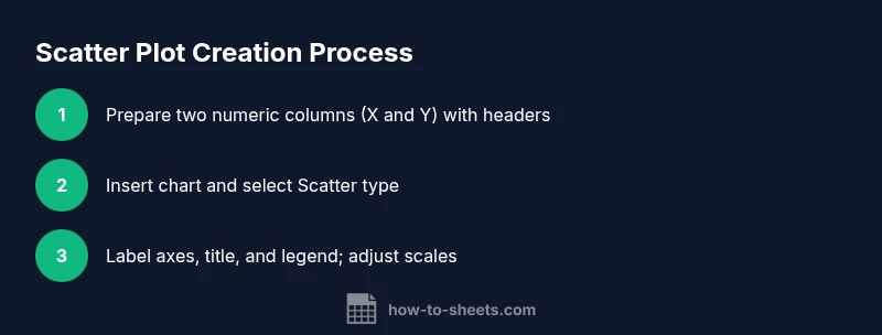
Inserting the chart and choosing Scatter type
With clean data, you can insert the chart that will become your scatter plot. First, select the data range you want to visualize, including headers. Then, go to the menu and choose Insert > Chart. Google Sheets will automatically propose a chart type, but you should switch to a Scatter chart for two-variable relationships. The Chart Editor on the right-hand side provides Setup and Customize tabs so you can lock in X and Y ranges, adjust series, and provide a descriptive chart title. If the automatic suggestion isn’t a Scatter chart, simply click the chart type dropdown and select Scatter. This step is the bridge from data to insight, turning raw numbers into a visual story you can inspect at a glance.
Customizing axes, titles, colors, and legends
A clear, well-labeled chart improves comprehension dramatically. In the Chart Editor’s Customize tab, adjust the horizontal (X) and vertical (Y) axis titles to reflect the variables you’re comparing, and enable axis labels and a chart subtitle if needed. Choose a color palette that contrasts points from the background and maintain consistent marker sizes for readability. If your data includes subgroups, consider using color or shape to differentiate series, and add a legend that makes those distinctions obvious. For accessibility, ensure sufficient contrast and readable font sizes across the entire chart. These formatting refinements help your audience quickly grasp the underlying pattern without squinting at tiny text.
Advanced options: trendlines, multiple series, and annotations
To quantify relationships, add a trendline to your scatter plot. In the Chart Editor, open the Series section and enable Trendline to display a line representing the overall correlation. If you’re plotting multiple datasets in one chart, assign each dataset to a separate series and use distinct colors. Annotations can highlight specific data points, such as outliers or notable clusters, to guide interpretation. When you add a trendline, keep in mind that the R-squared value may not be shown by default in Google Sheets; you may need to infer strength from the visual fit or export data for deeper analysis. These features elevate a basic scatter plot into a robust analytical tool.
Interpreting scatter plots: patterns, limitations, and best practices
Interpreting a scatter plot requires context. Look for positive, negative, or no correlation, clusters, and outliers. Remember that correlation does not imply causation; external factors may influence the relationship. To ensure valid conclusions, inspect the axis scales, check for data regime changes, and consider separating subgroups that might follow different patterns. Always label axes with units, provide a concise title, and include a brief interpretation note so viewers understand the practical takeaway. As you gain experience, you’ll recognize common pitfalls—such as misleading scales or cherry-picked ranges—that can distort interpretation. For students and professionals alike, combining a scatter plot with summary statistics (like correlation coefficients) often yields the most reliable insights.
Authority sources and best practices
To support visualization quality, consult established data visualization guidelines. For example, the U.S. Census Bureau outlines principles for presenting data clearly (https://www.census.gov). The National Institute of Standards and Technology (NIST) provides guidance on visual data communication (https://www.nist.gov). Nature’s publications also discuss best practices for scientific graphics (https://www.nature.com). These sources help ensure your scatter plots are not only aesthetically pleasing but also accurate and easy to interpret. The How To Sheets team also emphasizes consistent data preparation and thoughtful labeling as foundational best practices. By applying these guidelines, you’ll produce visuals that are trustworthy and decision-ready.
Tools & Materials
- Google Sheets (web or desktop)(Open a new or existing sheet to host your data and chart.)
- Two numeric columns (X and Y)(Example: X in column A, Y in column B; include headers.)
- Clear headers for X and Y(Helps Chart Editor reference axes and series.)
- A device with internet access(To access Google Sheets and save charts.)
- Optional: sample dataset template(A starter dataset to practice plotting.)
Steps
Estimated time: 15-25 minutes
- 1
Open your dataset in Google Sheets
Open the spreadsheet that contains your two numeric columns and verify that the values are numeric. If you have headers, ensure they describe the variables clearly (e.g., X and Y). This initial check reduces errors later when you plot.
Tip: Keep headers short and descriptive to simplify axis labeling and later references. - 2
Select the data range for plotting
Click and drag to highlight the X and Y columns, including headers. This defines what will appear in the chart. Avoid selecting extra non-numeric columns that could distort the plot.
Tip: Include the header row so Google Sheets can auto-label the axes. - 3
Insert the chart
From the menu, choose Insert > Chart. Google Sheets will insert a chart and open the Chart Editor on the right. If the default chart isn’t a scatter plot, you’ll adjust the type in the Setup tab.
Tip: If a chart appears as a line or column chart, switch the type to Scatter. - 4
Switch to Scatter chart type
In the Chart Editor Setup tab, pick Scatter as the Chart type. This ensures the visualization uses two numeric axes and shows data points rather than bars or lines.
Tip: Verify the data ranges are still correct after changing the chart type. - 5
Configure axes and labels
Label the X and Y axes with units, add a concise chart title, and adjust tick marks if needed. Set axis bounds to avoid squeezing data into a small visual area.
Tip: Use consistent units and readable font sizes to improve accessibility. - 6
Add a trendline and finalize
If you want to quantify the relationship, enable a trendline in the Series options. Review the chart to ensure it clearly communicates the pattern before sharing.
Tip: A trendline helps interpret correlation strength but remember correlation ≠ causation.
FAQ
Can I create a scatter plot with more than two variables?
A scatter plot compares two variables at a time. To explore additional variables, use color, size, or multiple charts to represent subgroups.
A scatter plot shows two variables; you can add colors or sizes to indicate extra factors, but you’ll need separate visuals for more than two variables.
How do I add a trendline to a Google Sheets scatter plot?
Open the Chart Editor, go to Customize > Series, then enable Trendline. Choose a type (linear, polynomial) based on your data.
In the chart editor, turn on a trendline under the Series options to see the overall direction.
What if my data has missing values?
Missing values create gaps. You can remove incomplete rows or impute values before plotting to avoid distorted results.
If you have blanks, consider removing those rows or filling them before plotting.
How should I switch axes to plot different data?
In the Chart Editor Setup, set X and Y ranges to reflect the variables you want to compare. You can swap which column is X and which is Y.
Use the chart editor to assign which column is horizontal and which is vertical.
Can I format different data series with colors?
Yes. In the Customize tab, you can color-code points, create distinct markers, and adjust opacity for readability.
You can assign different colors or markers to each data series to distinguish groups.
Why isn’t my chart plotting all data points?
Check that the data range includes all rows and that all values are numeric. Non-numeric entries can prevent full plotting.
Make sure the chart range covers every row and that all data is numeric.
Watch Video
The Essentials
- Plot two numeric variables with a Scatter chart.
- Clean data before plotting and label axes clearly.
- Use trendlines to quantify correlation, not causation.
- Ensure axis scales convey the intended story.
- Interpret patterns in the context of your domain knowledge.