Pareto Chart in Google Sheets: A Practical Step-by-Step Guide
Learn how to build a Pareto chart in Google Sheets from data prep to visualization. This practical guide covers sorting data, calculating cumulative percentages, and customizing charts to highlight the most impactful issues for clear prioritization.

Pareto chart google sheets is a practical visualization that helps teams prioritize issues by displaying categories ranked by frequency and a cumulative percentage line. In Google Sheets, you prepare data, compute a cumulative total, and combine a bar chart with a line chart to reveal the most impactful areas. This method clarifies where to act first and how to monitor progress over time.
What is a pareto chart google sheets and why it matters
A Pareto chart is a two-part visualization that combines a vertical bar chart with a line graph. The bars show the frequency or impact of categories in descending order, while the overlaid line tracks cumulative percentage. When you create this in Google Sheets, you can visually spot the 'vital few' items that drive the majority of results. Understanding which issues appear most often—and how much they contribute overall—empowers teams to prioritize actions, allocate resources wisely, and communicate findings clearly to stakeholders. This approach aligns with the Pareto principle, which suggests that roughly a majority of outcomes come from a minority of causes. For teams using Google Sheets, a Pareto chart google sheets is an approachable, cost-free way to apply this principle at scale.
Data integrity and scope for Pareto analysis
To build an effective Pareto chart google sheets, start with clean, well-structured data. Typically you’ll have a category column (e.g., defect type, customer issue) and a numeric column (frequency, cost, or impact). It’s essential to fix misspellings, standardize categories, and ensure there are no blank rows that could skew totals. If you’re analyzing a process, you can extend the dataset with date stamps or department tags to support filtering later. With a solid data foundation, Pareto analyses in Google Sheets yield reproducible insights and facilitate comparison across time periods or groups.
Data preparation: structure and cleanliness
A clear data layout is the backbone of a reliable pareto chart google sheets. Use two core columns: Category and Value. Remove duplicates, ensure values are numeric, and decide whether to treat ties consistently (e.g., by alphabetical order). If you plan to compare multiple datasets, consider adding a third column for a secondary attribute that you might filter on later. Label your columns clearly (for example, Category and Count) and include a header row. Clean data reduces errors downstream when you sort, sum, and calculate cumulative percentages.
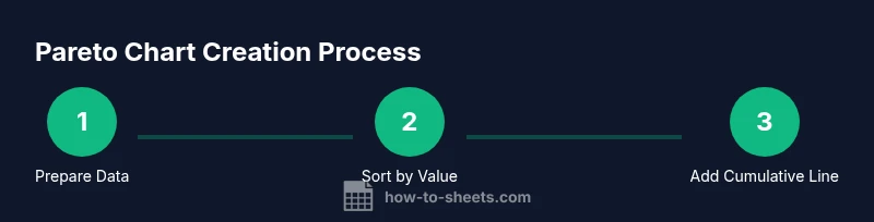
Step-by-step workflow overview
Creating a pareto chart google sheets involves several coordinated steps: prepare data, sort by value, compute cumulative totals, derive a cumulative percentage, and then plot a combined bar-and-line chart. Each action builds toward a single goal: to highlight the most influential categories at a glance. In Google Sheets, you’ll leverage basic formulas, the Chart editor, and simple customization options to produce a clear, publication-ready visualization that supports decision making.
Building the chart: combining bars and the cumulative line
With data ready, insert a bar chart that uses the Value column as the series and the Category column as labels. Then add a second series on the same chart using a line to represent the cumulative percentage. You’ll need to switch the second series to a line type and ensure the axes align: the left axis for bars (units of value) and the right axis for the cumulative percentage (0–100%). This dual-axis configuration is what makes a pareto chart google sheets meaningful, letting readers see both frequency and impact in one glance.
Customization tips to improve readability
Fine-tune the pareto chart google sheets for quick comprehension. Use bold titles, category labels that fit without overlap, and a clearly labeled right-hand axis for the cumulative percent. Color the bars with a consistent palette and choose a smooth line for the cumulative trend. Add data labels for the top categories if helpful, and consider enabling a filter view so stakeholders can focus on a subset of categories during reviews.
Common pitfalls and how to avoid them
Mistakes often arise from skipping data cleaning or misconfiguring the cumulative line. Ensure there are no blank rows in the data range, verify that the total used in the percentage calculation is the final cumulative total, and double-check that the line chart indeed reflects a cumulative percentage rather than a simple running total. When in doubt, validate results by recomputing the totals manually for a small sample to confirm the chart behaves as expected.
Practical example: hypothetical dataset walkthrough
Imagine a help desk dataset with categories like Login issues, Payment problems, and Data sync errors. After tallying frequencies and calculating cumulative totals, you would sort categories from highest to lowest, compute the cumulative percentage, and plot the chart. The pareto chart google sheets will reveal which issue types drive most complaints. You can then discuss targeted fixes, monitor improvements over time, and share the chart with teammates to align priorities.
Automating updates and extending with templates
Once you have the Pareto chart in Google Sheets, you can automate updates by linking the data range to a live source or using array formulas that expand as data grows. Consider creating a reusable Pareto template with named ranges, conditional formatting, and a small data-entry form for new records. This template can be shared with teammates and adapted for related analyses, such as Pareto analyses of customer feedback or defect rates.
Tools & Materials
- Google Sheets account(Any Google account with Sheets enabled)
- Dataset with two columns (Category, Value)(Cleaned and labeled (e.g., Category, Count))
- Internet connection(Needed to access Sheets features and functions)
- Optional: sample Pareto template(If you reuse a template, save as a new file to preserve data)
- Basic familiarity with Google Sheets formulas(SUM, SORT, and simple arithmetic are sufficient)
Steps
Estimated time: 25-40 minutes
- 1
Prepare your data
Arrange data in two columns: Category and Value. Ensure there are no blank rows and that values are numeric. This clean layout is essential for accurate counting and subsequent calculations.
Tip: Use Data > Remove duplicates and Data > Create a filter to review data quickly. - 2
Sort data by Value descending
Sort the dataset so the category with the highest value appears first. This ordering is critical for a Pareto chart because it defines the priority of issues.
Tip: Always sort on the Value column; reset the header row to prevent it from being sorted with data. - 3
Add a cumulative total column
Create a new column that accumulates the Value: first row equals that row's value, second row adds the next value, and so on.
Tip: Use a simple SUM range that expands with each row, e.g., =SUM($B$2:B2) and fill down. - 4
Add a cumulative percentage column
Divide each cumulative total by the grand total to convert to a percentage. This shows how much of the total is covered as you move down the list.
Tip: Compute the total once (e.g., in Bn) and reference it in each row, e.g., =C2/$C$N. - 5
Create the bar chart (Value by Category)
Insert a chart and select the Category as labels and Value as the bars. Choose a column chart to display the primary data clearly.
Tip: In the Chart editor, set Chart type to Column and confirm the data range includes headers. - 6
Add the cumulative percentage line
Add a new series to the chart using the Cumulative Percentage values, then convert that series to a line chart. Align the right axis to a 0–100% scale.
Tip: If the line doesn’t appear, use Customize > Series to adjust the chart type for the second series. - 7
Format axes and labels
Label the left axis with the Value units and the right axis with Percentage (%). Ensure the title and legend are concise.
Tip: Hide the gridlines for a cleaner look and add a chart title like “Pareto Chart of Issue Categories.” - 8
Interpret and save
Review which categories are driving the majority of the impact and discuss potential action items. Save the chart and share it with stakeholders.
Tip: Create a filter view if you want to explore subsets (e.g., by date or department) without adjusting the master chart.
FAQ
What is a Pareto chart and when should I use it?
A Pareto chart shows categories ranked by frequency or impact with a cumulative line. It helps you prioritize where to act first and is useful during quality improvement, customer support analysis, or process optimization.
A Pareto chart ranks issues by impact and adds a cumulative line, helping you prioritize actions quickly.
Can Pareto charts show both frequency and impact simultaneously?
Yes. The bars display frequency or raw impact by category, while the overlaid line represents the cumulative percentage, illustrating how much of the total is covered as you add categories.
Yes, bars show frequency and the line shows cumulative impact for quick prioritization.
Do I need a secondary axis for the cumulative line?
Often yes. A secondary axis allows the cumulative percentage to be read on its own scale (0-100%) while keeping the bar values legible on the primary axis.
Usually you should use a secondary axis so the percentage line scales properly with the bars.
How can I automate updates when data changes?
Use dynamic ranges or linked data sources in Google Sheets so that the chart grows as new rows are added. You can also create a template that updates formulas automatically.
Link the data range to live data and use a template for automatic updates.
Can Pareto charts be created in older versions of Sheets?
As long as you have access to basic charting features in Google Sheets, you can create Pareto charts. Some advanced formatting may require recent updates, but the core approach remains the same.
Pareto charts can be created in standard Google Sheets; some advanced formatting features may vary by version.
What are common mistakes when building Pareto charts?
Common errors include not sorting data correctly, miscalculating the cumulative total, or misaligning the secondary axis. Double-check formulas and range references before finalizing.
Common mistakes are sorting errors, wrong cumulative totals, and axis misalignment. Check formulas carefully.
Watch Video
The Essentials
- Identify top issues first and focus actions there.
- Sort data before charting to preserve Pareto logic.
- Use a dual-axis chart to show both frequency and impact clearly.
- Validate calculations by spot-checking a few rows.
- Save and share a reusable Pareto template for teams.